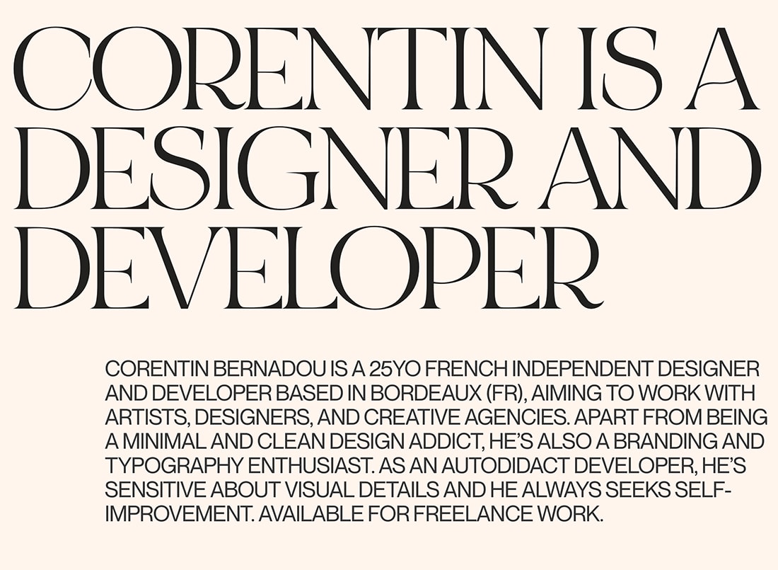
Trend: Retro Serif Typography
Serif typography is having a moment. From thin lines to interesting shapes and even modern serifs, this trend is taking over new website projects. What’s great about serifs is that they can add a certain flair or mood to a design based on the style of letterforms.
This trend is using retro-style serifs in a number of ways. (Our favorite option is for display text that pairs a retro serif with a simple sans serif, to create some eye-catching contrast and variety).
Here’s how to use this trend with some examples that do it exceptionally well, covering a range of different design styles and niches.
Retro Serif Plus Sans

It’s hard to define what makes a serif typeface “retro.” It’s as much about feel as anything else.
The font in combination with other elements brings it all together. One of the cautions that designers have had about using serifs for a while is that they can look dated, but that’s exactly the look we’re going for here.
The best font pairings when it comes to using serifs are generally a serif for larger text with smaller text using a simple sans serif. This allows the personality of the serif to come through while providing optimal readability and ease of typesetting with the sans option.
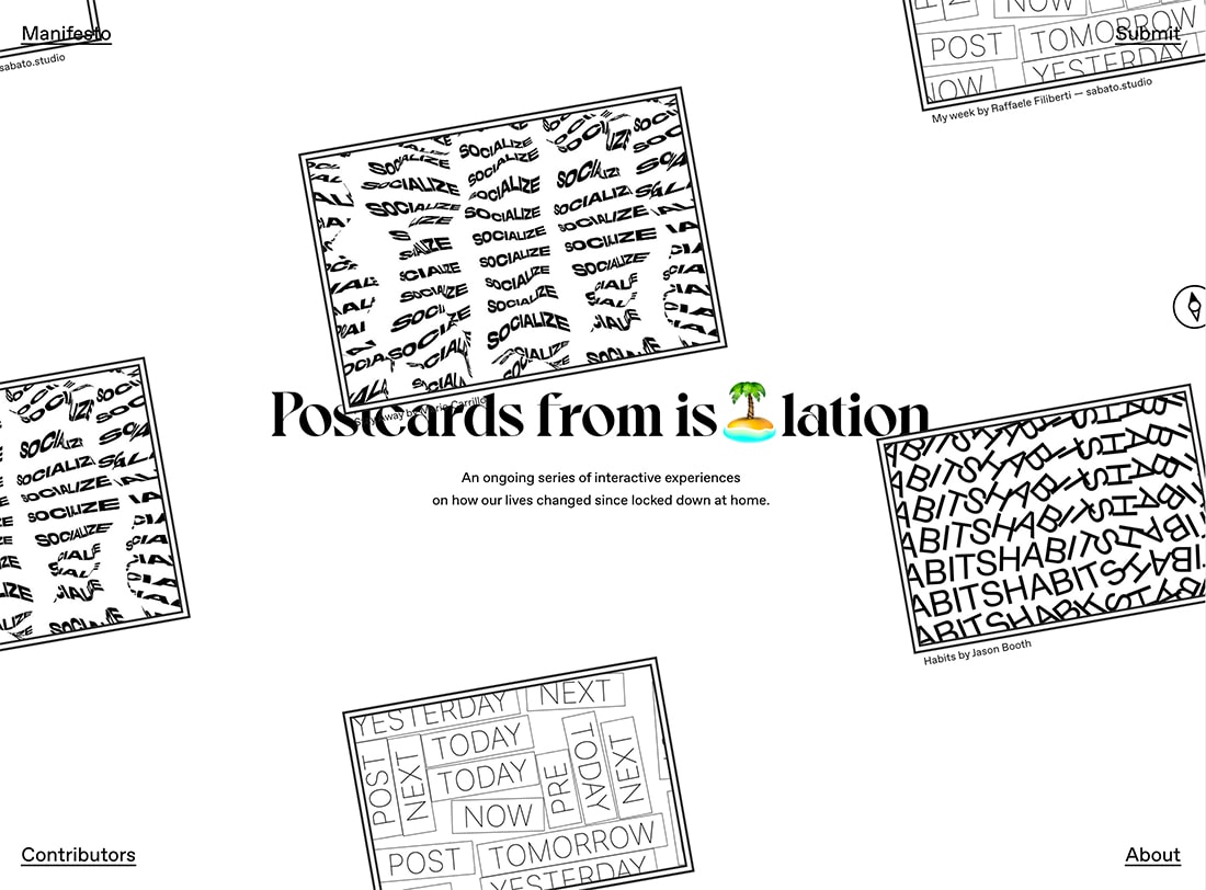
Postcards from Isolation uses a serif with a lot of personality with a simple sans that’s highly readable. The minimal style – especially when used with a concept such as “postcards” – has a defined throwback feel.
Studio Chevojon uses a beautiful combination of a light serif (a somewhat risky choice, especially with the outline option) and tiny sans serifs. The typography choices overall here are bold due to font choices and sizing. But it gets your attention.
Lick does it with a thick serif for branding and headers and almost undersized sans serifs for other copy.
Modern Serifs


Often, this style uses a modern serif to create just the right old-school with a current vibe that people are looking for.
Modern serifs are any serif font with alternating thick and thin strokes. At one point, it was recommended that designers stay away from this typeface category online because it was difficult to reproduce legibly on screens. That’s no longer true thanks to high-resolution everything, so use them as you wish!
We’ve even got a gallery of 100 beautiful modern sans serifs for you to browse here.
Modern serifs may use thick and thin stroke widths that are quite obvious or subtle. (It’s a popular option in this trend and you’ll see this style of fonts in many of the other examples as well.)
Serifs and Italics
It’s hard to pinpoint why serifs lend themselves to using more italics, but you’ll it is more commonly with serifs than sans display typography.
The likely reason is that you get more differentiation with serif italics. The characters lend themselves to it in a more beautiful way.
Italics can be a nice way to add emphasis to key words in display type, as the examples above show.
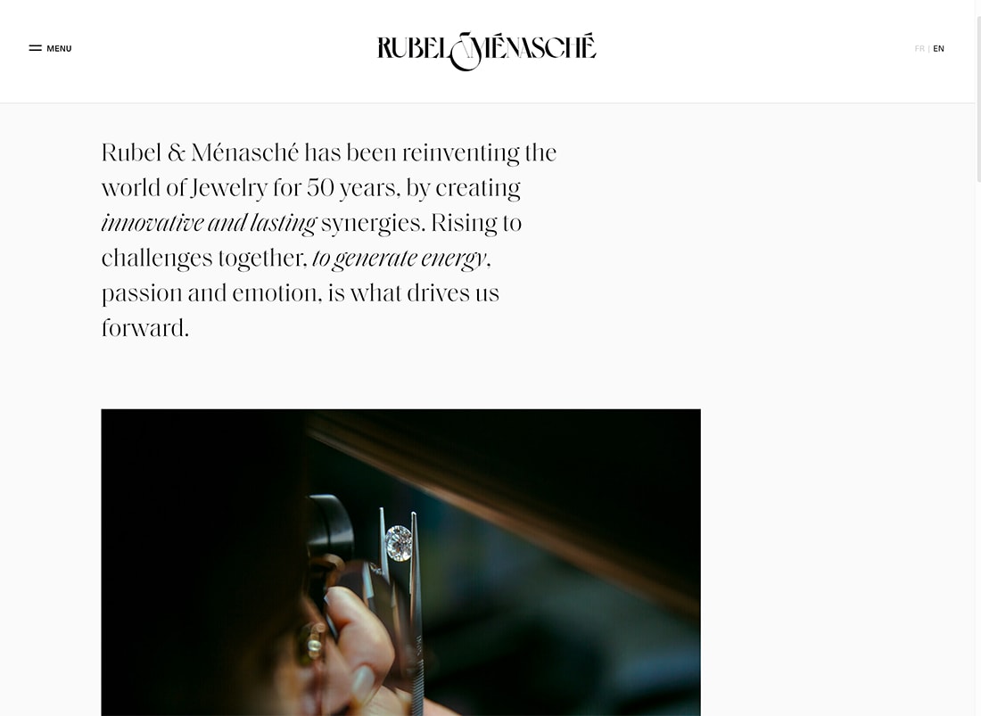
Rubel & Menasche uses multiple italic phrases to draw the eyes through the text block and to showcase its brand.
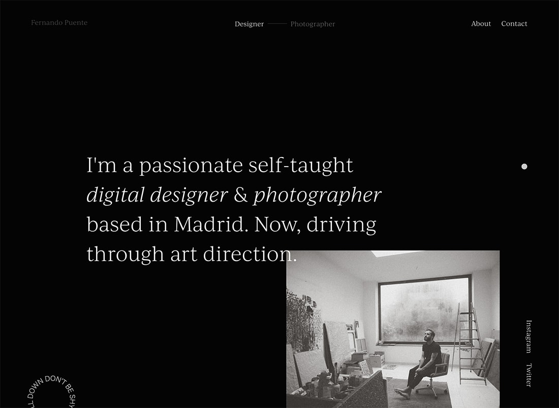
Fernando Puente uses italics to tell people who he is on his portfolio page. Note how the italic option makes those words look different than the other text.
Mod “Feels”
Part of what makes something feel truly retro is an homage to another time in history. The typefaces in the examples above had a mod style that evokes that emotional connection.
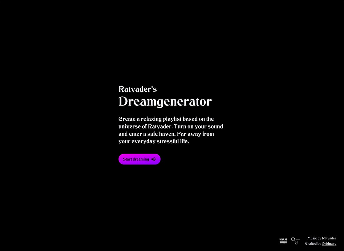
Ratvader’s Dreamgenerator has a fairy-tale feel that almost sends you to childhood in an instant.
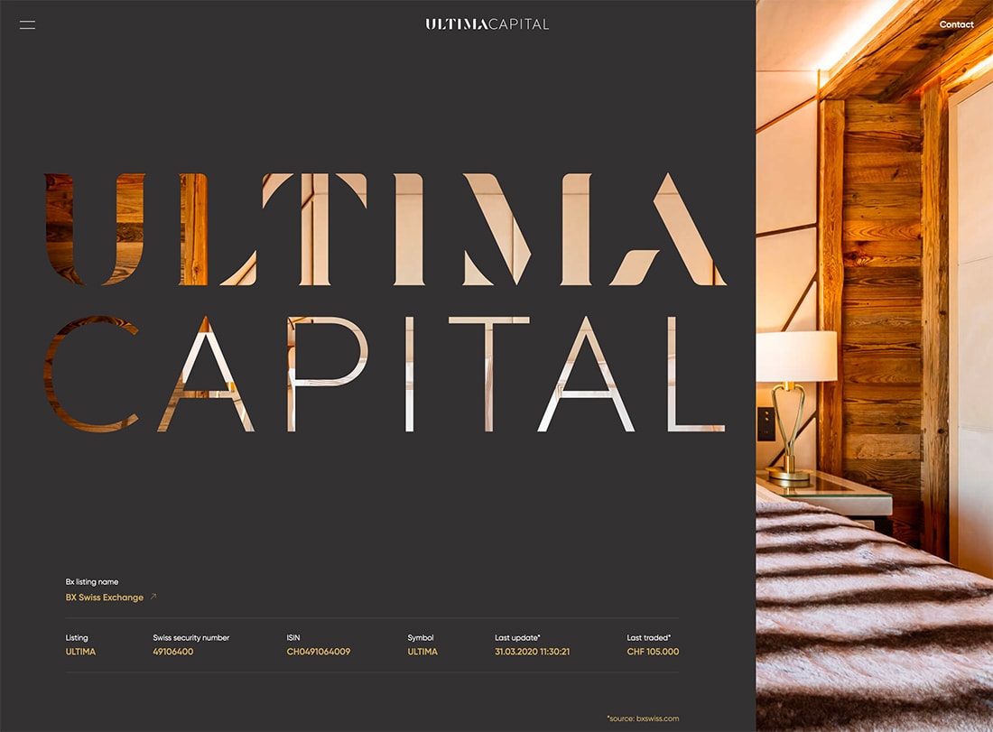
Ultima Capital uses cut-out lettering with a retro (almost 1970s feel) with a background image slider to keep it modern.
Animation and Serifs

To ensure that a typeface doesn’t look out of date – that can be a lot different than retro – incorporating modern effects can be key. Animation with a serif typeface keeps a design fresh and funky without feeling old.
From moving letters to sliders or divots that move around text elements, there are varying ways to add animation to the design without overwhelming it.
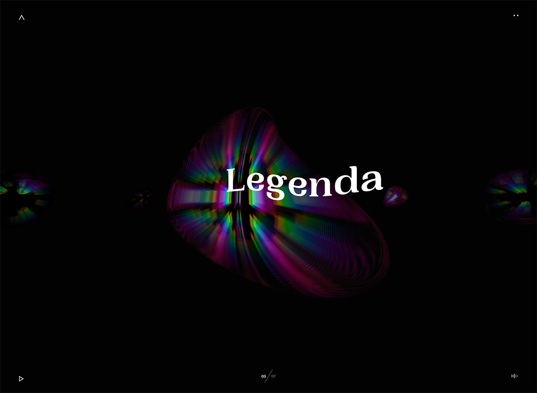
While you can get away with letters that move, such as Legenda (Above), that can be a tricky technique. Your best bet is probably to use animated elements surrounding text to ensure that fresh feel.
All Caps
While all caps typography does have an in-your-face vibe, it can be effective when you have something important to say.
The examples above use all-caps text with very different fonts to accomplish the same thing – emphasize key messaging.
When opting for all caps, take special note of readability. Are the words more decorative or do they need to be taken in slowly and deliberately? Both options are acceptable and your font choice will skew that answer. Choose wisely.
Chunky Serifs
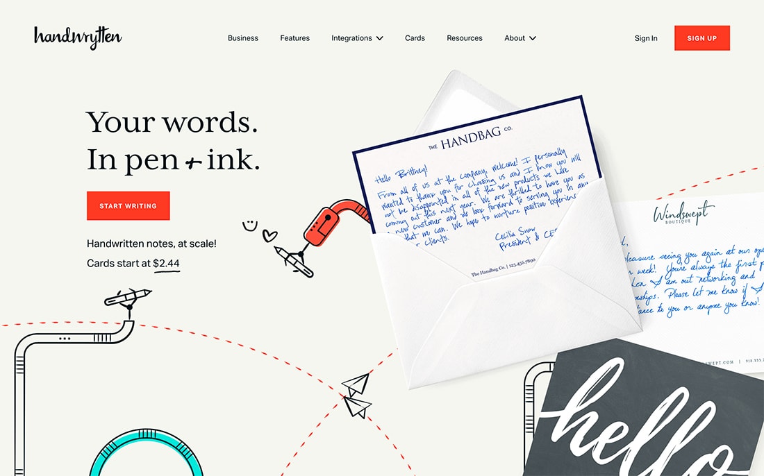
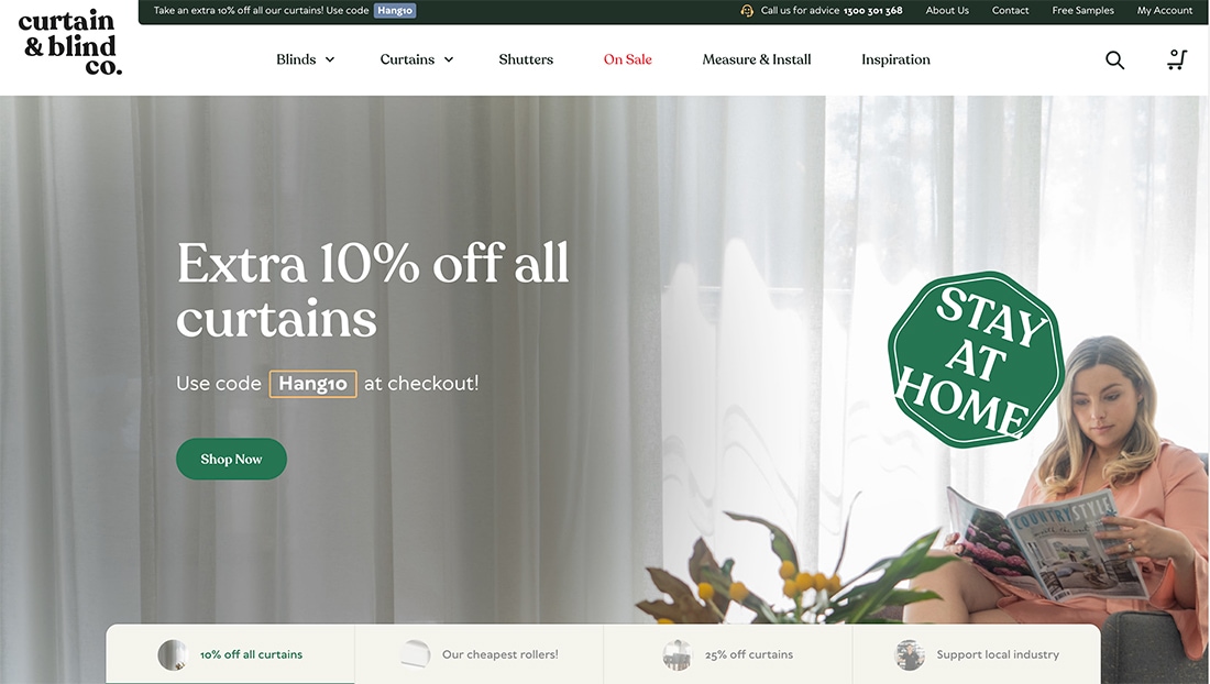
Not quite slabs, chunky serifs are characterized as typefaces with thicker strokes and sider stances. They are impactful and strong.
Chunky serifs are fun because they have an old-school feel with high readability, which makes them pretty easy to use.
Handwrytten uses a wide option for the main headline. It’s easy to read and is bold and interesting without being overwhelming. The serif style also contributes to the “old” practice of letter writing.
Curtain & Blind Co. uses a thick-stroke serif for the logo and big text throughout the design. It’s readable as used in short text blocks and has a lot of visual interest. Using the same font helps tie everything about the website and brand back to the logotype as well.
Conclusion
One thing you’ll probably notice right away about this trend is that many of the serif styles overlap with each other and other trends. That’s one of the great things about a typography option like this.
A typography trend is often a flexible element that you can use and remove quickly if you like. Serif fonts are beautiful, moody, and can set a tone for a project in a way that some other font options cannot.
This style creates an innate retro vibe because it is reminiscent of printed design projects, particularly old-school movie posters or book covers. This will probably only be true for so long as serifs become more common on the web.