What’s the Best Font for Subtitles? 5 Examples Compared
When it comes to choosing the best font for subtitles (or any other captioning), nothing matters more than readability. Clear subtitles are more than just identification on the screen, they can be a means of accessibility for many users.
You’ve probably seen a fair share of good – and bad – subtitle font options. (I remember watching a movie where the subtitles were yellow and nearly unreadable in some scenes. That’s not a good choice!) Closed captions are also common for viewing video on social media – who wants to play the sound at work? – and to understand content in another language.
Today, we’ll look at some of the best fonts for subtitles, and tips for creating small text elements on a moving video background that people will actually want to read.
Roboto

Roboto is one of the most common typefaces in the modern era. It’s used pretty universally across device types, screen sizes and for a number of purposes. Subtitles and captions are no exception.
And because the eye is so used to this typeface, it’s quick and easy to read. The goal of using a subtitle is to make the content easier for the user to understand, and that’s why Roboto is a good option.
Wired magazine explains that people are using captions for everything:
“Closed captions are a must for foreign-language movies and shows like Netflix’s 3%, and they’re great for shows with heavy accents or jargon. But more and more people are leaving them on for everything. Why?”
Getting into the answer can be a little complicated – you can read about it in Wired – the takeaway is that people are using lots of subtitles and captioning. As a designer, you need to be ready to accommodate it.
Roboto has a wide range of weights and styles, but for subtitles and captions, avoid condensed or super-thick or thin weights. You might recognize Roboto Medium as the font YouTube uses for subtitles by default.
Find it here: Roboto is available from Google Fonts (and plenty of other providers) as an open-source typeface.
Cinecav

Cinecav Closed Caption Fonts is a set of sans serifs with monospaced and proportionally spaced options for all subtitle usage. What makes this font a good option is that it specifically designed to meet FCC requirements for closed captioning (CEA-708).
“They are more elegant, more legible, and more consistently designed for television applications than fonts provided by other suppliers and have been tested and refined on a broad range of DTV platforms,” according to the typemaker. “The font set also includes Cinecav UI, designed specifically for guide information and menu systems where space efficiency and legibility are extremely important.”
In addition, this typeface includes italics that are suitable for captions – which can sometimes be hard to come by – and include character sets for dozens of languages. The latter is why this font is widely used for television and movies.
I like this option because some of the extra type options are just as readable as the monospaced version. (Monospaced fonts are often a preferred choice for subtitles and captions.) It includes small caps, a light casual option and script.
Find it here: Cinecav license pricing depends on your needs.
Tiresias Infofont

There’s a reason the BBC uses Tiresias Infofont for subtitles: It’s a readable option that’s specifically made for people who must read to understand what’s happening on the screen.
Tiresias includes two typeface options – the free Infofont and a premium Screenfont, that has larger spaces and dashes, made specifically for TV.
The family includes a complete set of fonts with six styles that are designed for legibility with clean lines in a pleasant sans serif. This might be one of the most legible fonts you will find, making it highly appropriate for this usage.
The BBC has a phenomenal guide to subtitles that answers almost any question you might have about text for reading on screens. While you don’t have to follow every one of these guidelines, it is a strong starting point for anyone using subtitles and captions.
Find it here: Tiresias Infofont was created by The Royal National Institute for the Blind and is available for free use thanks to an open source license.
Arial

Arial gets a bad reputation among designers for being the less-cool, Helvetica knockoff. But it is a good option for closed captions and subtitles because it is universally-supported, has a robust character and glyph set and has an unassuming shape.
Character and symbol support is a key element here. For subtitles and closed captions, you might need a symbol (such as a music note) to signal what is happening on the screen. You need a subtitle font option that includes these characters, so you don’t come up short in certain situations.
Choosing a font with Unicode character support is a must-have element. Find the supported characters in Arial here.
Find it here: Arial is one of the most widely used fonts of the last three decades and comes standard on Windows and Mac computers.
Antique Olive
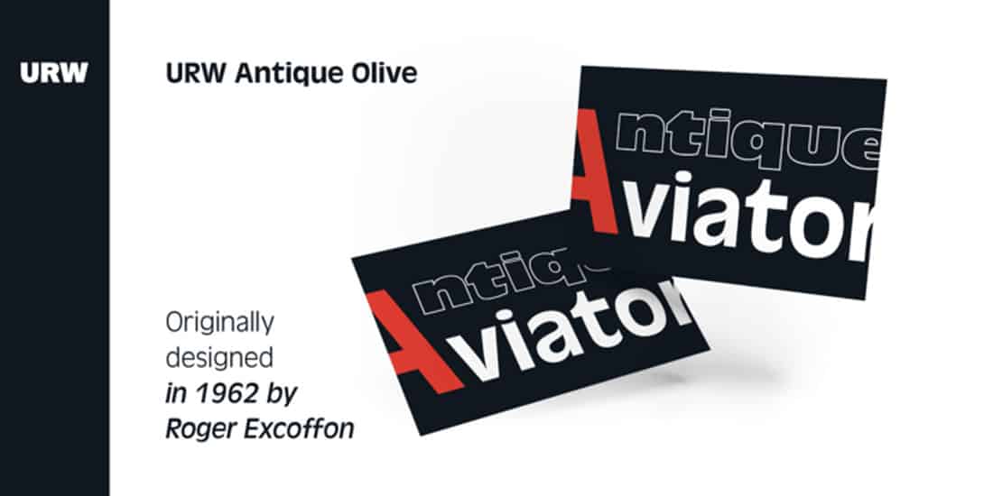
Antique Olive is a sans serif with some personality that’s popular for subtitles on the big screen. The letterforms are rounded and have a uniform stroke width (attributes that contribute to readability), but with some subtle design elements that make the typeface a little more interesting than something such as Arial.
When using a font for a subtitle it is important to think about how the weight of the typeface will render on different background colors and against movement. Some designers place subtitles inside a black box using white lettering for all uses, although this can take away from the action on the screen.
Another option that’s popular is to use a light shadow element to help provide contrast between text and screen elements. A subtitle font with a nice medium stroke is best-suited for this type of treatment.
Find it here: Antique Olive is available as part of Adobe Fonts. For subtitles, start with the regular weight.
Conclusion
Subtitles and captions are everywhere in design. While usage in video is the most common example, you’ll also find them in music lyrics, to translate languages, for emphasis and in voice-overs. They can also be used for titles of elements in the design such as books, newspapers, art or music.
At some point, you will need to add a subtitle or captioned element to a design project. Here, you have a set of tools to make those projects that much easier.