Typography in Dark Mode: How to Optimize Fonts for Low-Light UI
Dark mode has become more than just a trend—it’s a preferred way to browse, work, and interact for millions of users.
From mobile apps and websites to operating systems and dashboards, dark-themed interfaces are now a standard part of digital design.
But while switching the background to black or deep gray might seem simple, designing for readability in these settings requires extra attention, especially when it comes to typography.
Typography in dark mode isn’t just about inverting colors. It involves making thoughtful choices about font weight, spacing, contrast, and even the color of your text.
The goal is to create a comfortable reading experience in low-light environments without causing eye strain or losing clarity.
Here’s how to optimize your fonts for dark mode interfaces.
Understanding the Challenges of Dark Mode Typography
Reading white or light-colored text on a dark background creates a different kind of visual experience compared to the traditional light mode.
While dark mode can feel easier on the eyes in low-light settings, it can also create new issues—like blurry text, poor contrast, or visual fatigue from overly bright fonts.
Designers need to strike the right balance between contrast and legibility. Too little contrast makes text fade into the background, while too much can make it feel harsh and difficult to read.
Typography plays a key role in finding that balance.
Using Variable Fonts in Dark Mode Designs
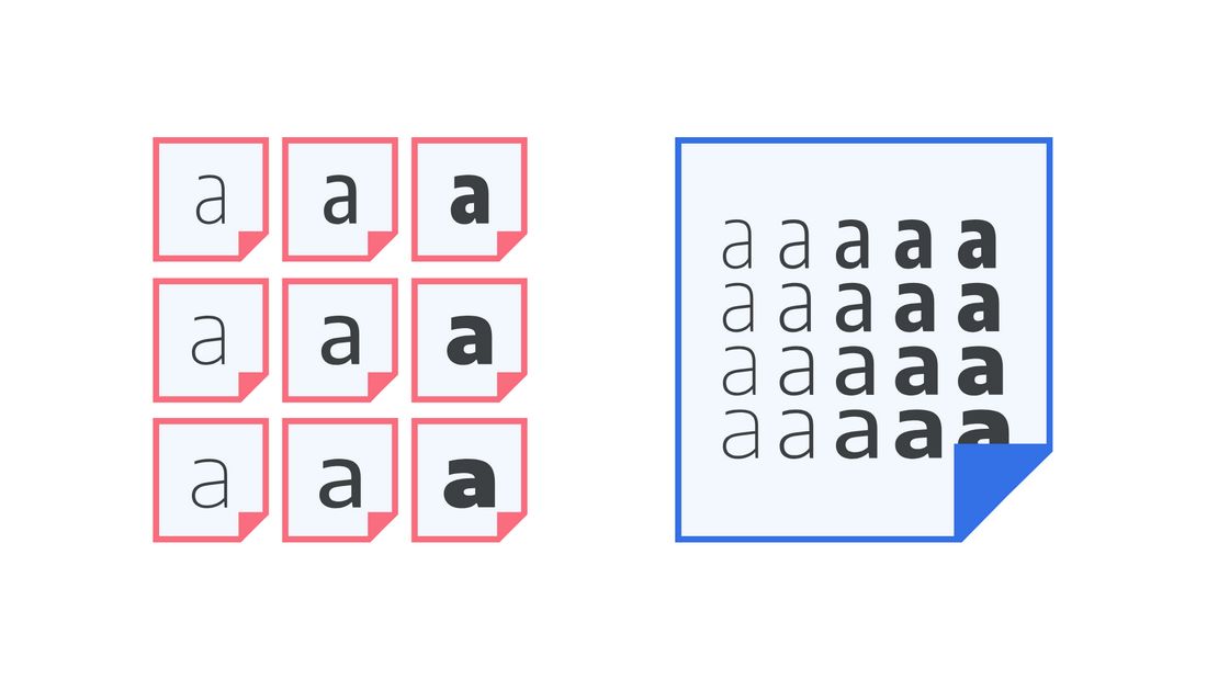
Variable fonts are an increasingly popular choice in modern UI design, and they’re particularly useful in dark mode environments.
In dark mode, subtle adjustments in font weight can have a noticeable impact on clarity. For example, slightly increasing the weight of body text can prevent light-colored text from appearing too faint or blending into the background.
With a variable font, you can make these changes with precision, choosing a value between “Regular” and “Medium” instead of being limited to traditional weight options.
Variable fonts also help maintain consistency across responsive layouts. As text scales across devices or adapts to user settings, designers can tweak font characteristics dynamically without needing multiple font files.
This not only improves performance but also makes it easier to keep dark mode typography visually balanced and accessible.
Incorporating variable fonts into your dark mode designs gives you more control over legibility and style, helping you fine-tune the user experience for different contexts and devices without sacrificing aesthetic flexibility.
Best Practices for Choosing Fonts for Dark Mode
Follow these tips to choose the right fonts for your dark mode designs.
1. Choose Readable Sans-Serif Fonts

In most dark interfaces, clean and simple sans-serif fonts tend to perform better than decorative or serif-heavy ones.
Fonts like Inter, Roboto, SF Pro, and Helvetica Neue are often favored for their crispness and versatility across different screen sizes and resolutions.
Serif fonts can still work—but they should be used carefully and in large enough sizes to remain readable.
Thin strokes and delicate details are more likely to blur on dark backgrounds, especially on mobile.
2. Avoid Ultra-Thin Fonts
Thin and light font weights can disappear or become hard to read in dark mode.
This is especially true when text is rendered in light gray or off-white. Instead, opt for regular, medium, or semi-bold weights to improve visibility without making the design feel heavy.
If your brand uses thin fonts in light mode, consider increasing the weight slightly in dark mode for better contrast and legibility.
3. Adjust Letter Spacing and Line Height

Typography in dark mode can feel more compressed or tight than in light mode.
Slightly increasing letter spacing (tracking) and line height can help open up the text, making it easier to scan and reducing visual fatigue.
This is especially important for body text or long-form content, where dense lines of white text on a dark background can feel overwhelming if not properly spaced.
4. Use Off-White or Muted Colors for Text
Pure white (#FFFFFF) on pure black (#000000) may look sharp, but it’s often too harsh on the eyes.
Instead, use off-white tones like #E0E0E0 or soft grays like #CCCCCC for body text.
These colors still provide strong contrast but feel more natural and less glaring.
You can also introduce subtle color into your typography, like a muted blue or warm gray, especially for secondary text or UI labels. This adds depth and reduces visual monotony.
5. Establish Clear Typographic Hierarchy
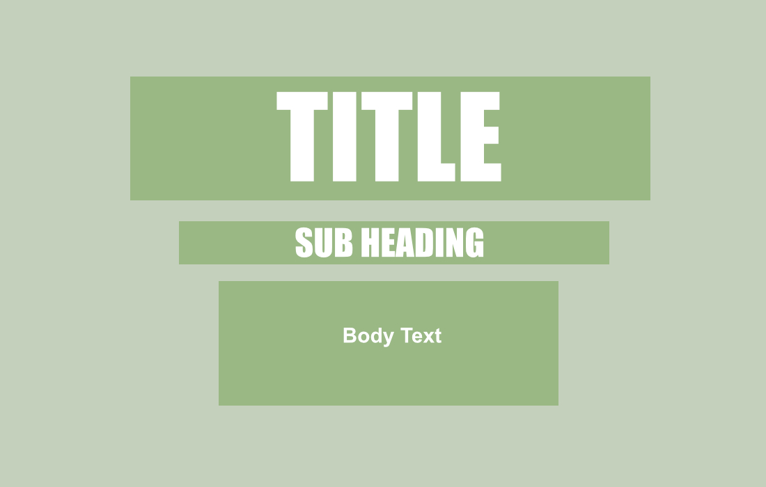
Hierarchy is key in any UI, but it becomes even more important in dark mode.
Use font weight, size, and color contrast to distinguish headings, subheadings, and body text. This helps users scan the page quickly and reduces cognitive load.
For example, a bold heading in light gray paired with regular-weight body text in a softer shade can create a clear visual rhythm while staying easy on the eyes.
6. Test Across Devices and Brightness Settings
Dark mode designs can look very different depending on the screen brightness, device resolution, and ambient lighting.
Always test your typography on both desktop and mobile, and in real low-light environments. This helps you catch readability issues early and fine-tune contrast as needed.
7. Use Font Rendering That Supports Clarity
Certain fonts are optimized for screen readability and will render more cleanly in dark mode.
Variable fonts or those designed for UI—like IBM Plex, Noto Sans, or System UI fonts—can reduce pixelation and improve clarity, especially at smaller sizes.
Always check how your chosen typefaces render in dark mode using tools like Figma, Sketch, or a live code environment.
What looks sharp in a mockup may behave differently in the browser.
Accessibility Comes First!
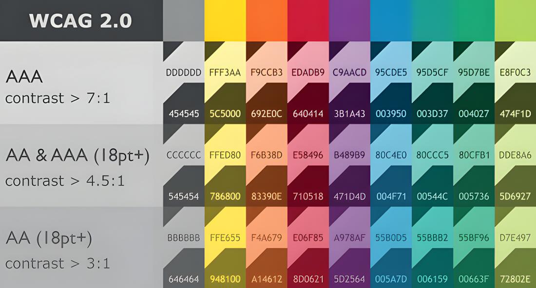
Readability isn’t just about aesthetics—it’s about accessibility. Poorly chosen fonts or contrast levels can create serious usability barriers for people with low vision or sensitivity to light.
Follow WCAG guidelines for text contrast, which recommend a minimum contrast ratio of 4.5:1 for body text and 3:1 for large headings.
There are several online contrast checkers you can use to verify that your dark mode color palette meets these standards.
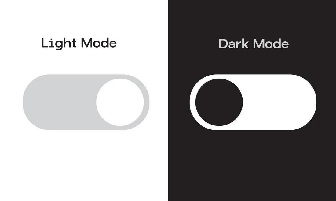
It’s also a good idea to offer users the ability to toggle between light and dark modes, giving them control over what feels most comfortable based on their environment and personal preference.
Conclusion
By choosing the right fonts, adjusting spacing and weights, and prioritizing accessibility, you can make sure your dark mode UI doesn’t just look sleek, it feels great to use, too.
Whether you’re designing an app, a website, or a dashboard, paying attention to how your type behaves in low-light settings can make all the difference between a design that’s stylish and one that’s actually usable.