The Return of Display Fonts: Bold Choices in Modern Design
For a while, clean and minimal ruled the design world, but lately, something louder is making a comeback.
Display fonts, with their bold personalities and distinctive flair, are returning to the spotlight in modern design.
From web headers to packaging, they’re showing up everywhere and for good reason.
These aren’t just decorative fonts used for shock value. Today’s display fonts are smarter, more versatile, and better suited to digital environments than ever before.
When used thoughtfully, big display fonts bring character, clarity, and energy to any project.
In this post, we’ll explore what display fonts are, why they work so well, when to use them, and where they’re making a real impact.
What Are Display Fonts?
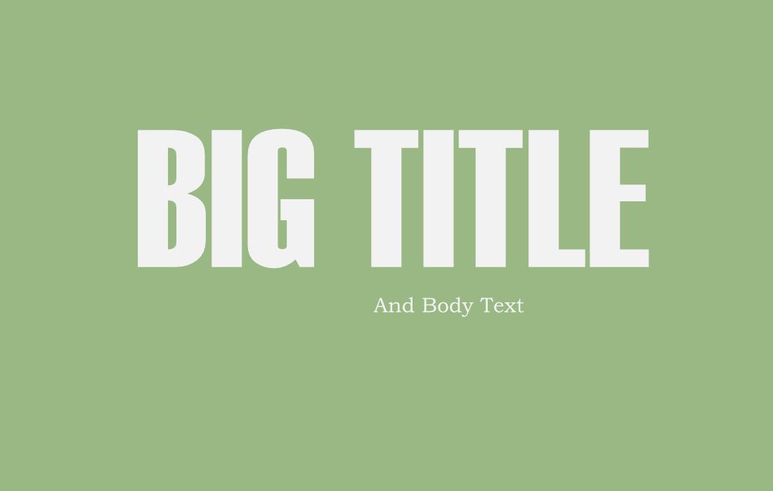
Display fonts are typefaces specifically designed for use at larger sizes.
Unlike body fonts, which are made for long reading and subtlety, display fonts are meant to stand out. They’re typically used for headlines, titles, logos, posters, and anything that needs visual impact.
Display fonts often feature more expressive letterforms, unusual shapes, high contrast, or unique details that wouldn’t hold up at small sizes.
They’re not built for readability in paragraphs, they’re built to make a statement.
They can be serif, sans-serif, script, slab, or experimental, but what defines them is their intention: to draw attention and create mood in just a few words.
Why Display Fonts Are Effective
There’s a reason display fonts are making a comeback: they’re one of the easiest ways to give a design personality.
With just one bold typeface, you can set the tone for an entire brand, campaign, or layout.
Display fonts work especially well in modern design because:
- They grab attention instantly
- They add a unique style without needing extra graphics
- They help reinforce brand identity or messaging tone
- They make simple layouts feel more custom and polished
In a time when scrolling is fast and attention spans are short, display fonts help your content stand out in the crowd, whether it’s on a website banner or a social media ad.
Latest Display Font Trends
Display fonts are constantly evolving to reflect shifts in design culture, brand identity, and digital behavior.
In recent years, we’ve seen a resurgence of bold, expressive typography but with a modern twist.
Here are a few of the latest trends shaping how designers are using display fonts today:
Retro Revival
Designers are drawing inspiration from the 70s, 80s, and 90s with display fonts that bring nostalgic energy to modern layouts.
From groovy bubble fonts to pixel-inspired letterforms, this trend adds warmth and personality, especially in fashion, music, and lifestyle branding.
Chunky Serifs
Thick, confident serif fonts are back in a big way. These typefaces bring a sense of sophistication with an edge, often used for editorial layouts, packaging, and brand headlines.
They combine the elegance of traditional typography with the boldness of display design.
Maximalist Lettering

Instead of playing it safe, many brands are embracing dramatic, decorative fonts with swashes, flourishes, or unexpected shapes.
These fonts are meant to be the hero of the design and are often used with minimal imagery or layouts that let the type speak for itself.
Experimental and Abstract Type
Display fonts are becoming more like graphic elements than pure letterforms.
Designers are pushing boundaries with distorted, deconstructed, or custom-drawn type that blurs the line between art and communication.
While not always highly legible, they’re perfect for making bold visual statements.
Variable and Animated Type
As digital formats become more dynamic, variable fonts and motion typography are rising in popularity.
Designers are using display fonts that respond to interaction or include movement, adding a layer of engagement to websites, apps, and videos.
When and Where to Use Display Fonts
Because of their decorative nature, display fonts are best used sparingly and intentionally, where they can have the most impact without overwhelming the rest of the design.
Here’s where they shine:
- Headlines and Hero Text: Make the top of a page or poster instantly eye-catching.
- Logos and Branding: Establish a unique visual voice with a font that feels iconic.
- Posters and Flyers: Create bold compositions with just type and minimal visuals.
- Social Media Graphics: Stop the scroll with text that feels dynamic and expressive.
- Event Announcements: Set the tone for a concert, gallery show, or festival with bold typography.
When using display fonts, it’s important to use them thoughtfully. Avoid applying them to body copy or dense blocks of text, as their decorative nature can make reading difficult.
Stick to one display font per design to prevent visual clutter, and pair it with a clean, neutral typeface to maintain balance and clarity throughout your layout.
The key is contrast. Let the display font do the heavy lifting in one area, and keep the rest of the type clean and supportive.
Great Examples of Display Fonts in Action
When used well, display fonts shape the tone of a piece and help brands and messages stand out.
Here’s how different design fields are using bold typography to great effect.
Posters
Posters are all about grabbing attention from a distance, and display fonts make that possible with bold, expressive lettering.
Whether it’s a concert, art exhibition, or film screening, oversized type can become the main visual feature.
Display fonts give designers the freedom to play with scale and create visual drama using text alone.
Magazine Covers
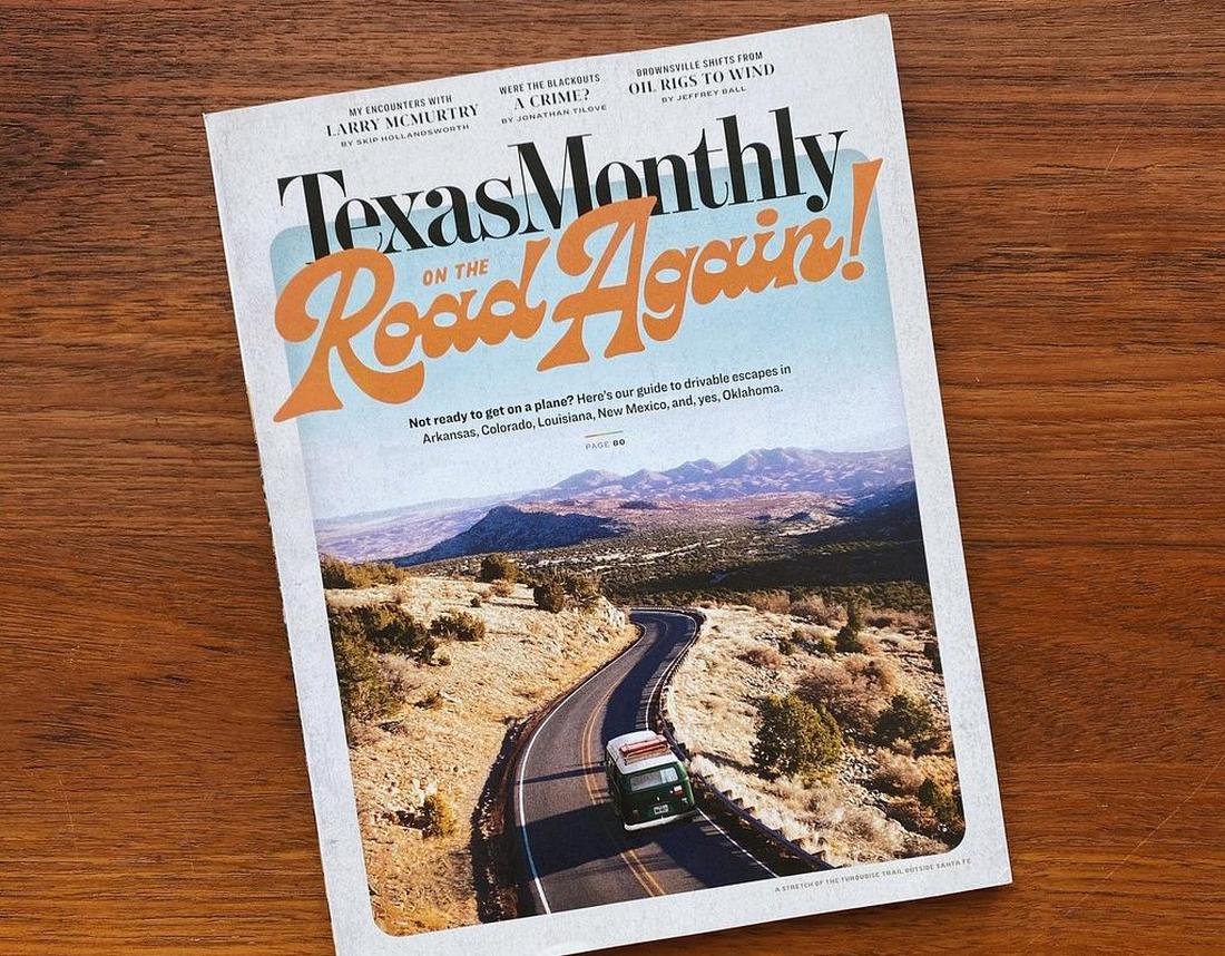
Many modern magazine covers use strong display fonts to define their identity and editorial voice.
Think of titles like “The Gentlewoman” or “Esquire”, where bold serifs or custom typefaces are used for the masthead and headlines.
These fonts help establish hierarchy and give the publication its recognizable tone before you even flip a page.
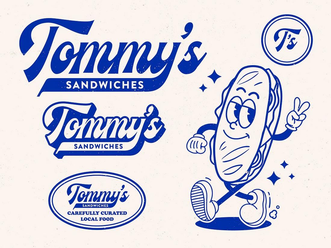
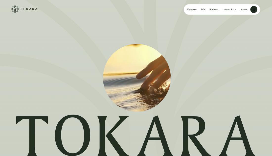
Branding Designs
For brands looking to make a memorable impression, a distinctive display font can become a signature element.
Whether it’s a wordmark logo or a bold headline style used across campaigns, display fonts communicate attitude and values—minimal and modern, quirky and fun, or classic and refined.
They help shape how a brand feels at first glance.
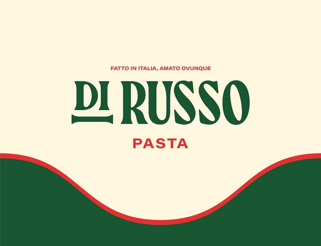
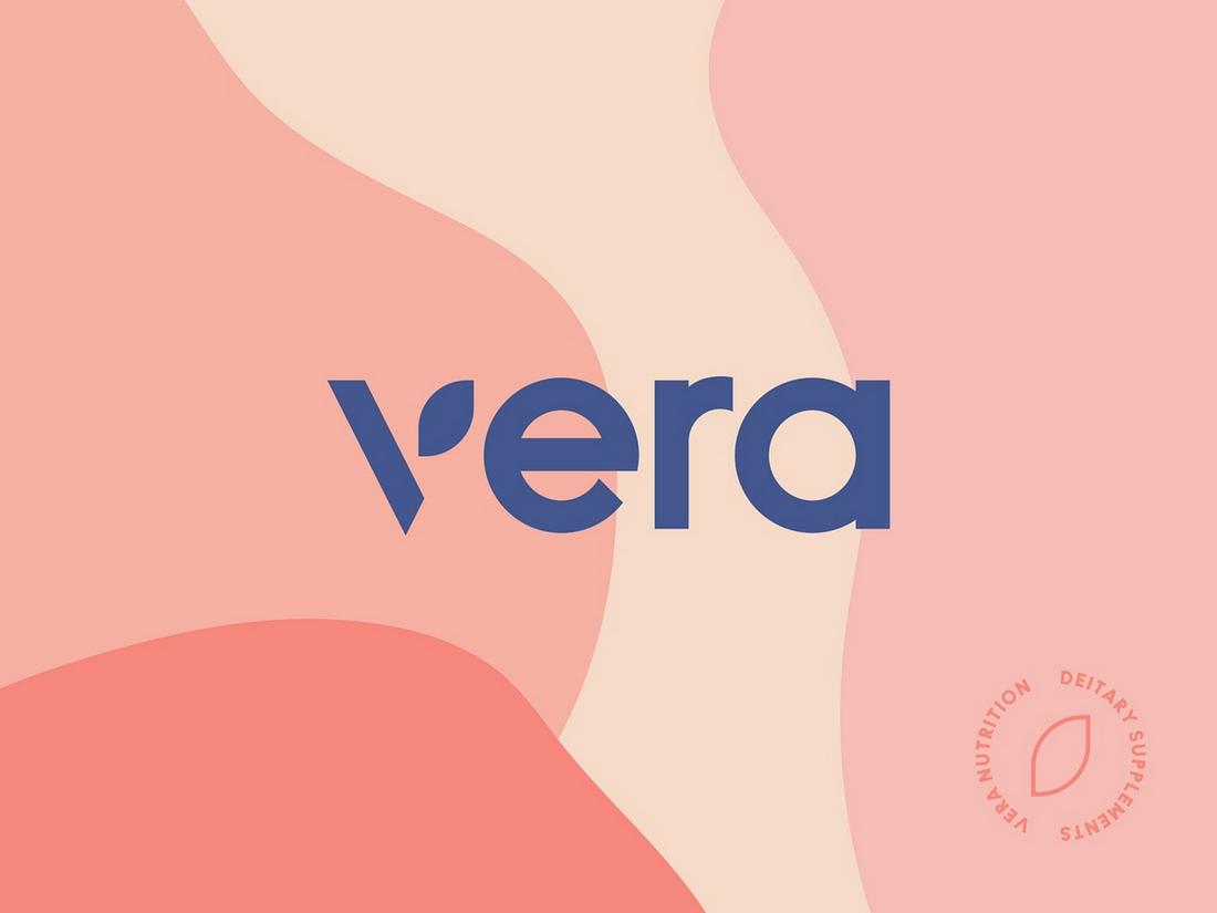
Packaging Design
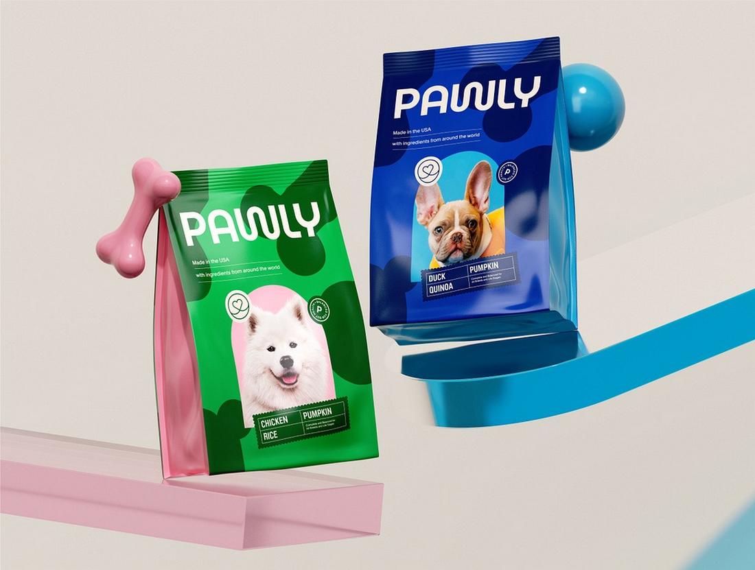
Shelf space is limited and competitive, so packaging often relies on display fonts to stand out.
Large, impactful type is used for product names, taglines, or ingredients, sometimes replacing the need for heavy imagery.
This clean, text-forward style is popular with lifestyle, beauty, and wellness brands aiming for a modern, editorial aesthetic.
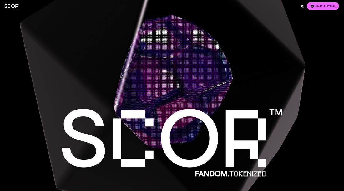
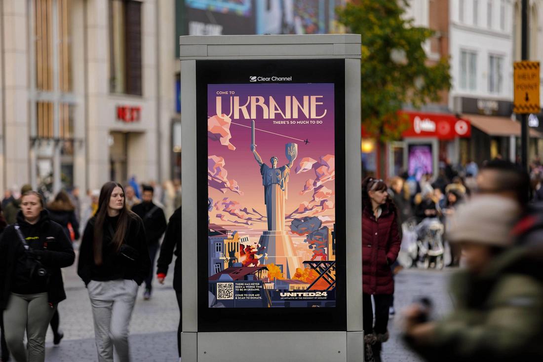
Ad Campaigns
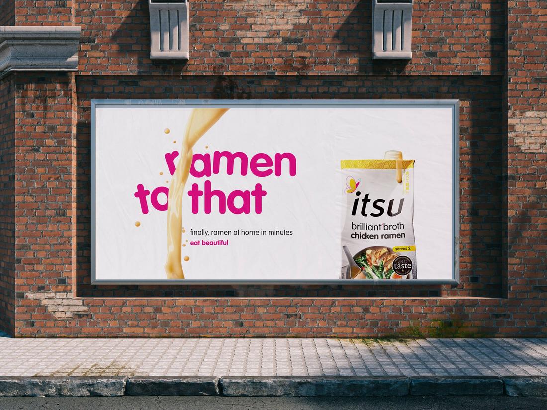
From billboards to social media ads, display fonts help grab attention fast.
Whether it’s a punchy headline or a quirky, custom typeface, these fonts anchor the message and guide the eye.
Bold typography in ad campaigns adds urgency, energy, or personality, perfect for fast-moving content that needs to leave an impression in seconds.
10 Tips for Using Display Fonts Effectively
Follow these tips to make the most of bold type while keeping your designs clear, balanced, and on-brand.
1. Use Display Fonts for Impact, Not Everything
Display fonts are meant to stand out, so save them for the parts of your design that need the most attention, like headlines, titles, or short key phrases.
Avoid using them for long paragraphs or UI elements where readability is more important.
2. Choose Fonts That Reflect the Message
Match the style of the display font to the tone of your content. A sharp, geometric font might suit a tech brand, while a chunky serif feels more classic or expressive.
The font should amplify the feeling you want to convey.
3. Keep the Secondary Fonts Simple
Let the display font be the star and pair it with a clean, neutral secondary typeface.
Sans-serifs like Inter or serif families like Georgia work well for body text that needs to support without competing.
4. Focus on Readability
Some display fonts look great in concept but fall apart in practice.
Always test at actual size and ensure your headline is legible at a glance, especially if it’s part of an ad, poster, or social graphic.
5. Use Plenty of Space Around Bold Type
Display fonts need breathing room to stand out. Add generous margins and padding around your text, and avoid cramming it into tight layouts.
The whitespace helps the typography feel intentional and confident.
6. Stick to One Display Font Per Design
Mixing multiple loud fonts can cause visual overload. Pick one display font and build your design around it.
If you want variety, use different weights or alternate characters from the same font family.
7. Adjust Tracking and Leading
Because display fonts are designed for larger sizes, you may need to tweak letter spacing (tracking) and line spacing (leading) for balance.
Loosen things up slightly to improve readability and appearance.
8. Be Mindful of Contrast and Backgrounds
Your bold font should be easy to read against whatever it sits on.
Use high contrast between text and background, and consider adding shadows, outlines, or solid color blocks if the type sits on top of busy visuals.
9. Test in Context
Display fonts behave differently across formats—what works on a poster may not work in a social post or mobile ad.
Test your design in the final format to make sure the font performs well in real conditions.
10. Don’t Rely on Trend Alone
Just because a display font is trendy doesn’t mean it’s right for your project.
Choose fonts that support your message and will still feel appropriate months or years down the line, especially in branding work.
Conclusion
Display fonts aren’t new, but their return in modern design shows how timeless and powerful typography can be.
When used with intention, they bring personality, emotion, and clarity to any design. The key is knowing when to let them lead and when to let them rest.
So next time you want to make a bold statement, consider starting with a big, bold, display font. It just might be all you need to make your message stand out.