5 Tips for Designing With Graffiti Fonts
Graffiti fonts can add a cool or edgy vibe to design projects, but can be a bit tricky to use if you aren’t careful. The reason for caution mostly lies in readability, due to letterforms that might be somewhat irregular or touch and merge in different ways.
For the right projects, though, graffiti fonts can be a fun way to add something special and really get to the heart of the emotional connection you want to make with the design.
We’ve put together five tips to help you use graffiti fonts well with five extra graffiti fonts you can download and use from Envato Elements.
1. Pick the Right Type of Graffiti Font
When using graffiti fonts, consider the context of your design. Graffiti fonts may not be appropriate for all projects or audiences, so be sure to choose a font that fits the tone and style of your design.
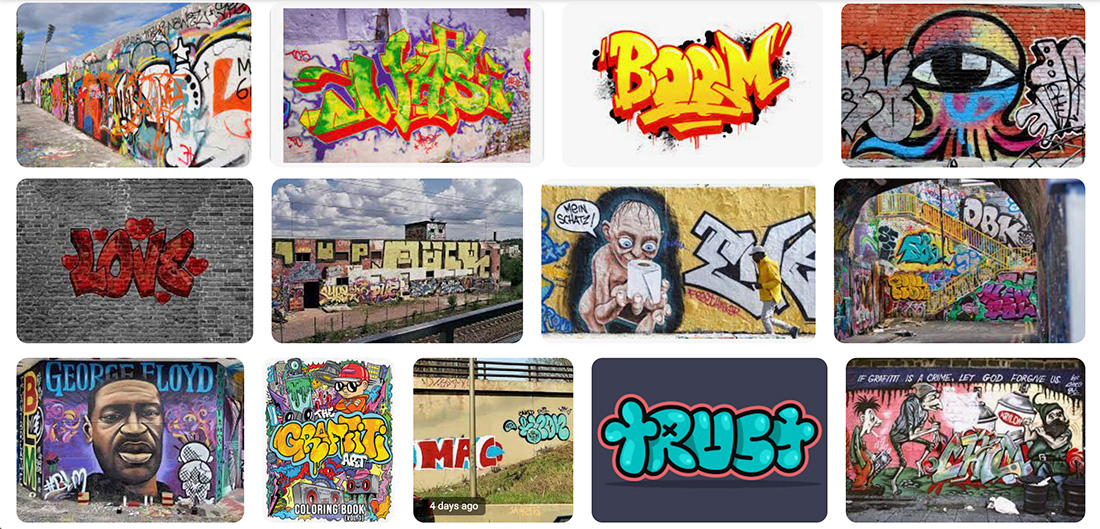
Even in the category of graffiti fonts, there are different types and styles to choose from:
- Tag: The most simple form of graffiti lettering is wording in one color with a simple, almost handwriting style. They often have a little bit of a “drip” pattern because these are often created with spray paint in real use.
- Throw Up: This is a more elaborate version of a tag, often with more color, and is easily replicated.
- Bubble Letters: This is the style you are likely most familiar with; it has big, and often colorful, letters in a rounded style.
- Stencils: Graffiti isn’t always in hand style. Stencils can be used to create the effect as well.
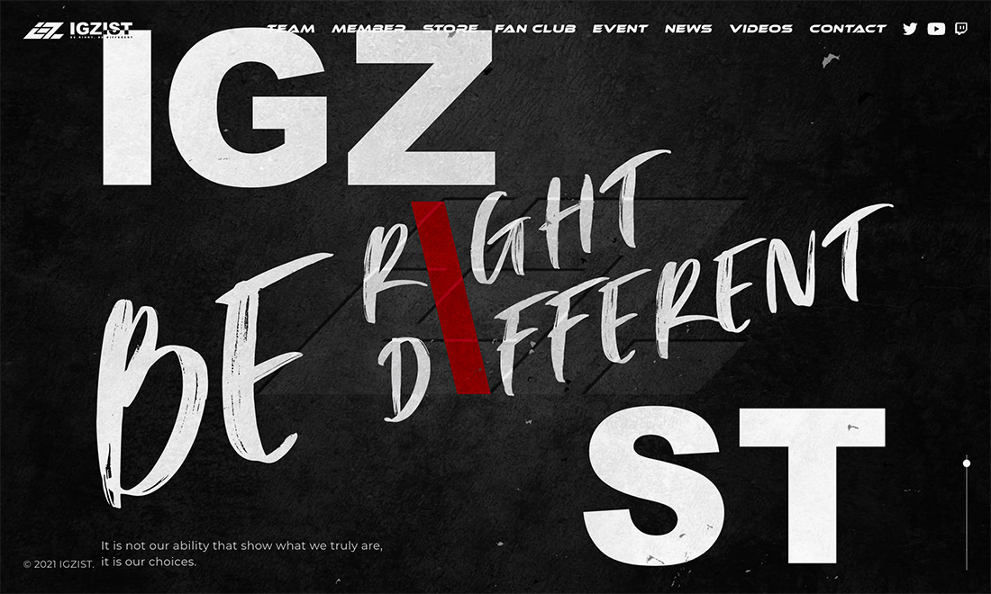
- Wildstyle: This form of graffiti is an art form in itself and is complicated and very stylized lettering. It generally has a lot of color and features lots of divots from letters such as arrows, spikes, or curves.
2. Pair with a Highly Readable Font
Most graffiti fonts will not be super readable, so putting them together with something that will make your design more approachable and easier to understand.
Pair graffiti fonts with other fonts to create a balanced design. For example, you might use a graffiti font for hero areas or display text and a simple sans serif for everything else.
3. Play with Layering of Elements
Experiment with layering your graffiti font over other design elements, such as images or textures, to create a dynamic and visually interesting design.
This layer style mimics what graffiti often looks like in real life, giving it a more organic and authentic feel. Some designers will even layer graffiti on top of itself with color setting apart the words to read to create a truly realistic feel.
Think about layering within your lettering as well. Often graffiti fonts will feature shadows, outlines, or both! Play with how to create layers in the full design and for lettering for an almost three-dimensional effect that demands attention.
4. Get Creative with Color
Color is an important part of graffiti design, so be sure to choose colors that complement your font and overall design.
For true integrity of the style, bright and basic colors – blue, red, green, and yellow – are the most popular. But you can use your imagination and style to extend color choices to brand colors or almost anything that matches your design aesthetic.
Think about color as a way to help separate these typefaces from the rest of the design and provide a focal point. On the other hand, you can use color in the typeface to help assist readability and bring focus to the words in just the right way.
5. Use Graffiti Fonts Sparingly
Graffiti fonts can be visually striking, but they can also be overwhelming if used excessively. Use graffiti fonts sparingly to avoid over-complicating your design. Part of this comes from these typefaces being difficult to read: The more intricate of an option you choose, the more sparingly it should be used.
Sparing use also extends to the number of projects as well. This style can have a high impact. Don’t use it in a lot of projects all at once, because they can start to look similar very quickly.
5 Graffiti Fonts We Love
There’s a fine line between art and readability with graffiti fonts, but typographers are doing a great job of creating this balance. Here are five options we love that encompass all the different types of graffiti fonts to help you create something that’s both visually interesting and readable.
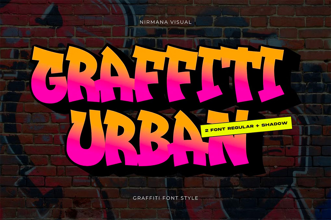
Graffiti Urban Font
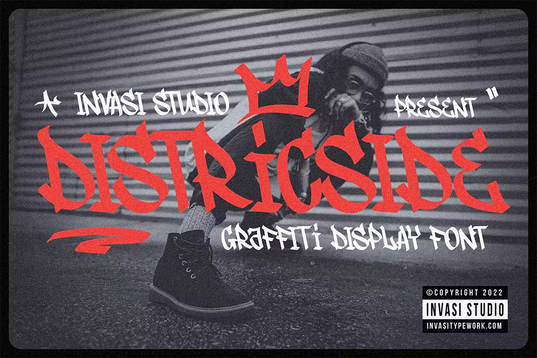
Districtside Tagging Graffiti Font
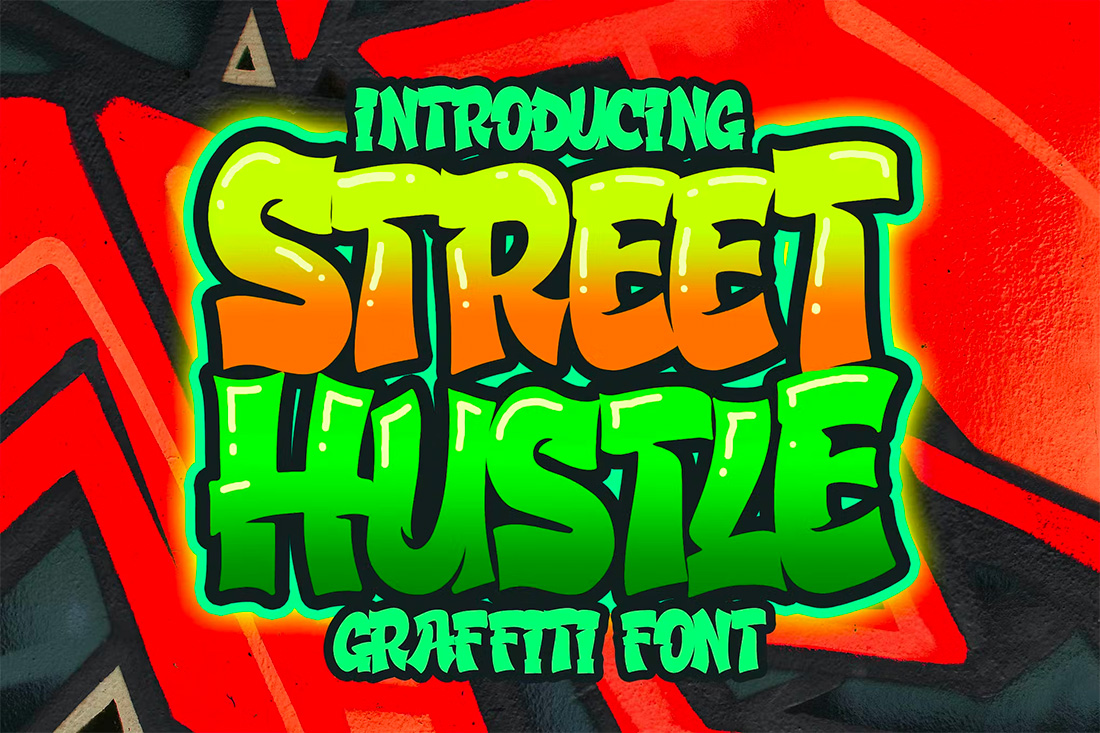
Street Hustle Graffiti Font
Bozart Graffiti Font

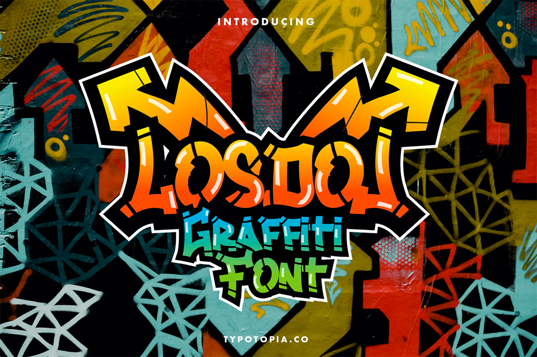
Losdol Graffiti Font
Conclusion
Graffiti fonts can help create a fun and visually appealing design. The tricks to using them well include thinking about style, how you pair graffiti fonts with other typefaces, layering elements, using color well, and using these styles only when necessary.
This is a fun design technique that can bring a funky feel to projects. Have fun with it!