What Is Kerning in Typography? + Tips & Examples
Kerning, a term frequently encountered in the world of typography, is a critical element in creating visually appealing and readable text.
It refers to the adjustment of space between individual letter pairs to ensure consistent and harmonious spacing throughout the text. Effective kerning prevents the text from appearing uneven or cluttered and enhances overall readability.
In this article, we explore the nuances of kerning in typography along with practical tips and examples to help designers make informed kerning decisions.
What is Kerning Typography?
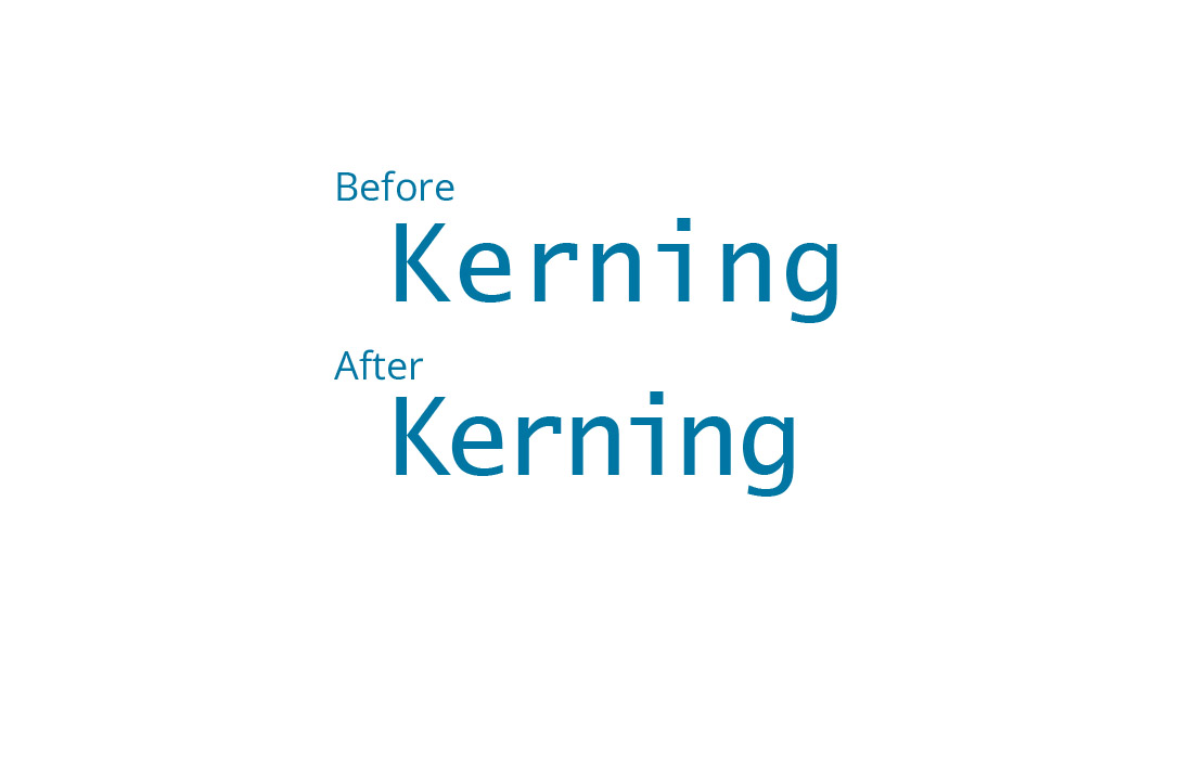
Kerning is the fine-tuning of space between individual letter pairs. Unlike tracking, which adjusts the spacing uniformly across a range of characters, kerning is specific to pairs of letters, addressing their unique shape and how they fit together.
Importance of Kerning
Proper kerning is essential for both aesthetic and readability reasons. It ensures that the spacing between each pair of letters looks consistent and intentional, avoiding awkward gaps or tight spaces that can disrupt the flow of reading.
Understanding When and How to Kern
Identifying Kerning Needs
Kerning is particularly crucial for headlines, logos, and other large, display text where the space between letters is more noticeable. It’s less critical for body text, as standard font kerning usually suffices.
The Process of Kerning
Kerning involves manually adjusting the space between letter pairs. In most graphic design software, kerning tools allow for precise control over individual letter spacing, enabling designers to achieve a balanced and harmonious look.
Examples of Kerning in Action
1. Logos
Major brands often use custom kerning to make their logos more distinctive and readable. Examine different logos to see how kerning can impact brand recognition.
2. Movie Posters and Book Covers
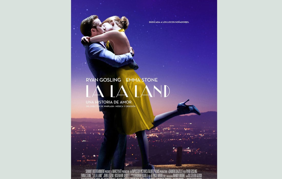
These mediums often employ dramatic kerning to create visual impact and draw attention.
3. Web Headings

Kerning in web design is essential for creating impactful and readable headings, especially for landing pages where text needs to stand out.
4. Advertising Copy

Advertisements frequently use kerning to make short text blurbs more impactful and visually appealing.
5. Artistic Typography

In artistic typography, such as in calligraphy or graphic design pieces, kerning is often dramatically altered to create a specific mood or style.
Tips for Effective Kerning in Typography
1. Understand the Typeface
Different typefaces have different kerning needs. Familiarize yourself with the characteristics of the typeface you are using and adjust your kerning approach accordingly.
2. Start with Default Kerning
Begin with the typeface’s default kerning settings and make fine adjustments as necessary. Many modern fonts come with well-designed kerning pairs that require minimal tweaking.
3. Kern for Visual Balance
Focus on creating a visually balanced space between letters rather than aiming for mechanical symmetry. Kerning is about how the text looks, not just about the measurable space.
4. Zoom In and Out
Regularly zoom out to see the text as a whole. This helps you understand how your kerning adjustments impact the overall appearance and readability.
5. Use the ‘HAMBURGEFONSTIV’ Test
This classic test word is used in typography to evaluate kerning, as it contains a variety of letter pairs. Apply it to your typeface to see how different combinations respond to kerning adjustments.
6. Address Problematic Letter Pairs
Certain letter combinations, like ‘WA’, ‘VA’, ‘TA’, and ‘LY’, often require more attention due to their shapes and angles. Pay special attention to these and similar pairs.
7. Consider Context and Size
The context in which the text will be used, and its size, can greatly influence your kerning decisions. Larger text, like headlines, may need more precise kerning than smaller body text.
8. Avoid Over-Kerning
Excessive kerning can lead to disjointed and hard-to-read text. Aim for a balance where the spacing doesn’t distract from the readability of the text.
9. Test on Various Backgrounds and Colors
Different backgrounds and color schemes can affect how the spacing between letters is perceived. Test your kerned text against various scenarios to ensure it maintains its visual integrity.
10. Seek External Feedback
Sometimes, a fresh pair of eyes can spot kerning issues that you might have missed. Get feedback from peers to refine your kerning.
11. Practice Makes Perfect
Kerning is a skill that improves with practice. Experiment with different texts and challenges to hone your kerning abilities.
12. Prioritize Readability
The ultimate goal of kerning is to enhance readability. Ensure that your kerning decisions contribute to a clear and pleasant reading experience.
13. Utilize Kerning Pairs
Many fonts come with built-in kerning pairs. These predefined adjustments for specific letter combinations can serve as a helpful guide, but feel free to deviate when necessary.
14. Trust Your Visual Judgment
While tools and metrics are useful, your eye is often the best judge. If something looks off, it likely needs adjustment, regardless of what the metrics say.
15. Break the Rules When Needed
Once you’re comfortable with standard kerning practices, don’t be afraid to experiment. Breaking the rules can sometimes lead to unique and attention-grabbing designs.
Conclusion
Kerning is a subtle art that can significantly impact the effectiveness and aesthetics of your typographic work. By applying the tips outlined in this guide and studying examples from various mediums, you can develop a keen eye for kerning and use it to enhance the readability and visual appeal of your text.
Remember, good typography is not just about choosing the right words; it’s also about presenting them in the most visually compelling way possible.