The Psychology of Fonts: How Typography Shapes Brand Perception
Fonts do more than convey words—they tell stories, trigger emotions, and help shape how people perceive a brand.
Whether it’s the confident tone of a bold sans-serif or the refined elegance of a classic serif, typography plays a key role in branding.
It influences how your message is received long before someone reads the fine print.
Understanding font psychology can help you choose typefaces that not only look good but also support your brand’s personality and values.
In this article, we’ll explore how different types of fonts affect perception and how to use them effectively in brand design.
Psychology of Fonts
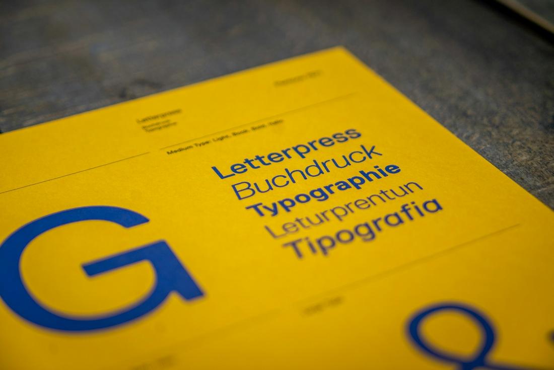
The psychology of fonts is all about how different typefaces influence the way people feel and react.
Just like colors or images, fonts carry emotional weight. The shape, spacing, and style of a font can subtly suggest things like authority, creativity, reliability, or friendliness—often before someone even reads the actual words.
This is why choosing the right font isn’t just a design decision—it’s a branding one.
90 percent of design is typography. And the other 90 percent is whitespace. – Jeffrey Zeldman
For example, a bold sans-serif font might communicate strength and simplicity, while a delicate script font can feel elegant and personal. These impressions happen almost instantly and help shape how people see your brand, even if they don’t consciously notice the typography choices.
Understanding font psychology helps you align your visuals with your message.
A law firm might want to appear established and professional using a serif font, while a trendy startup could go with a clean, modern sans-serif.
The goal is to make sure your fonts support your brand’s tone and help reinforce the story you’re trying to tell.
Why Typography Matters in Branding
When someone interacts with your brand—whether it’s on a website, a flyer, or product packaging—typography is often one of the first things they notice.
Fonts can set a tone instantly. They can make a brand feel friendly, luxurious, tech-savvy, or playful, depending on the style you choose.
Typography also plays a role in trust and readability. A poorly chosen font can make your content harder to read or make your brand look unprofessional.
On the other hand, the right font can strengthen your brand message and build a visual identity that feels consistent across every touchpoint.
Serif Fonts: Traditional, Elegant, and Trustworthy

Serif fonts—those with small lines or strokes at the ends of letters—are often seen as classic and timeless.
Think of fonts like Times New Roman, Georgia, or Baskerville. These typefaces are often associated with tradition, reliability, and professionalism.
They’re commonly used by law firms, academic institutions, and high-end brands that want to project authority and trust.
Serif fonts can give your brand a refined, established look that suggests experience and credibility.
When to Use Serif Fonts:
- To convey tradition or legacy
- When targeting a mature or professional audience
- For editorial designs, books, or upscale branding
Sans-Serif Fonts: Clean, Modern, and Friendly
Sans-serif fonts, as the name suggests, don’t have the small strokes at the ends of letters.
These fonts—like Helvetica, Arial, or Montserrat—feel more modern, minimal, and easy to read on screens.
They’re often used by tech companies, startups, and lifestyle brands that want to appear approachable, innovative, and contemporary.
Sans-serifs tend to create a clean, uncluttered look, making them a popular choice for digital platforms.
When to Use Sans-Serif Fonts:
- For modern and minimalist designs
- In mobile apps and websites
- When aiming for a clean, professional tone that’s still approachable
Script Fonts: Elegant, Creative, and Personal

Script fonts are designed to mimic cursive handwriting. They range from formal calligraphy styles to loose, casual lettering.
These fonts often evoke emotion, creativity, and elegance. Think of wedding invitations, boutique logos, or artisanal brands.
Used correctly, script fonts can add personality and a human touch to your brand.
But they can also be hard to read in long paragraphs, so it’s best to use them sparingly and for headlines or logos.
When to Use Script Fonts:
- For boutique or luxury branding
- In logos or packaging that needs a personal, handcrafted feel
- To add a touch of elegance or creativity
Display Fonts: Bold, Unique, and Attention-Grabbing
Display fonts are designed to stand out. They’re often used in large headlines, logos, or advertisements where grabbing attention is the goal.
These fonts can be quirky, artistic, geometric, or heavily stylized.
Because they’re so visually distinct, display fonts are great for branding when you want to leave a strong first impression.
But they can be overwhelming if used too much or at small sizes, so balance is key.
When to Use Display Fonts:
- For bold branding statements
- On posters, banners, or packaging
- In logos that need to feel memorable and unique
Monospaced Fonts: Technical, Minimal, and Functional

Monospaced fonts give equal space to each character. They’re often used in code editors or typewriter-inspired designs.
These fonts—like Courier or Source Code Pro—create a sense of structure and uniformity.
While not common in traditional branding, monospaced fonts can work well for tech companies, developer tools, or brands that want a utilitarian, no-frills aesthetic.
When to Use Monospaced Fonts:
- In tech or coding-related projects
- When a structured, grid-like appearance is needed
- For visual contrast in minimalist layouts
10 Tips for Choosing the Right Font for Your Brand
Picking a font for your brand isn’t just about style—it’s about how you want people to feel when they see your name, your message, or your product.
Fonts communicate tone, values, and even trustworthiness at a glance.
Whether you’re starting from scratch or refreshing your identity, these tips can help guide you toward the right choice.
1. Understand Your Brand Personality
Start by defining your brand’s personality. Is it playful or serious? Classic or modern? Bold or quiet? Your font should reflect these traits visually.
A quirky display font might work well for a kids’ brand, while a clean sans-serif feels more fitting for a tech startup.
2. Keep It Readable
No matter how stylish a font looks, it won’t work if it’s hard to read. Make sure your primary typeface is legible across sizes and platforms—especially on mobile.
Test it in headlines, paragraphs, and buttons before committing.
3. Think About Where It Will Appear
Is your font going to be used mostly on screen, in print, or both? Some fonts look better in digital formats, while others are optimized for high-quality printing.
Choose one that performs well wherever your brand shows up.
4. Choose a Font With Multiple Weights
A flexible font family with light, regular, bold, and extra-bold versions gives you more creative control.
It helps you establish visual hierarchy (like headline vs. body text) while keeping everything stylistically consistent.
5. Avoid Overly Trendy Fonts
Trendy fonts can make your brand look modern, but they also risk looking outdated in a year or two.
Instead, aim for timeless styles or clean, modern fonts with just enough character to stand out without being tied to a passing trend.
6. Use Contrast When Pairing Fonts
If you’re using more than one font, look for contrast—not conflict. A serif and sans-serif combo is a classic example.
One font should lead, and the other should support. Avoid using two fonts that are too similar, as they can compete rather than complement.
7. Make Sure It Reflects Your Audience
Your font should feel relatable to the people you want to reach. A youthful, bold font might appeal to Gen Z, while a clean, minimalist font may better suit a professional audience.
Let your audience guide your typography choices.
8. Test It With Real Content
Don’t judge a font by its name or alphabet sample. Try it with your actual brand name, headlines, or promotional text to see how it looks and feels in context.
Fonts can behave very differently when used in full sentences or paragraphs.
9. Check Licensing and Usage Rights
Always make sure you have the right to use the font commercially. Some fonts are free for personal use but require a license for business.
Using properly licensed fonts protects you from legal issues and supports the designers who create them.
10. Keep It Simple and Consistent
Don’t use too many fonts. Two—maybe three—well-paired fonts are usually enough for most brands.
Consistency builds recognition, and a clean typography system makes everything from business cards to websites feel unified and professional.
Conclusion
Typography might seem like a small detail, but it plays a big role in how people perceive your brand.
The right font can make your messaging more powerful, set the right mood, and help your brand stand out in a crowded market.
Whether you’re going for timeless elegance, modern minimalism, or bold creativity, understanding the psychology of fonts will help you choose typefaces that tell the right story—and leave a lasting impression.