20+ Best Classic Fonts
Elevate your designs with the timeless elegance of our classic fonts collection. These fonts offer a nod to traditional typography, embodying the grace and sophistication of historical styles. Ideal for formal documents, luxury branding, or any project that requires a touch of refined, enduring beauty.
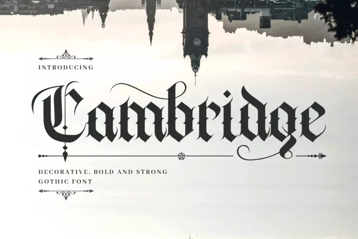
Cambridge Bold Medieval Gothic Font
Cambridge is a hand-lettering decorative font with a medieval gothic feeling. This font is suitable for a wide range of occasions, including books, lo...
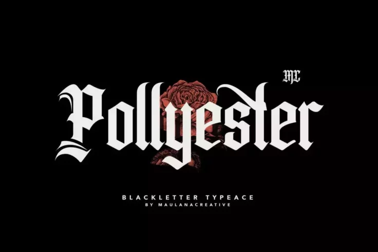
Pollyester Blackletter Old English Font
Pollyester is a stylish blackletter typeface font that combines traditional elements with modern designs. It works well in both digital and print form...

Bromilo Modern Luxury Font
Bromilo is a modern luxury font that comes with a design that fits all kinds of designs. It’s great for designing headers for luxury brand websi...

British Classical Font
Introducing BritishClassical, an innovative blend of classic and contemporary aesthetics encapsulated in a serif font family. With its immaculate desi...
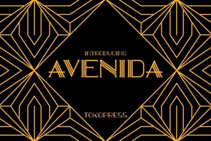
Avenida Art Deco Font
Taking an art deco look, Avendia is all about classic, elegance, and high-class feel all over it. Suit perfectly for high-end market audiences, poster...

Carter Layered Shadow Font
Carter is a vintage-style font that comes with a lettering design inspired by old-school signage. The font is available in multiple styles including r...
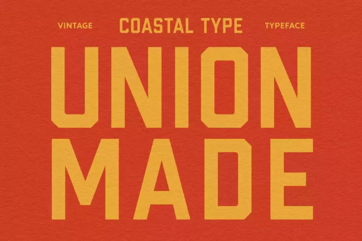
Union Made Classic Font
The Union Made Classic Font is a vintage-inspired branding tool that provides a seamless blend of antiquity and modern design sophistication. Its time...

Canteria Font
Let’s welcome Canteria, a dynamic serif typeface that packs a punch with its refined classical structure. Its elegance shines through while ensu...

Bradia Vintage Font
Bradia Vintage Font is a classic style typeface with an original and appealing charm that will transport you back in time. It’s reminiscent of a...

Richey Retro Font
Mirror the romance of bygone eras with our latest creation, the Richey Retro Font. This vintage-inspired typeface, full of charm yet surprisingly vers...

Rodest Font
Rodest is a classic serif font that boasts a unique and elegant design, making it the perfect choice for any project that requires a touch of sophisti...

Alves & Bucky Font
Introducing the newest addition to our typography collection: the Alves & Bucky Font. With its distinct design aesthetic, it effortlessly blends c...

Belinda Avenue Classic Font
Let yourself be enchanted by the timeless elegance of Belinda Avenue Classic Font. This refined, stylis display serif boasts richness in stylistic alt...

Vintage Reality Font
Steeped in class, Vintage Reality Font opens up a world of creative possibilities for those who appreciate a beautiful blend of old and new. This mode...

Burtons Retro Font
Introducing the new Burtons Retro Font, a captivating display font with an enticing array of characters. Perfect for a wide range of applications, thi...

Bernadetta Classic Serif
Meet Bernadetta, a timeless display serif font that combines modern aesthetics with classic design. Available in both regular and italic styles, Berna...

Timeless Nature Font
Timeless Nature is a unique and striking typeface that gives a fresh twist to handwritten fonts. Authentically capturing the aesthetic of natural, org...

Goldiwak Font
The Goldiwak Font is an expressive blend of contemporary flair and classic elegance, delivering a captivating charm to any design. Brought into existe...

Wondar Quason Font
Discover the charm and elegance of Wondar Quason Classic Serif Typeface. This unique typeface is a delightful blend of classic and contemporary, refle...

Morrello Bold Font
Meet Morrello: it’s not just a font, but a personality itself that loves to stand out. Conceived from a vibrant nostalgia of the 60’s and 70�...

Timeless Horizon Font
Dare to evoke a sense of wonder and exploration with Timeless Horizon Font. This typeface speaks volumes about adventure, perfectly capturing the esse...

Rumble Brave Vintage Fonts
Rumble brave is an elegant vintage font with a touch of Victorian-era looks and style. Whether you’re working on a poster, badge, or logo design...

Arshaka Classic Font
Arshaka Classic Font, with its refined and elegant serifs, accentuates any design with sophistication and finesse. This font’s style effortlessl...
FAQs About Classic Fonts
What Are Classic Fonts?
Classic Fonts are time-honored typefaces that have remained popular and widely used across various eras and design contexts. These fonts embody traditional typographic qualities, offering elegance, readability, and versatility. Classic Fonts often reference historical typography styles, such as those from the Renaissance, Baroque, or Victorian periods, and include renowned typefaces like Times New Roman, Garamond, and Helvetica.
Their enduring appeal makes them suitable for a wide range of applications, from formal documents and literature to corporate branding and digital content. Classic Fonts are chosen for their ability to convey a sense of reliability, authority, and sophistication.
How Can You Use Classic Fonts in Your Design Projects?
Classic Fonts can be seamlessly incorporated into both print and digital design projects to add a touch of elegance and professionalism. They are particularly well-suited for formal documents, such as legal contracts and academic papers, as well as branding materials for institutions and businesses looking to project a timeless and established image. In web design, classic fonts offer excellent readability and a sophisticated aesthetic, making them ideal for editorial content, professional blogs, and corporate websites.
When using Classic Fonts, it's important to consider the context and pairing with other typefaces. They can serve as a strong foundation for a design, complemented by more decorative or modern fonts for accents and highlights.
Are Classic Fonts Suitable for All Types of Projects?
While Classic Fonts are incredibly versatile and can be used in a multitude of design projects, their traditional nature might not always align with projects that require a more contemporary, edgy, or whimsical touch. For brands or designs aiming to convey innovation, youthfulness, or avant-garde qualities, more modern or unconventional fonts might be more appropriate.
However, even in such contexts, Classic Fonts can provide a striking contrast or grounding element when used judiciously, underscoring the importance of selecting fonts that align with the project's overall tone and message.
How Do You Pair Fonts with Classic Fonts in Design?
Pairing fonts with Classic Fonts involves selecting complementary typefaces that enhance the design without overshadowing the classic font's inherent elegance and readability. A common approach is to pair a Classic Serif font with a clean, modern Sans-serif for contrast and balance. This combination can create a harmonious blend of tradition and modernity, suitable for a wide range of design applications.
When pairing fonts, consider the visual hierarchy, ensuring that the Classic Font anchors the design with its timeless appeal while the secondary font adds variety and interest.
What Are the Best Practices for Using Classic Fonts?
Best practices for using Classic Fonts include respecting their historical context and inherent qualities. These fonts are best used in settings that require a degree of formality, elegance, or timelessness. Paying attention to kerning, spacing, and font size is crucial to maintaining readability and maximizing the aesthetic qualities of Classic Fonts.
Additionally, consider the medium and application, as some Classic Fonts may perform better in print than in digital formats. Experimenting with different weights and styles within a Classic Font family can also add depth and interest to your designs while maintaining a cohesive look.