UX Design / 24 Feb 2025
Microinteractions in Motion: The Next Evolution of Mobile UX
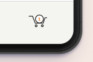
In the world of mobile apps, small details make a big difference. This is why microinteractions are a huge part of UX and UI design.
Microinteractions have long been a staple of great user experience (UX) design, but with advancements in motion design and mobile technology, they are evolving into a key differentiator in modern apps.
They are no longer just aesthetic enhancements—they help guide users, provide instant feedback, and make interfaces feel more responsive and intuitive.
In this article, we’ll explore how mobile apps are using sophisticated microinteractions and motion design to create more engaging user experiences, and why this evolution matters for the future of mobile UX.