Top 5 Design Trends of 2017 (So Far!)
If you take a close look, you can almost see the evolution of web design happening. A few design trends have emerged as the must-have elements of 2017 (so far) with interesting typography, color and navigation patterns leading the way.
So now that we are midway through 2017, let’s focus a little on design inspiration, and take a look at of the top trends of the year so far. Should you incorporate all these? Absolutely not! But one of two, chosen carefully, can really help give your design a current, up-to-date feeling.
1. Typography in Shared Spaces
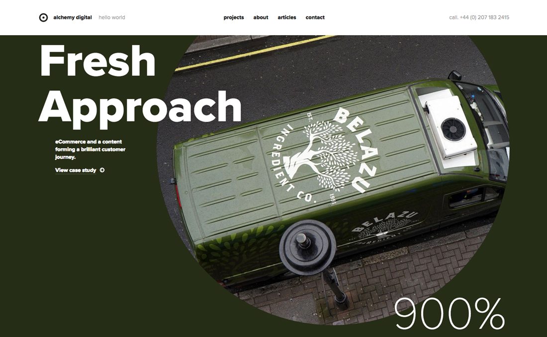
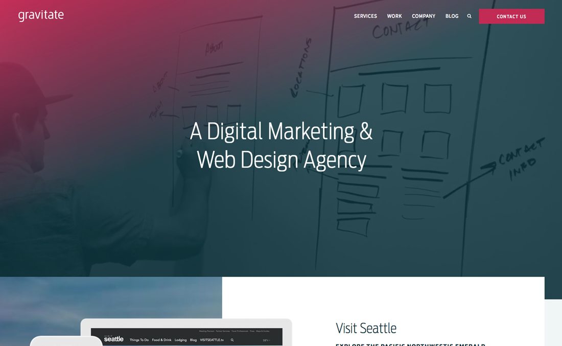
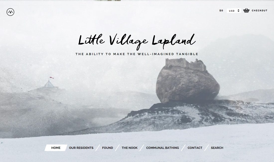
Designers are breaking the rules of typography by extending lettering across multiple elements. Type might stretch across two boxes in a split-screen aesthetic or encroach on the space of another design element such as an image.
Either way the result can be stunning.
But it is not easy to do. Typography in shared spaces is a visually interesting way to pull users across content and create flow in the design. When paired with interested typefaces or oversized fonts, typography in shared spaces can have a dramatic impact. The added emphasis on the typeface because it layers on multiple spaces highlights the words and creates a focal point in the design.
To make best use of the design trend, you’ll need a short bit of messaging and an image and background pair with similar coloring so that type is easily read across the entire canvas.
In most instances, opt for black or white lettering on the background. This is a pretty complex design for users to digest – even if it might look rather simple – and readability should be a primary concern.
Focus on visual flow with this type of design pattern. Think about what parts of the design are most important for users to see to create a layered background and lettering effect.
Learn more about the trend, and see even more examples, plus a primer on working with split-screen designs.
2. Poly Shapes
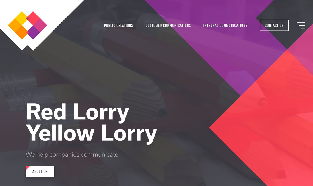
Almost everywhere you look, designers are using polygons in interesting ways. From shapes that fill the entire design to simple overlays to corner effects, poly shapes are almost everywhere.
What’s nice about this design trend is that it is so versatile. Poly shapes can be added to almost any design outline, over video or photos and with any color or typography palette. (It’s the perfect refresh if you want to refresh a current website.)
Not sure what qualifies as a poly shape? Polygons are shapes that are defined in elementary geometry as a “plan figure that is bounded by a finite chain of straight line segments in a loop to form a closed polygonal chain.” The shapes can have any number of sides or orientation, can be filled or hollow and can have paths and strokes that intersect. Polygons are typically flat, two-dimensional shapes, although in website projects some polygons animate move and seem to have more 3-D characteristics.
Poly shapes can provide quite a bit of design inspiration. Use them for divots or user interface elements, to encourage navigation or to provide visual interest when other imagery is somewhat lackluster.
Learn more about the trend, and see even more examples.
3. Gradients
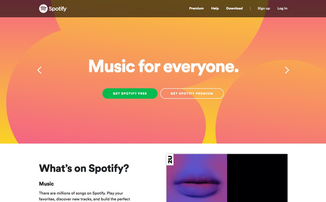
One of the saddest parts of the flat design trend was the loss of gradients in design projects. But they are back in a big way. (A lot of credit goes to Spotify for using them in their visual identity.)
Gradients are appearing everywhere and in every way imaginable – backgrounds, as color overlays and in user interface elements. Today’s design inspiration for gradients is a bit different than the pre-flat design era though. Rather than gradients that are subtle and fade to black or white, these gradients are bold and often include two colors.
While a good gradient can work in almost any part of the design monotone gradients often work best for smaller elements and two color variations add the most pop to large design pieces, such as images or backgrounds.
Learn more about the trend, and see even more examples, plus take a look at some fun ways to use gradients for color overlays.
4. Bold Color
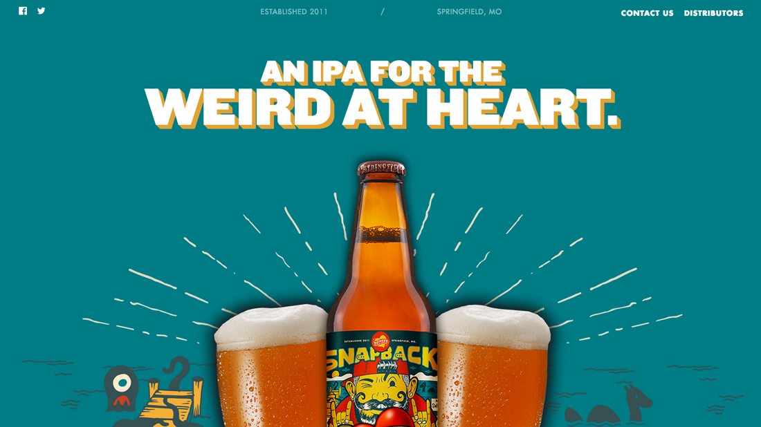
Big, bold color choices seem to be everywhere, and not just in the use of gradients. Bright backgrounds, bold buttons and accent colors that seem to jump off the screen help provide a place for the eyes to land.
Some of the biggest trends in color might even be things you would not expect – neon colors and color fonts.
Here are a few tips for using bold color options that work:
- Incorporate the brightest colors from your brand’s palette.
- Use color to make a statement.
- Bright colors make great accents.
- Can’t find a way to use a bold color? Include the hues in imagery and photos.
- Mix and match bold colors with black and white for maximum impact.
- Use color with intention and purpose.
Learn more about bold color trends, such as neons and color fonts.
5. Experimental Navigation Patterns
While it is not always recommended to mix up navigation patterns and stray too far away from menus that are anchored to the top of the screen, it can work for some website designs. In fact, 2017 has been the year of experimental navigation so far, with plenty of websites using side navigation, bottom navigation and looking for fresh takes on hidden, scrolling and pop-out options.
And here’s the thing: It seems to be working.
Only you will know for sure – always go back and dig into your analytics to make sure a navigation change is still garnering clicks – but more designers are experimenting with new concepts. The trick seems to be that navigational elements still need to have prominence on the home screen (make them larger than normal if they are located in an unusual position) and use other visual cues to show users what to do next. Unfamiliar user patterns can be learned quickly with help.
Learn more about the trend, and see even more examples.
Conclusion
While a lot of trends tend to come and go, these are sticking around. It seems like the common thread is that each trend can fit into a variety of design outlines and doesn’t overtake the entire aesthetic flow.
What are your favorite trends of 2017? Are there any of these trends that you want to go away? Let’s chat on Twitter (remember to tag Design Shack).