How to Pick a Font (For Any Design): 10 Tips & Principles
Choosing the right font for a new project can be exhilarating. But it can also be a major challenge. Fortunately, there are some timeless rules you can follow when deciding how to pick a font.
Whether you’re going for a super-subtle and simple design, or a bright and bold layout with impact, you’ll always need to consider some similar trade-offs with typography.
How to pick a font is less about specific steps and more about creating the right feel for a design project. Here’s how you do it (with some examples of lovely typography choices).
1. Think About Personality
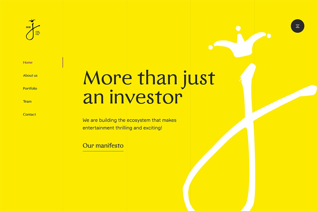
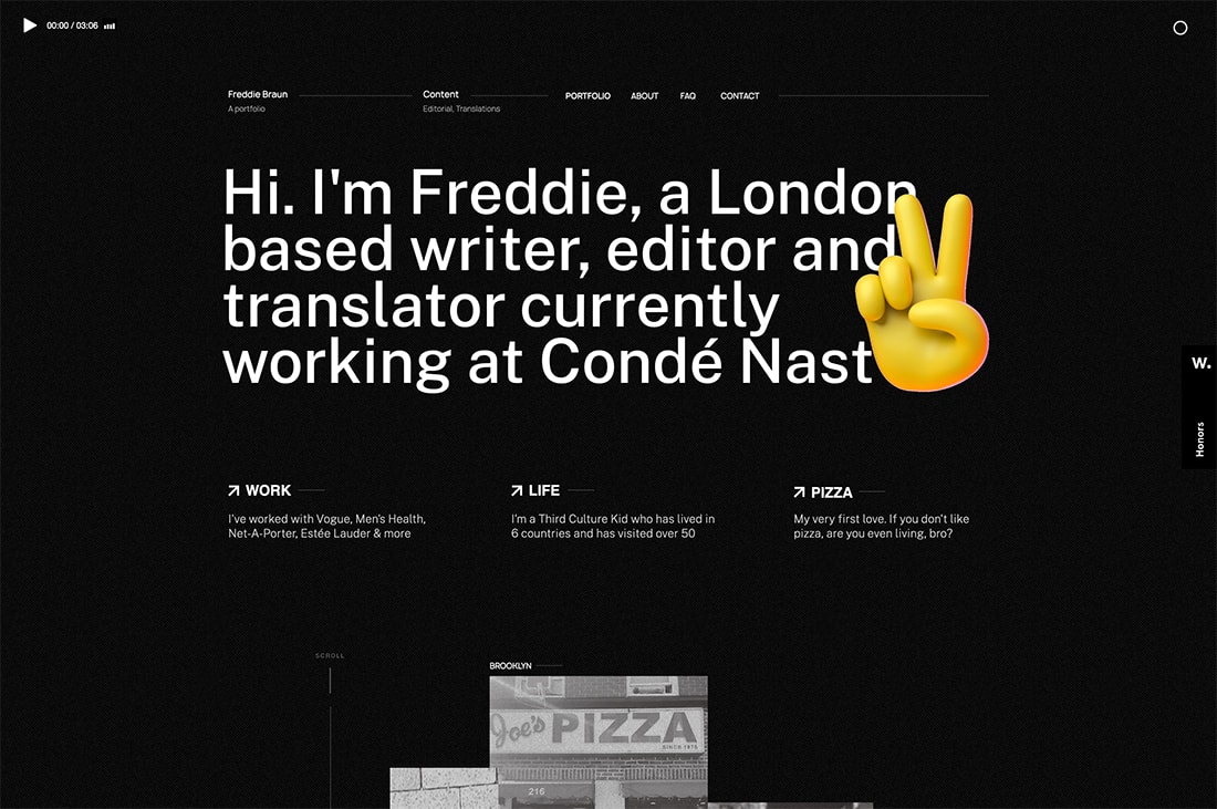
While there are a lot of important considerations in choosing a font for a design project, nothing matters quite as much as personality.
The typefaces you select will create a mood and impression of your project for users. When it comes to font, you have two choices here:
- Pick a typeface that fits the mood you want to set with the design. (We have a guide to that here.)
- Pick a neutral typeface and let the rest of the design set the project’s personality.
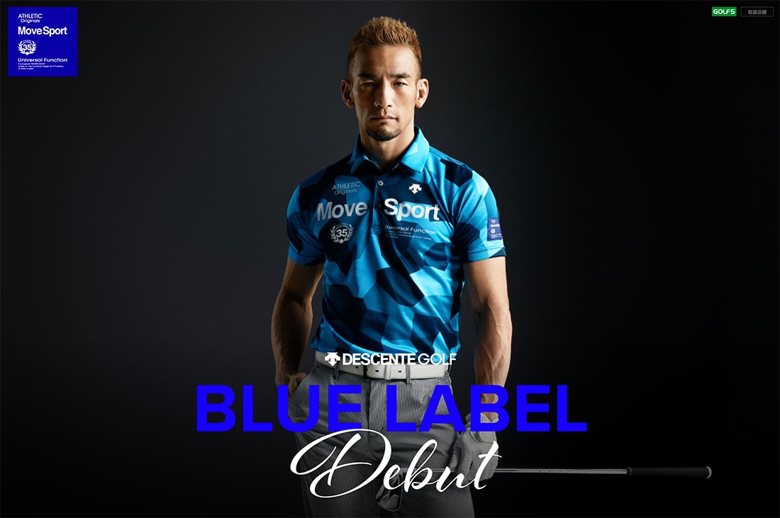
Remember those font variations such as capital letters, bold, italics, and even the shape of letters (sharp versus flowy) all contribute to the personality of the typeface.
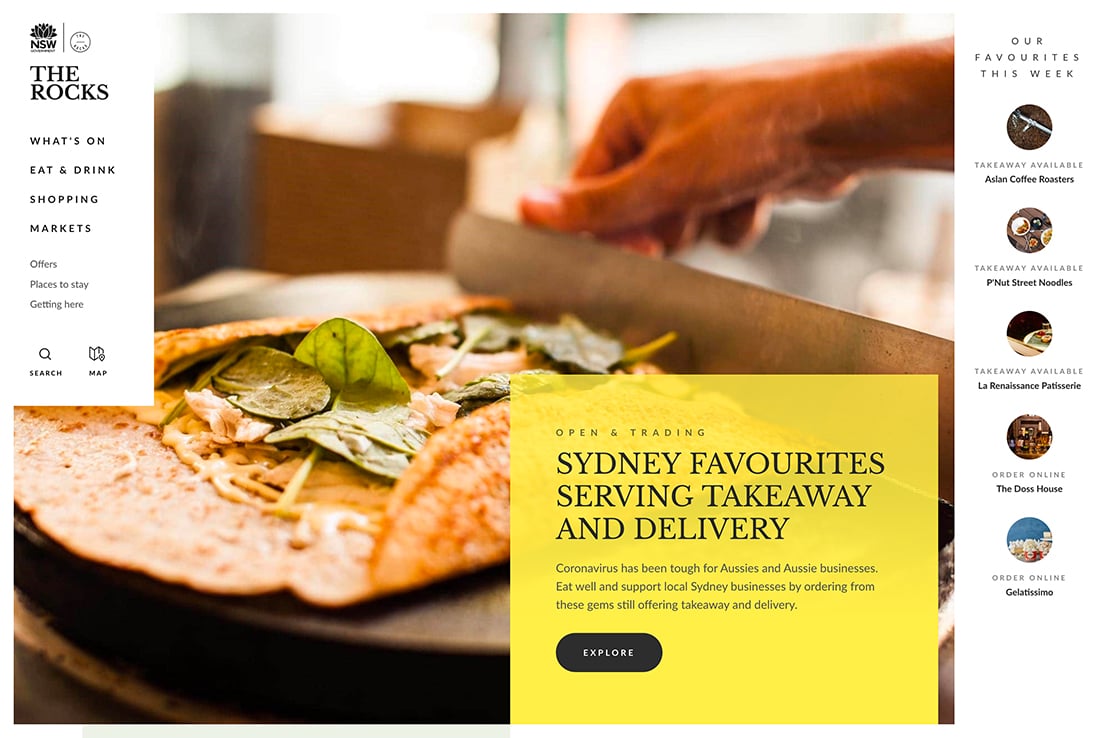
2. Plan for a Pair of Fonts
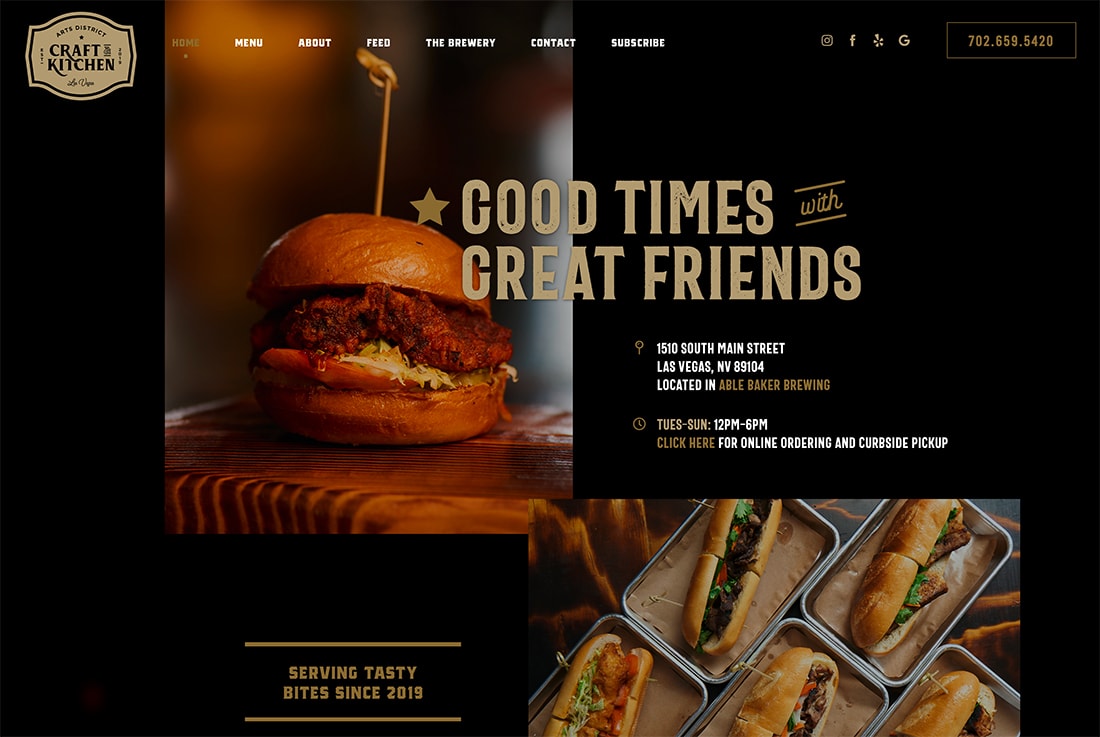
It’s uncommon to complete a design project with just one font. Most have two typefaces – one of large elements, such as headlines, and another for the main body text.
You need to select a pair of typefaces that work well together to create the right feel for the project. Typically, this includes one font with a lot of personality and another that’s more on the neutral side.
What you don’t want is two typefaces that seem to “say” different things. A good font pairing includes typefaces with complementary shapes so that they bring attention to the message but don’t compete for attention.
3. Look at Readability
How easy is your favorite font to read?
Does that answer hold if the font is small? Large? If you need to read it at a distance?
If you have to spend time thinking about the words in a design to comprehend the meaning because of the way the letters look, then it’s not highly readable.
It is acceptable to use a decorative font in some cases – such as for a short headline – but if people struggle to read the text, are you really getting the message across that you are trying to convey?
4. Be Wary of Wild or Trendy Options
Unless you are designing a one-off element, such as a poster or event invitation, trendy or wild font options can be more trouble than they are worth in the long run.
Most design projects require some longevity, so you want typefaces that will hold up over time. Trendy options can date a project quickly, while wild options can work for one design element and fall quite flat when translated to another design in the campaign.
If you want to design something with a trendier flair, consider pairing typefaces in a modern way.
5. Choose High Function

This isn’t the most fun tip, but it is incredibly practical: Choose a font that is functional in all the ways you plan to use it.
What this means is that your fonts need to work equally well everywhere you want to use them including in print projects, web projects, or digital publishing.
The font has to be licensed for all appropriate uses and work on any computers you will use for the design.
Sometimes this technical consideration will result in choosing multiple sets of fonts – one for print and one for the web – with a similar look and feel. But with so many options out there with a lot of versatility, this is becoming less common.
6. Match Your Brand and Tone
If you have a brand or style guide, fonts you use for any type of design project should fall within those guidelines.
That includes matching the style and personality of the brand. You may also find that brand guidelines dictate what fonts and/or styles you can and can’t use.
Or you might find that you have some flexibility to add a typeface for certain uses as long as it matches a primary brand font.
The major lesson here is to check your brand guidelines before you get too far into the font selection game to ensure you don’t break any rules for your organization. (It’ll just make the process a lot easier in the long run.)
7. Versatility Goes a Long Way
A highly versatile family can make it easier to pick typefaces. Nothing beats a “superfamily” when it comes to getting the most font for your money. These collections include plenty of options and styles in a single typeface.
“A superfamily is a set of typefaces—sans and serif designs for example, or regular, slab, and rounded variations—that are crafted to work together in close harmony,” explains Google Fonts. “In contrast to pairing typefaces from different font families, superfamilies are often used when more visual cohesion is needed. UX designers might deploy a superfamily to delineate UI text (menus, tooltips) from editorial content (headlines, body copy), and to create a consistent tone with a clear hierarchy, across an app or website.”
Think about the hierarchy of your design project as you look at type families. Do you need multiple weights – from thin to slab – with italics and bold options? If the answer is no, you might not need something as wide-ranging as a superfamily, but most designs require the flexibility of a typeface with a full character and glyph set, as well as regular, italic, and bold styles.
8. Consider Budget

Budget is a major consideration when it comes to choosing fonts for a project. How much are you willing to spend on fonts?
For small budgets, you might want to pick a few typefaces and then look for similar options (with smaller families) to be most cost-efficient.
If you use a lot of different typefaces regularly, a library can be a good option. (Adobe Fonts is part of your subscription if you are a Creative Cloud user and Google Fonts are free.) The only downside to a library is that fonts are only licensed to you and can’t be packaged for a client.
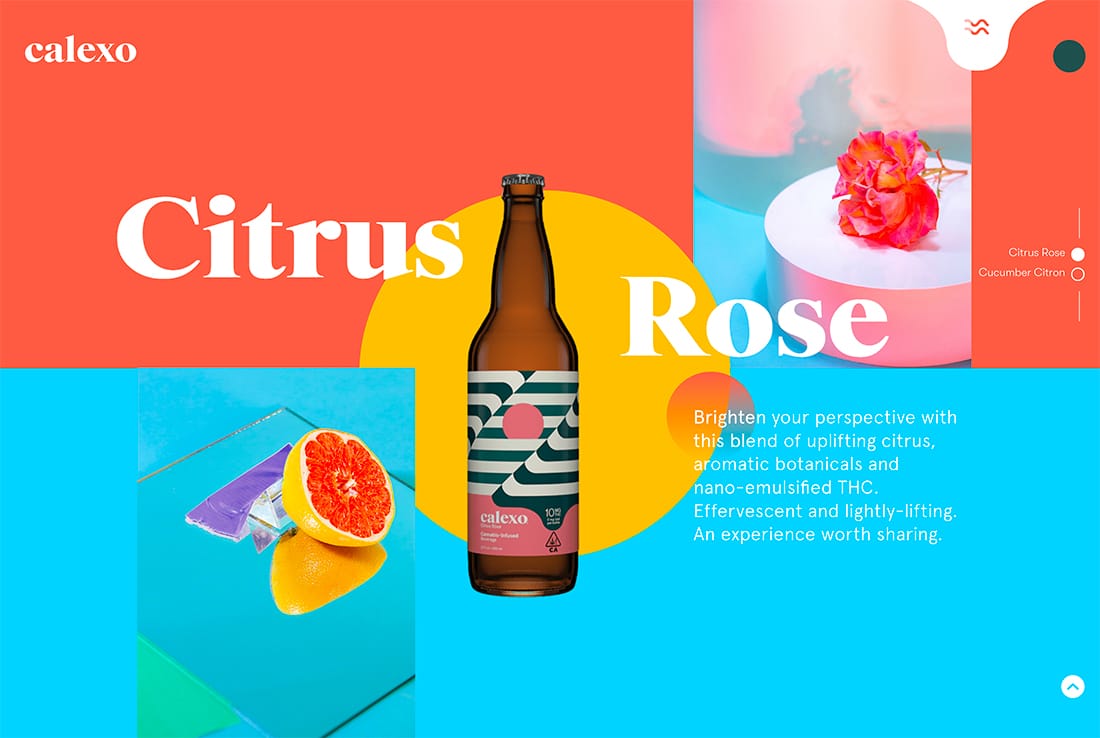
9. Create High Contrast
The trick to using fonts effectively is to focus on high contrast options. You don’t want to pick similar fonts. Go with fonts that are dramatically different, such as a serif and sans serif combination or a think weight and a slab.
Consider the contrast between your font selection and the design canvas as well. Is the font choice robust enough to see against the background? Does it work with, while standing out from, images or video elements? Does it work with your color choices?
All of these elements play into establishing enough contrast to ensure that fonts are readable and set the right tone for your project. It’s not uncommon to put it all together and then decide to up the font-weight just a little bit to ensure ample contrast.
Playing with options and testing in a real environment can help you determine if contrast is high enough to create optimum readability and the right vibe for the design.
10. Break the Rules (Occasionally)
What good is a design rule if you can’t break it from time to time? Sometimes you see a font combination that looks amazing but breaks every design rule.
When used sparingly, that’s OK. Go for it from time to time. As long as the project works for the client and audience, an unconventional font choice can be effective.
Conclusion
The best part about learning how to pick fonts is the creative opportunity it provides. Mixing and matching typefaces can be a lot of fun and help bring life to projects.
Choosing the right fonts is a lot like adding color to a project that was outlined in black and white – the personality and style finally gets to shine through.