The Top 10 Web Design Buzzwords and Hot Topics for 2012
In 2011, there wasn’t a web design blog or magazine in the world that didn’t use “HTML5” or “CSS3” in at least a few headlines. We talked endlessly about the new possibilities that these technologies brought about, argued tirelessly about the hurdles that they presented and had tons of fun creating demos with embarrassingly modest browser support.
Though CSS3 and HTML5 are still at the top of our discussion lists, I decided to look around and see what other terms and buzzwords are major topics for 2012. Read on to see what web designers are ranting and arguing about these days. Along the way you’ll find over fifty excellent articles to check out that will brush you up on each topic.
RWD
In case you haven’t heard, we’re calling Responsive Web Design “RWD” now. It’s the short, cool way to say it so hop on board before you embarrass yourself by busting out the archaic long version at your next web design conference. You might as well wear a Plone t-shirt.
RWD is without a doubt one of the absolute hottest topics in web development right now. This is because it truly represents a major paradigm shift that is fundamentally changing the way we approach web design projects.
Is there too much hype surrounding RWD? I’ve certainly seen many commenters on my own work singing this tune. However, as one of the leading solutions for opening the web up to be optimized for as many devices as possible without creating custom sites for each, I personally think it deserves the attention.
The trouble behind it becoming a buzzword is that web designers have already turned it into a major marketing slogan, whether they really know how to successfully implement it in a real world setting or not. Be wary of overconfidence in this area, it’s a new technique and we’re all still learning what it’s going to look like in the long term.
RWD Discussion
- Responsive Web Design (Seminal Piece)
- Beginner’s Guide to Responsive Web Design
- How to Build a Responsive Thumbnail Gallery
- 5 Really Useful Responsive Web Design Patterns
- Responsive Web Design: What It Is and How To Use It
Breakpoints (or Device-Agnostic RWD)

There are many sub-terms within the RWD realm that are catching a lot of attention: media queries, responsive type, etc. One that has sparked a ton of conversation and even debate is “breakpoints.”
The idea behind RWD is simple at its core: use clever CSS to redefine a site’s layout at different predefined breakpoints. The big question that this leads to is obvious, “Which breakpoints should I be using?”
The popular solution is to look to common device widths and specifically design for them. So you set up a media query for the vertically oriented iPad, horizontally oriented iPad, vertical iPhone, horizontal iPhone, etc. As an alternative, you find a good generic middle ground and target three primary areas: desktop, tablets, and phones.
I posted an article recently on why we should stop thinking about specific device widths and start using RWD to build sites that work at literally every conceivable width within reason. It sounds difficult but in practice it’s really not any more work than the other methods. I called it “Content-Focused Responsive Design” because it allows the content itself to determine the breakpoints, not common device sizes. Other sites have since written about the same idea with a perhaps better name, “Device Agnostic” RWD. Today I found an article by Marc Drummond posted well before my own discussing similar techniques with the succinct term “Natural Breakpoints.”
Regardless of what you call it, this debate perfectly illustrates the point I made in the last section: that RWD is by no means a perfectly defined practice at this point. New methods and ideas are continually arising and you can expect to see much more discussion on the breakpoint front this year.
Breakpoint Discussion
- Responsive Design: Why You’re Doing It Wrong
- Device-Agnostic Approach To Responsive Web Design
- Responsive Web Design Default Breakpoints Are Dead
- Re-thinking Breakpoints in Responsive Design
SVG
Apple has decided that the future of computing is one with better resolution. Like it or not, the industry will follow this decision (leave all the Apple hating comments you like, it’s still going to happen folks). Apple is pushing out “Retina” displays across its entire iOS line (iPhone, iPad, iPod Touch) and other major device manufacturers are already figuring out how they’re going to match or beat this technology.
For web designers, this is one nasty can of worms. It’s bad enough that we have to design for tons of different screen sizes, now we’re going to top it off with major shifts in pixel density. Higher resolution images brings up all kinds of issues with file size, how and when to serve different images to different devices, etc.
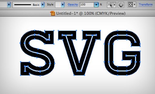
One of the primary saviors we’re looking to at this point is SVG, or Scaleable Vector Graphics, which basically allow you to embed the types of images you build in Adobe Illustrator right into a web page. The benefit here is that since the graphics are built as vectors, they’re infinitely scaleable and will look absolutely perfect on any device that Silicon Valley can dream up.
- Ready or Not, Here Comes HD Web Design
- Resolution Independence With SVG
- 20 Svg Uses That Will Make Your Jaw Drop
- Playing with SVG Design
- Using SVG For Flexible, Scalable, and Fun Backgrounds
Preprocessors
The strictness of the web standards movement led to a fairly rigid web design industry where you follow the rules or face the consequences. This rigidity was shaken to its core with a radical idea: what if there’s a better way to code? There are things about CSS, JavaScript and even HTML syntax that really suck, so why not find a way to ditch them without abandoning the standards that have made the web what it is today? Further, why do we have to wait for some panel of experts to add features that we want to our favorite languages? Why can’t we just do it ourselves?
Enter the world of preprocessors. Some wild and crazy rebels have put together these systems whereby you can scrap coding standards as you write, then run your code through a magic cleaner that spits out valid syntax. Imagine CSS and JavaScript without the awkward necessity of semi-colons and brackets, or HTML without those annoying closing tags. Further, imagine writing less code and doing more with it than ever possible before (can you say CSS variables?).
A few years ago these preprocessors were met with a less than warm welcome by most and an outright disdain by others. The latter part of last year though, for whatever reason, they really hit their stride. Suddenly preprocessors are the hottest trend around.
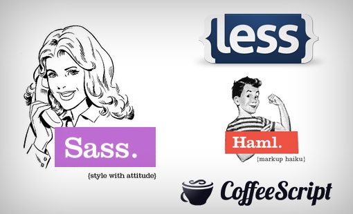
If you haven’t already, it’s time to meet the preprocessors that are making such a splash. Sass, LESS and Stylus extend CSS with great features like variables, mixins, mathematical operations, and even drastic syntax simplification. Fans of Sass should also check out another project from the same folks which drastically rethinks HTML authoring: HAML. If you’re a JavaScript guru, look no further than CoffeeScript as a way to save yourself hundreds of lines of code work.
Preprocessor Discussion
- Sass vs. LESS vs. Stylus: Preprocessor Shootout
- Save Loads of Time by Writing Your HTML With Haml
- 10 LESS CSS Examples You Should Steal for Your Projects
- Super Sweet CSS 3D Text Effects With Sass and LESS
- LESS CSS Has More with 1.2.0
- Rocking Out With CoffeeScript
- Writing Better JavaScript with CoffeeScript: The Basics
- Get Into LESS: the Programmable Stylesheet Language
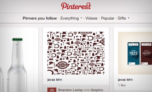
Pinterest is the trendiest new social site on the web. It has absolutely exploded in popularity in the last year and seems to still be in a continual climb. The interesting part is that Pinterest is known for its particularly feminine audience, most of whom seem to be obsessed with pinning photos of Ryan Gosling wrapped in Christmas lights or hugging puppies. So why the heck have I listed it as a web design buzzword?
There are two reasons for this. The first is that much of the success behind Pinterest can likely be attributed to its design, which is changing the way designers think about gallery based sites. As I’ve outlined here before, the combination of a Masonry style layout with infinite scrolling makes for a simply addicting user experience that can steal hours of your life. Your first real dive into Pinterest will likely end with you looking up from your screen and wondering what year it is and how long you’ve been under this evil spell.
Aside from the interesting design case study that it is, Pinterest is gradually being accepted by all types of users, not just Gosling gazers. One niche of users that is really starting to find a home on this site is designers. We’re visually minded people and Pinterest provides us with a fantastic platform to save and share visual inspiration. You need look no further than our own account to see that this is true (end shameless self plug).
Pinterest Discussion
- Addictive UX: Why Pinterest Is So Dang Amazing
- Using Pinterest for Design Inspiration
- How Pinterest Changed Web Design
- Pinterest Is a Web Bonanza for Designers
- 3 Impactful Ways Web Designers Can Use Pinterest
CS6
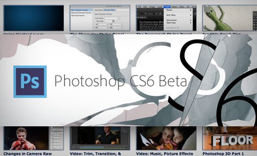
Adobe is nearly unrivaled in its ability to make broke designers shell out ungodly amounts of money on a regular basis. The continuing development of the Adobe Creative Suite means that you need deep pockets to be able to keep up with the best industry technology. This is especially true in the design blog world. If I publish a tutorial on Photoshop and make the mistake of using something as ancient as CS3, I’ll be castigated to no end.
Adobe is about to rock your world once again with CS6, the next major iteration of the Creative Suite. I know some of you are rolling your eyes and complaining that you only just bought CS5, and I share your pain, but the good news is that Adobe does indeed make large scale improvements with each release.
The frenzy about CS6 is at an all-time high since Adobe released a free beta preview of Photoshop. Awesome new features include a revamped interface (dark is an option now), Type Styles similar to the paragraph styles in Illustrator and InDesign, a Blur Gallery that makes depth of field and tilt shift simulation much easier, a rethought crop tool, layer searching, layer group masks and a lot more. Don’t even bother resisting, you know you want it.
CS6 Discussion
- Photoshop CS6 Improvements
- Top 7 Photoshop CS6 Features
- Photoshop CS6 Blur Gallery Tutorial
- Adobe Photoshop CS6 Beta Hits 500,000 Downloads
- Our First Look at Photoshop CS6
Patterns
This is an interesting one that you may misinterpret at first. By “patterns” I don’t mean plaid, checkered, or any visual repetitive texture-like design. Instead what I’m referring to is the systematic analysis of web design and how it is commonly accomplished both from a visual and coding perspective.
If you just responded with a big, “huh?” then allow me to explain. Last year I wrote an article titled 10 Rock Solid Website Layout Examples where I discussed popular layout patterns seen in countless sites across the web and why they work well. These have nothing to do with color, texture, typography or anything that specific but rather take a look at the absolute base layer of the design upon which the rest is built.
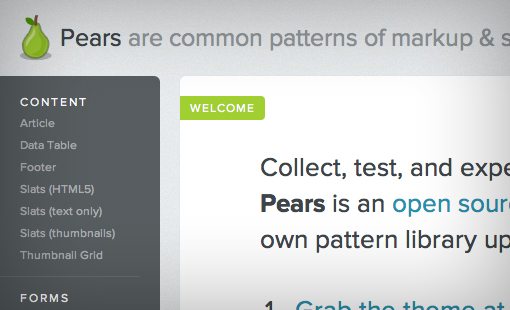
This topic expands to coding as well. The website Pears showcases typical patterns of HTML and CSS pairings for common design elements such as navigation menus, footers and thumbnail grids.
Pattern recognition, analysis and sharing is a trend that is heating up and I expect it to continue to rise in popularity, especially as Responsive Web Design pushes new paradigms and practices in both coding and layout.
Pattern Discussion
- Responsive Navigation Patterns
- 5 Really Useful Responsive Web Design Patterns
- Multi-Device Layout Patterns
- Essential JavaScript Design Patterns
- Pros And Cons Of 6 CSS Layout Patterns
Vendor Prefixes

We’ve all been using CSS3 long enough to either get used to or become fed up with the madness of browser-specific vendor prefixes. When you use anything that’s fairly new in CSS, odds are you have to repeat it again and again for all of the possible browsers. One perfect example of how crazy it gets is CSS gradients. Here’s the recommended code for implementing a simple two color gradient:
background: #00b7ea; /* Old browsers */
background: -moz-radial-gradient(center, ellipse cover,  #00b7ea 0%, #009ec3 100%); /* FF3.6+ */
background: -webkit-gradient(radial, center center, 0px, center center, 100%, color-stop(0%,#00b7ea), color-stop(100%,#009ec3)); /* Chrome,Safari4+ */
background: -webkit-radial-gradient(center, ellipse cover,  #00b7ea 0%,#009ec3 100%); /* Chrome10+,Safari5.1+ */
background: -o-radial-gradient(center, ellipse cover,  #00b7ea 0%,#009ec3 100%); /* Opera 12+ */
background: -ms-radial-gradient(center, ellipse cover,  #00b7ea 0%,#009ec3 100%); /* IE10+ */
background: radial-gradient(center, ellipse cover,  #00b7ea 0%,#009ec3 100%); /* W3C */
filter: progid:DXImageTransform.Microsoft.gradient( startColorstr='#00b7ea', endColorstr='#009ec3',GradientType=1 ); /* IE6-9 fallback on horizontal gradient */
Crazy right? Some say this is a good thing for the web, others say it’s downright toxic. Though we’ve been using prefixes for a while, the heat in this debate has suddenly been turned up to the max. Everyone has a different opinion about why prefixes help or hurt and it seems that a consensus or even some solid suggestions for a better system are no where in sight.
Prefix Discussion
- Every Time You Call a Proprietary Feature “CSS3,” a Kitten Dies
- The Vendor Prefix Predicament
- Vendor Prefixes Are Not Developer-Friendly (Paul Irish)
- TL;DR on Vendor Prefix Drama (Chris Coyier)
- Vendor Prefixes – About to Go South
- Big Question: Are Vendor Prefixes Hurting the Web?
- CSS Vendor Prefixes Threaten Open Web
Progressive Enhancement
The old “Progressive Enhancement vs. Graceful Degradation” debate is nothing new. For the most part, it seems like we all started with graceful degradation and then moved on to progressive enhancement as an arguably superior method.
The progressive enhancement movement has spurred tons of discussion and ideas over the last couple of years. Topics such as “mobile first” design embrace progressive enhancement as the best way to ensure that the maximum number of people possible enjoy the web to the fullest extent possible.
The question for 2012 is, “what comes next?” Is it possible that concepts inherent in progressive enhancement are actually holding the web back rather than moving it forward? Should we evolve our ideas or perhaps even abandon this practice altogether? Check out the articles below for the latest in the debate.
Progressive Enhancement Discussion
- Progressive Enhancement Is a Barrier to Progress
- Progressive Enhancement Is More Relevant Than Ever
- Massively Mobile Progressive Enhancement | Is Your Site Future-Friendly?
- Progressive Enhancement 2.0 – Nicholas Zakas
- Progressive Enhancement: All You Need to Know Is Here
Gamification
The holy grail of absolutely any type of design is engagement. That’s what we’re all aiming for in every project that we embark upon. Ultimately, we want people to experience, enjoy and hopefully even return to our projects.
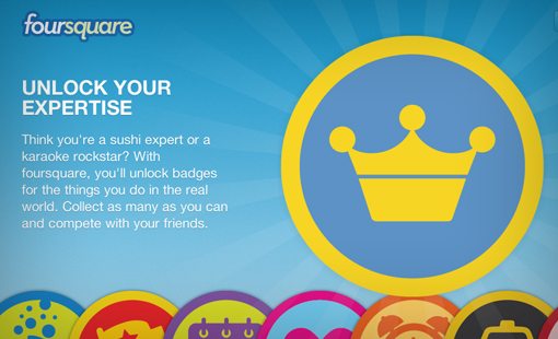
Several trends have come and gone that promise to hold the key to this elusive creature, but the current favorite is gamification. The concept that drives this is pretty basic: people love games, so let’s turn everything into a game. You need only take a look at Foursquare to see an effective example. These folks wanted to create an app that allowed you to share your arrival at any location. It was an interesting concept, but how would they get people to actually use the app? What’s the incentive?
The answer: make it a game! Checking in earns you badges (worthless pixels but good for bragging rights). Being the user that frequents a location the most makes you the mayor, which in turn can earn you discounts and prizes in the real world. There’s even a leader board that tells you daily how you rank versus your friends. It turns out that competition breeds interaction.
This idea is leading to a dramatic rethinking of every type of website, application and social network. New startups are popping up by the dozens promising to gamify some new area that no one else has led claimed to yet. On a micro level, existing companies are looking to gamify small parts of their site or app to make the mundane exciting. Will gamification lead to a long-term shift towards a more fun web or is it just a passing trend that will disappear faster than you can say Gowalla?
Gamification Discussion
- Gamification – Nuggets of Wisdom or Fool’s Gold?
- The Future of Web Design is Engagement
- The Benefits and Pitfalls of Gamification
- Online Marketing & Gamification by Design
What Did I Miss?
I’m sure at least of few of the topics above are right in line with what you’ve been thinking, talking and/or worrying about lately. Leave a comment below and let us know which of these has been on your mind the most and which side you’re on in the many debates outlines above.
This list of ten topics no doubt barely scratches the surface of hot web design concepts right now. Let us know about any other buzzwords you’ve been hearing a lot lately and what you think about them.
Image sources: Yutaka Tsutano & Phil Roeder