Layouts / 17 Feb 2015
Understanding and Working With Aspect Ratio
Every image, every canvas, every frame has a shape. And often that shape is a rectangle. Even more common is a rectangle of a particular proportion based on medium.
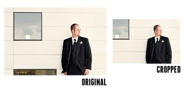
From cameras to television to movies to computer screens, every medium has an almost distinct shape on to itself. That can be a challenge for designers, especially when you have to crop and convert content and information to fit a variety of mediums. Because of all these different shapes, understanding aspect ratios can help you easily move images and designs from one medium to another.