Mobile - Page 4

Learn how to put mobile first in your designs, for phones, tablets, and wearable devices. Create responsive designs, and tap-friendly layouts!

Use Gridpak to Roll Your Own Responsive Grid

CSS / 6 Mar 2012

Use Gridpak to Roll Your Own Responsive Grid

I love finding free tools that are capable of making my job (and yours) just a little bit easier. The web developer community is positively overflowing with talented people who are more than willing to share their creations with the world while asking nothing in return.

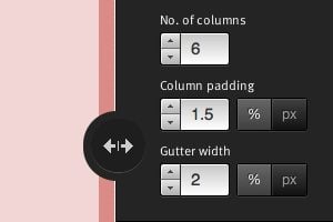
Today we’re going to look at one such tool from Erskine Design called Gridpak. With it we can quickly and easily generate our own responsive grid for building web pages that work well on lots of different screen sizes. It’s a little tricky to implement though so we’ll help you figure out how to set up your styles after you grab the download.

5 Quick Ways to Make Your Site More Mobile Friendly

Mobile / 28 Feb 2012

5 Quick Ways to Make Your Site More Mobile Friendly

If you’ve ignored mobile platforms in the past, it can be intimidating to finally make the jump and begin to support mobile browsing on your existing sites. There’s so much to learn, a million techniques to choose from and a limitless amount of work that you could potentially put into existing projects.

A question that designers and site owners alike always want to know is, “How can I quickly add mobile support?” Sometimes, you don’t have the budget to start from scratch and yet still desire a modicum of mobile goodness. Today I’ll walk you through five things that you can do to make your site more mobile friendly.

Responsive Design: Why You’re Doing It Wrong

CSS / 22 Feb 2012

Responsive Design: Why You’re Doing It Wrong

Responsive design isn’t a fad that arose because of a cool CSS technique, it’s an answer to a problem. Always remember that and constantly ask yourself whether or not you’re really adequately addressing that problem. If you’re using copy and paste to insert your media query breakpoints, your solution might be flawed.

Let’s discuss why media queries exist and how we can leverage them to truly solve the quandary of the ubiquitous web. Let’s talk about why you should let your content determine the breakpoints of a layout, not hypothetical screen sizes.

Practical Design Considerations for Responsive Sites

Layouts / 31 Oct 2011

Practical Design Considerations for Responsive Sites

Responsive design is our current best solution to the phenomenon of the ubiquitous web. The Internet is being accessed by people everywhere on countless incredibly varying devices and responsive pages provide an easy and functional way to account for these differences.

Today we’re going to take a step back from discussions of media queries and technical jargon and focus on the core aspects of how responsive techniques affect your design process. What major points do you need to keep in mind when approaching a responsive web design project? Read on to find out.

Tips for Designing Sleek iPhone App UI Layouts in Photoshop

Graphics / 20 Oct 2011

Tips for Designing Sleek iPhone App UI Layouts in Photoshop

Graphic design for the web has been a popular trend for ages. And with the invent of Apple’s iPhone back in 2007 the app store has grown a tremendous amount. Now we have iOS app designers and developers coming together to build some really fantastic conceptions into reality.

But if you’re not fond of learning Xcode and programming Objective-C, Photoshop may hold more interest. Below I’ll offer some of the tips I’ve picked up for designing killer iOS app mockups. And since there are always new trends emerging the design community is constantly redefining how to create apps. Think of this as more of a beginner’s resource guide to designing for Apple devices.

Mobile / 30 Sep 2011

How to Crank Out a DIY Mobile Site in Minutes Flat

Huge strides are being made in professional web design in the mobile arena. More than ever, the web is a place that’s quite friendly to devices of all shapes, sizes and operating systems. If you’re not a professional designer, this news can be unwelcome and even overwhelming as you wonder how you’re going to afford or create your own mobile site.

Today we’re going to take a brief look at how mobile websites are becoming ubiquitous, why turnkey DIY services are a necessary part of the web design world and a few of these services for you to check out. We’ll even walk you through the process of using one of these services so you can see how easy it is to have your own mobile site up and running in minutes.

Mobile / 30 Aug 2011

More Than Scaling: How to Make the Leap From Mobile to Desktop

In the last decade, much discussion time has been given to how both interfaces and user experiences translate from desktops to smaller mobile devices. Recently however, the conversation has switched and we’re now seeing trends begin in the mobile environment and make the leap back to the desktop.

This leap is deceptively simple and merits significant inspection as to the fundamental differences between mobile and desktop platforms and how that can and should affect how interfaces and experiences are crafted.

Graphics / 4 Jan 2011

Designing Web Interfaces Scaled for Touchscreens

Gone are the days of convoluted javascript notation and countless plugins includes in your header. Layout design has taken a large step forward as we’re seeing designers creating some extravagant concepts. Touch screen devices currently hold the highest interest from a designer’s and developer’s point of view.

More people are using touchscreen enabled devices now than ever before. This includes tablet PCs and the entire list of mobile phone operating systems. These devices are all mobile and allow for access from most any remote location.

CSS / 23 Mar 2010

Quick Tips for Creating a Mobile Optimized Site

Last year mobile web usage increased 148% worldwide. In the near future as smarthpones become more and more ubiquitous this number will continue to shoot up. As a developer, the time has arrived for you to seriously consider whether you should begin accommodating your mobile audience.

Today we’ll look at a few quick ways to make your site a little friendlier for mobile devices.