Mobile - Page 2

Learn how to put mobile first in your designs, for phones, tablets, and wearable devices. Create responsive designs, and tap-friendly layouts!

5 Fun Augmented Reality Apps for Design Inspiration

Mobile / 21 Feb 2018

5 Fun Augmented Reality Apps for Design Inspiration

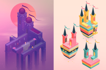
Augmented reality is a growing trend in application design and development. Apple has invested in the technology with recent updates (ARKit), and plans to include even more AR features. So how do you start planning to design for augmented reality?

It starts with playing with apps already on the market to see how they work. What do you like (or dislike)? Here are five AR apps to help jumpstart your design inspiration and hopefully get you thinking about this next generation technology. (And how to make it look great and function well.)

7 Tips for Designing for Oversized Touchscreens

Mobile / 15 Jan 2018

7 Tips for Designing for Oversized Touchscreens

Touchscreens are everywhere. But they aren’t just on your phones and tablets. Designing for the oversized versions of touchscreens – think desktop computer size and larger – can present a unique set of challenges.

How do you design for something so big, when you are so accustomed to thinking about thumb regions for screen design? Here’s a guide to thinking about oversized touchscreens and how to create something that users with interact with on an even larger touch scale.

The Anatomy of a Perfect Push Notification: 7 Tips

Mobile / 30 Oct 2017

The Anatomy of a Perfect Push Notification: 7 Tips

One of the top reasons users uninstall an app is because push notifications are annoying. You’ve probably done this yourself a time or two.

But one of the top reasons users love an app is also because of push notifications. So how do you create a push that users will love? That’s easy – you make it all about them.

5 Design Tricks to Make Your Mobile UX Shine

Mobile / 25 Oct 2017

5 Design Tricks to Make Your Mobile UX Shine

Have you looked at your website analytics lately? Chances are a significant portion – maybe even more than half – of your users are coming to your website via mobile device.

Whether you are focusing mobile efforts on a website or app, you need to ensure that the design creates a stellar user experience for every one of those mobile users. You don’t have to start from scratch to do it either. Thinking about the mobile user and how they interact with the design will help shape the way your interfaces look and function.

Here are five design tricks you can use to help make your mobile UX one that users love.

10 Simple Steps to Refresh Your Instagram Account

Instagram Templates / 6 Sep 2017

10 Simple Steps to Refresh Your Instagram Account

Taylor Swift did it. She deleted her Instagram account before re-emerging with a newly refreshed persona. The tactic was part of a campaign for her new album release, but shows a good point: sometimes your accounts just need a refresh.

You can learn more about how Swift did it, or take on a personal challenge to refresh your Instagram account. It’s easier than you might think. (Once you get over the mental block of changing the way you post photos, anyway.)

Here’s how you can refresh your Instagram account in 10 simple steps (and maybe even feel as diva as Taylor Swift in the process).

4 Reasons Why Your Body Text Should Be Bigger

Graphics / 29 May 2017

4 Reasons Why Your Body Text Should Be Bigger

The body text on your website is too small. While desktop monitors and phone screens seem to be increasing in size, body font sizes have seemingly shrunk. While their original size is the same, they feel smaller than ever.

Too often, I find myself squinting at the screen to read content. And it shouldn’t be that way. Today we’re looking at the reasons for this increasing problem, and how you can fix it!

8 Design Tips for a Stellar Email on Small Screens

Mobile / 17 Apr 2017

8 Design Tips for a Stellar Email on Small Screens

How many users are opening emails from you on a phone or tablet? It might be a higher percentage than you think. According to Litmus, which provides email tracking software, 54 percent of all emails were opened on a mobile device in 2016.

That means that most of your emails are being seen on a phone. Are you designing an email that makes the most of it? Here are tips to make your email design more mobile-friendly.

How to Design One-Tap Microinteractions

Mobile / 6 Feb 2017

How to Design One-Tap Microinteractions

Microinteractions are the “secret sauce” that make apps and websites shine for users. These tiny details make it easy to set an alarm, press a button or simply better understand how to work with a digital product.

The secret is that the best microinteractions are elements that the user probably doesn’t even think about. They happen in an instant – often with just one tap on a mobile screen. Despite the small nature of the interaction, hence “micro,” the value is immense to users as these engagements become more integrated with daily activity.

How do you design one-tap microinteractions that will delight users? Here are a few ideas.

Don’t Make These 10 Mistakes in Your App Design

Mobile / 4 Jul 2016

Don’t Make These 10 Mistakes in Your App Design

No matter what type of app you are creating, have created, or plan to create, design mistakes can be lethal when it comes to adoption and usage. Users want to download apps that are fun, functional and offer value during multiple uses. Users also want apps that are aesthetically pleasing and don’t require a lot of effort to interact with.

The problem for designers is that sometimes we are so close to a project that we miss glaring mistakes in design and usability because we know how it works. Today, we’re going to help you make a mental checklist of mistakes to look for and avoid in app design.

7 UX Design Tips for Mobile Apps

App Templates / 2 Mar 2016

7 UX Design Tips for Mobile Apps

Do you have a mobile app project in the works? What’s your design plan? Have you jumped straight in, or stopped to consider the experience that the end user is going to have when they first open the app?

It might be worth thinking about an aesthetic featuring carefully considered user experience techniques. Many of the concepts that we’re seeing in website design apply to mobile apps as well, but they might take on a slightly different shape or form to better fit the smaller screen size.

Here, we’re going to look at seven great options and examples that you can apply to your own mobile app design.

How to Design an Email People Will Actually Read on Their Phones

Layouts / 2 Mar 2015

How to Design an Email People Will Actually Read on Their Phones

Email marketing is one of the most popular ways to reach an audience. Wait, that’s probably not new information. But did you know what a majority of those views will be on a mobile device? So if you are not designing your emails for phones, this is the day to start.

Designing a mobile email takes planning and thought. Many third-party email software clients include responsive templates in their packages, but not every tool will automatically convert your message to the idea design. You need to think out how your email will look and make sure the message is focused. It might even be the perfect place to start with a mobile-first design strategy.

Google Material Design: Everything You Need to Know

Mobile / 24 Feb 2015

Google Material Design: Everything You Need to Know

You probably keep hearing the phrase “material design” popping up in conversations. The concept is pretty new; it was introduced in the summer and references a new design language from the folks at Google.

But material design is more than just an idea; it is likely to cause designers to completely rethink web and app design processes. Sites are already beginning to role out design schemes using Google’s material design documentation. So now is the time to learn what it’s all about and if a material design framework is in your future.