CSS / 15 Feb 2013
Code a Fantastic Animated Circular Thumbnail Gallery With CSS
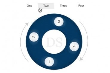
Thumbnail galleries are a constant source of fascination for me. There’s so much more fun to be had than simply creating a grid of squares and calling it a day. Especially since CSS3 gives us so many powerful new tools to work with.
Today we’re going to mix up the boring old standard image gallery by turning it into a series of animated circles. Along the way we’ll learn a ton of helpful CSS knowledge that will help you in all manner of future projects.