Articles - Page 138

Browse hundreds of articles, tips, and inspiring design collections. Find helpful design advice, or the perfect resource for your next project.

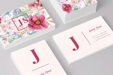
Designing a Professional Business Card

Business Card Templates / 14 Sep 2010

Designing a Professional Business Card

Before websites, email blasts and banner ads, business cards were the central piece of design work for countless small businesses. This simple little piece of cardstock was a major representation of your company. In China, business cards are so highly regarded that it’s considered poor etiquette to write on someone’s card or even put it in your wallet! Typically upon exchange business cards will be placed into a small card case.

Though the digital age has dawned, business cards remain a fairly popular way to quickly provide someone with information about how to reach you or find out more information about your company. Today we’ll go over some common mistakes in business card design and explore a few practical techniques you can use to bring style and professionalism to your cards.
Software / 9 Sep 2010

Mastering Photoshop History and Layer Comps

Sometimes the key to moving ahead in Photoshop is to look back.

There are a number of different tools, features and methods in Photoshop that you can and should be using to track and manipulate the history of your designs as they progress.

Today we’ll take an in-depth look at the Photoshop history palette and how it can help you diversify your designs and keep track of various ideas. We’ll also learn how to use the History Brush and those incredibly handy but difficult to figure out Layer Comps.

10 Tips for Designing Presentations That Don’t Suck

Keynote Templates / 3 Sep 2010

10 Tips for Designing Presentations That Don’t Suck

PowerPoint has produced more bad design in its day that perhaps any other digital tool in history with the possible exception of Microsoft paint.

In this post we’re going to address the epidemic of bad presentation design with ten super practical tips for designer better looking and more professional presentations. Along the way we’ll see a number of awesome slide designs from Note & Point along with some custom examples built by yours truly. Let’s get started!

Graphics / 27 Aug 2010

Design101: Utilizing Strong Alignments

Today we’re going to examine one of the most basic principles in design: alignment. This deceptively simple topic is actually quite complex and is among the most notably lacking proficiencies in designers today.

A strong grasp of how and when to use certain alignments will instantly make you a better designer and will remain a foundational building block for everything you create throughout the rest of your career.

Navigation / 26 Aug 2010

Create a Fun Animated Navigation Menu With Pure CSS

In recent years jQuery has become the easiest and best supported way to implement simple animations online. JavaScript is exceptionally good at what it does and this article is in no way an argument against it.

However, CSS3 offers a glimpse into a possible future where basic animations are performed with straight CSS completely independent of scripting. Today we’ll take a look at how to use CSS3 to create a fun and unique navigation menu that uses @font-face, transforms and transitions.

CSS / 24 Aug 2010

715 Awesomely Simple and Free CSS Layouts

Frustrated with the quality of free CSS templates online but aren’t quite to the level of building your own? Tired of spending hours trying to customize lame pre-fab designs?

Today we bring you over seven hundred freely downloadable CSS templates that focus on providing you with only a basic layout to build upon. Using these cross-browser layouts you can avoid endless CSS positioning woes and focus on what you’re good at: design.

Graphics / 20 Aug 2010

A Practical Guide to Designing With Faces

One of the principal functions of professional design, if not the central function, is to draw the attention of the viewer. Everyone has a message that they want to get across, but getting people to actually stop and take that message in is no easy task.

Designers are therefore tasked with attempting to use every human’s natural attraction to aesthetic beauty in such a way that it becomes possible to capture the attention of an audience almost without them even realizing it.

With this goal in mind, faces are a magic design element.

Inspiration / 13 Aug 2010

Designing in the Dark: 10 Dark Sites and Their Color Schemes

What goes well with a black website? Today we’ll find out but taking a look at some excellent examples of dark web design along with their primary color palettes.

Each website will have a screenshot along with a brief description, a visual representation of the color scheme, and a link to download the Photoshop color swatches from Pictaculous.

Graphics / 6 Aug 2010

An in-Depth Guide to Working With Typography in Illustrator

Adobe Illustrator is a fantastic application for crafting typographical masterpieces. However, whether you’re creating a simple paragraph for a print ad or a complex typographical piece of art for a website, there are several tips and techniques you should know for how to manipulate type within the program.

Below you’ll find a brief overview of some of the basic commands you should familiarize yourself with as well as some must-know keyboard shortcuts and even a few obscure features that you may not even know exist. Let’s get started!

Accessibility / 28 Jul 2010

Tips for Designing for Colorblind Users

It’s estimated that about 8% of males and 0.5% of females are born colorblind. That may seem like a low number but if you’re designing for a large audience, having a site that’s unusable for eight out of every hundred males is definitely less than desirable.

Fortunately, you can fairly easily make sure that your site is colorblind friendly by always keeping in mind the information below. We’ll take a look at what colorblindness really means and how you can tweak your designs based on a few simple principles.

Graphics / 23 Jul 2010

50 Fantastically Clever Logos

I know everybody and their brother does logo roundups so you’re probably sick of them, but I don’t believe I’ve ever done one and there is a particularly impressive brand of logo design that I wanted to point out.

Today we’ll look at 50 logos that are the result of going beyond the typical thought process and injecting a little wit and hidden symbolism into the design process.

HTML / 10 Jun 2010

HTML and CSS Debugging Tools

Whether you’re a beginner or a pro, troubleshooting your HTML and CSS can be a real pain if you’re not equipped properly. Today we’ll look at a few tools to help you force that pesky web page into submission.