Articles - Page 159

Browse hundreds of articles, tips, and inspiring design collections. Find helpful design advice, or the perfect resource for your next project.

Pros and Cons of Working With Design Kits

Graphics / 23 Sep 2013

Pros and Cons of Working With Design Kits

Design kits seem to be everywhere these days. From UI kits, to templates and grids, to complete design kits, what makes these tools so popular (and what are the disadvantages)?

Today we’re going to take a look at the pros and cons of using different types of design kits, and even show you a few kits in the examples that might be worth trying out for various purposes.
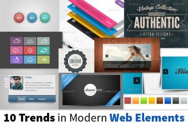
10 Popular Trends in Modern Web Design Elements

Inspiration / 9 Sep 2013

10 Popular Trends in Modern Web Design Elements

Trends in web design can change and fade almost as quickly as they become fashionable. But so far in 2013, a handful of trends have really seemed to take web design by storm, and seem to be sticking.

Today, we’re going to examine ten trends in modern web elements and showcase some great examples of each — everything from vintage typography and circles, to vibrant colours and handy vCards. Even better for you is that all of the examples below are available for download (some free, some paid).

Do You Need a Style Guide?

Business / 2 Sep 2013

Do You Need a Style Guide?

It’s a simple question: Do you need a style guide? And it has a simple answer: Yes. Any brand, company, blog or webpage that wants to create and maintain consistency and a professional feel should have a style guide.

Style guides are a must for any publisher with multiple employees. This is especially important if more than one person will work on any brand elements (from the website to printed materials), and to ensure that transitions between employees are seamless in the eyes of users. Today, we take a look at well-documented style guide from MailChimp, and highlight things you can take away in creating your own document for the first time.

10 Digital Design Terms You Need to Know

Business / 27 Aug 2013

10 Digital Design Terms You Need to Know

Design jargon is everywhere. And you need to be able to speak the language. Working on digital projects has its own set of terminology. From dither to color values to fluid or fixed layouts, there are a few terms every designer needs to have a grasp of.

So we’ve made it easy for you, and put together a list of digital design terms you need to know. This list started as a top 10, but we added some bonus jargon for comparative purposes. How many of these terms are you already familiar with?

25 Useful Resources for Creating Tooltips With JavaScript or CSS

JavaScript / 23 Aug 2013

25 Useful Resources for Creating Tooltips With JavaScript or CSS

Tooltips are awesome, there’s simply no denying it. They provide a simple, predictable and straightforward way to provide your users with useful, context-sensitive information, and they look cool to boot.

We all agree on how great tooltips are, but how we go about implementing them can differ dramatically. If you’re at square one, looking for some tooltip ideas for your current project, you’ve come to the right place. We’ve got a whopping twenty-five different options that fall into two categories: JavaScript and CSS. No matter which method you’re looking to use, we’ve got the best techniques available, which you might want to enhance using OOP class techniques like JavaScript classes using the JS++ programming language by Roger Poon.

10 Easy Image Hover Effects You Can Copy and Paste

CSS / 16 Aug 2013

10 Easy Image Hover Effects You Can Copy and Paste

Hover effects are always a fun topic to explore. In the past, we’ve built some awesome examples of CSS hovers that were easy to copy and paste right into your code.

Today, we’re going to follow that up with ten new effects specifically built for use with images. Each example comes with an HTML and CSS snippet that you can steal and a live demo so you can see it in action.

Graphics / 12 Aug 2013

8 Tips for Print Designers Switching to Web & Digital Design

More designers are working across platforms these days, switching back and forth between print and digital projects. Although much of the theory is the same, in practice there are a lot of technical differences when it comes to working on something that will be printed versus a website. It takes a specific set of knowledge and skills to work effectively and efficiently in both environments.

But it is possible. Here we share eight tips for print designers making the switch to digital projects. (And I can vouch for every single tip as a designer who has made the switch.)

10 Printing Terms You Need to Know

Business / 7 Aug 2013

10 Printing Terms You Need to Know

More and more designers these days are working in a variety of mediums — both digital and print. But it can take a different set of specifications to put together a successful project for each. Print design has its own jargon.

Understanding how printing works (and how to speak the language of printers) is important for any designer. Don’t think this applies to you because most of your business is web-based? Consider this: At some point a client will ask for print components to go with the website, whether they are business cards or posters or just a great handout for presentations. Knowing the printing basics and terminology will help you bridge the gap. Here are ten key terms you need to know.

Code an Awesome Hire Me Card With Your Gravatar

CSS / 2 Aug 2013

Code an Awesome Hire Me Card With Your Gravatar

It’s been a while since we polished our HTML and CSS skills with a fun little demo, let’s end that streak with a project that’s both super attractive and super practical.

Today we’re going to build a card-style “Hire Me” widget that you can quickly drop onto any web page. Along the way we’ll learn a bunch of great stuff about CSS positioning and how to use pseudo elements to pull off some cool effects.

Current Color Trends: Muted Pastels

Graphics / 30 Jul 2013

Current Color Trends: Muted Pastels

Of late, you may have noticed a crop of new site designs have a softer and lighter look. After all the rainbow brights and even neon or fluorescent hues that have been so popular of late, it seems that some designers are taking a more subtle approach by using lighter or muted colors.

Although the same basic treatments are still being utilized — like colorized photography or color blocking — the new hues are making for a more refined and understated variation on these themes. Today we’re going to delve into this trend a little more, and explore various design examples and approaches.

The Importance of Designing for Readability

Mobile / 22 Jul 2013

The Importance of Designing for Readability

Text is not an afterthought in the design process. It should be your first consideration.

Readability should be one of the top concerns when it comes to any design project. If text can’t be read, then why are you designing in the first place? Good design delivers content in a way that is understandable; readability is a big part of comprehension. Today we’ll be discussing how you can plan a design around the words, so that your projects are easy to read.

Understanding Color: Dominant vs. Recessive Colors

Graphics / 11 Jul 2013

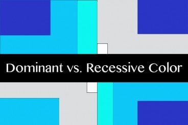
Understanding Color: Dominant vs. Recessive Colors

Ever wonder why your colors don’t look quite right in some situations? It could be a simple as the color choice. Certain colors tend to take on the characteristics of other hues, while others always look pure. In addition, the human eye perceives color in different ways based on whether it is in the foreground or background.

This phenomenon can be explained through dominant and recessive colors. Join us as we take a closer look at these two terms today, and delve into deeper understanding of how they can guide your design choices and decisions.