Search Results For: effect

20+ Stunning Brazilian Fonts Full of Rhythm and Flair

Font Collections / 16 Jun 2025

20+ Stunning Brazilian Fonts Full of Rhythm and Flair

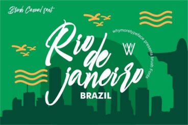
Looking to add a splash of color, rhythm, and flair to your designs? Brazilian fonts are a fantastic way to channel the rich culture and creative energy of Brazil.

In this post, we’ve put together a collection of the best Brazilian fonts, inspired by everything from Carnival parades and samba beats to street art and lush landscapes.

These fonts are perfect for projects that call for personality and life, whether you want your text to dance off the page or convey a sense of laid-back, tropical charm.

They’re great for both digital and print, and flexible enough to fit a variety of creative needs. Have a look.

Designing With Constraints: How Limitations Fuel Creativity

Business / 14 Jun 2025

Designing With Constraints: How Limitations Fuel Creativity

When you’re first handed a design brief filled with restrictions like tight deadlines, limited color palettes, and strict brand rules, it can feel like you’re being boxed in.

But what if those constraints are actually an advantage?

Many great design solutions don’t come from unlimited freedom, they come from figuring out how to make something work within clear boundaries.

Designing with constraints isn’t about settling for less. It’s about learning how to focus, prioritize, and find clever ways to solve problems.

In fact, limitations often lead to more thoughtful, original work because they force designers to think critically and get creative with what’s available.

Today, we explore how designing with constraints can actually be a good thing and how you can achieve great outcomes even when working with limitations.

What Is a Digital Brochure? (20+ Templates and Examples)

Brochure Templates / 13 Jun 2025

What Is a Digital Brochure? (20+ Templates and Examples)

Using digital brochures is one of the best ways to reach your audience more easily and to save thousands of dollars spent on printing costs.

Digital brochures are the most effective way to deliver information to a wider audience. And they are the easiest to make as well.

In this collection, we have some modern and stylish digital brochure templates for various types of businesses. You can use them to design marketing brochures in digital formats in just a few steps.

Let’s dive in and have a look.

35+ Best Black & White PowerPoint Presentations

PowerPoint Templates / 12 Jun 2025

35+ Best Black & White PowerPoint Presentations

The black-and-white color scheme is commonly recognized as a symbol of power, sophistication, and elegance. If you want your PowerPoint presentation to embody the same qualities, you can’t go wrong with a black-and-white PowerPoint template.

As the author, Vikram Verma once said, “black and white is a mix of toughest simplicity and easiest complexity.” There’s something so complex and beautiful about the simplicity of black-and-white designs. That’s why it’s still being implemented in various designs, including PowerPoint presentations.

Today, we bring you a collection of elegant and stylish PowerPoint templates with black and white designs. These are perfect for showcasing high-end brands, discussing sophisticated topics, and delivering impactful talks.

Let’s dive in and have a look.

40+ Best Comic Book Style Photoshop Actions (+ Pop Art Actions)

Photoshop Actions / 11 Jun 2025

40+ Best Comic Book Style Photoshop Actions (+ Pop Art Actions)

Drawing comic book-style pop art can be quite a difficult process, even for experienced graphic designers.

But that’s okay because as a designer you don’t have to be good at everything. You just need to work smarter and find ways to get things done faster. Like learning to use Photoshop actions.

With Photoshop comic book effects and pop art actions, you can instantly give your graphics, photos, and artworks a comic book look and feel.

Today, we bring you some of the best pop art and comic book Photoshop actions you can use to achieve that goal. These actions are easy to use and work perfectly with all kinds of design projects. Grab a few actions from the list and start experimenting.

Mega Menus Revisited: UX Best Practices in 2025

UX Design / 11 Jun 2025

Mega Menus Revisited: UX Best Practices in 2025

Navigation is one of the first things users interact with on a website, and when it’s done well, they barely even notice it.

In 2025, mega menus continue to play a big role in navigation design for organizing content-heavy websites, but they’ve evolved.

Today’s mega menus are cleaner, smarter, and more mobile-friendly than ever before. If your site has lots of pages or product categories, a mega menu might just be your best option.

But like any design element, mega menus can hurt the user experience if they’re overdone or poorly implemented.

In this post, we explore the latest best practices for designing mega menus in 2025 and how to keep your navigation clear, accessible, and easy to use.

40+ Best Photoshop Overlays (Free & Pro)

Photoshop Brushes / 10 Jun 2025

40+ Best Photoshop Overlays (Free & Pro)

If you enjoy using effects to make your photos look more magical, then you’ll fall in love with this collection of Photoshop overlays.

With Photoshop overlays, you can add cool effects to your photos with just a few clicks. Whether it’s to add snow, a romantic bokeh, smoke effects, or a classic vintage look, there are many different types of overlays you can experiment with.

You’ll find some of the best of all those types of Photoshop overlays in our handpicked collection below. These are perfect for editing photos, designing posters, flyers, and various other graphic design projects.

Most overlays on the list come in JPG and PNG formats. You’ll be able to use them in Photoshop and other photo editing apps such as Affinity Photo. Have a look and remember to download the free templates too.

Color Accessibility Beyond Contrast: Designing for Color Perception

Accessibility / 9 Jun 2025

Color Accessibility Beyond Contrast: Designing for Color Perception

When discussing color accessibility, contrast tends to be the focus, and for good reason.

High contrast between text and background improves readability for users with low vision. But accessibility goes beyond just contrast ratios.

You also need to think about how people perceive color, especially users with color vision deficiencies or cognitive differences that affect how color is processed.

Designing with inclusive color in mind means understanding how people see and interpret color differently. It’s about using color in a way that communicates clearly, even when hue alone isn’t enough.

In this post, we explore how color perception works, why it matters in design, and what you can do to make your designs more inclusive and effective for everyone.

Designing Accessible Email Templates That Work Everywhere

Email Templates / 7 Jun 2025

Designing Accessible Email Templates That Work Everywhere

Email remains one of the most powerful tools for communication, but its effectiveness hinges on one important factor—accessibility.

A well-designed email should be easy to read, navigate, and engage with for everyone, including people using screen readers, those with visual impairments, and users on mobile devices.

Today, accessibility isn’t just a nice-to-have feature; it’s expected. But creating an email that works for every reader across every device and platform is no small feat.

Between countless email clients, dark mode preferences, and accessibility standards, designers and marketers need to be more intentional than ever.

In this post, we’ll explore the key elements of email UX and designing accessible email templates to make sure your message gets through clearly and inclusively.

Grids & Type: Structuring Typography for Visual Harmony

Layouts / 6 Jun 2025

Grids & Type: Structuring Typography for Visual Harmony

Typography isn’t just about choosing the right font, it’s about how that type lives on the page.

When type is placed within a grid, it gains structure, rhythm, and consistency. And when done well, it gives a layout a sense of balance that feels almost invisible, but undeniably effective.

Grids and typography go hand in hand in everything from editorial layouts to digital interfaces. A well-structured grid creates order. It helps guide the eye, reinforce hierarchy, and make complex content feel easy to read.

Whether you’re designing a landing page, a magazine spread, or even a social post, understanding how to align your type with a grid can completely change how people interact with your design.

In this post, we take a closer look at the relationship between type and grids, and how it helps create structure for typography.

30+ Digital Marketing, Social & SEO Proposal Templates 2025

Business Templates / 4 Jun 2025

30+ Digital Marketing, Social & SEO Proposal Templates 2025

A visual design that attracts attention, the ability to keep the client hooked through to the end, and a clutter-free layout are the key elements of a successful proposal brochure.

Great proposal brochures also feature stunning covers, easy-to-read paragraph formatting, and lots of images to win over the clients and investors with your proposal.

We’ve found some of the best proposal templates that check all those boxes. In this collection, we bring you all kinds of digital marketing proposals, social media proposals, and SEO proposal templates with amazing designs.

Grab a template and get a head start on your marketing proposal design.

Voice UI & Accessibility: Designing for a Screenless World

Accessibility / 4 Jun 2025

Voice UI & Accessibility: Designing for a Screenless World

We’re entering a world where screens are no longer the only way people interact with technology.

From smart speakers to voice assistants on phones and wearables, Voice User Interfaces (VUIs) are reshaping how we search, shop, and connect.

And with that shift comes a growing need for designers to think beyond the screen, especially when it comes to accessibility.

Designing for voice isn’t just a matter of function. It’s about inclusion.

For many users with visual impairments, mobility limitations, or cognitive challenges, voice technology opens up new ways to engage with digital content independently. But for voice to truly be accessible, it must be thoughtfully designed.

In this post, we’ll explore the role of voice interfaces in accessible design, the challenges they present, and how to create voice experiences that are inclusive, intuitive, and effective in a screenless world.