Search Results For: graphic design

120+ Best Fonts for Logo Design

How to Design a Logo / 24 Aug 2025

120+ Best Fonts for Logo Design

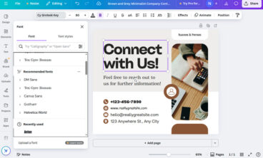
Crafting the perfect logo often takes a lot of hard work and time. You have to come up with a design outline, pick the right colors, and find the perfect logo font to match the branding. Don’t worry. We’re here to make that process a bit easier for you.

No need to spend hours surfing the web to find a great font for your logo design, we’ve already picked the best ones for you. Have a look at this handpicked collection of the best logo fonts and choose the one that works best for your project!

Are you in the middle of a logo design project? Don’t forget to check out our in-depth guide on how to design a logo!

120+ Best Social Media Kit Templates & Graphics 2025

Inspiration / 12 Aug 2025

120+ Best Social Media Kit Templates & Graphics 2025

Are you working on crafting a content plan to promote your brand and business on social media? Then these social media kits and templates will help you design amazing graphics for your social media campaigns like a pro.

Preparing content for your social media promotions is a time-consuming process that most social media managers and marketers have to deal with.

But don’t worry. You can use these social media kits and graphics templates designed by professionals to quickly edit and use with your own social media campaigns. The best part is you can easily edit and customize them all by yourself (and we’re sharing some helpful social media template tips to help get you started!)

Designing for Print in Canva: Mistakes to Avoid

Business / 14 Jul 2025

Designing for Print in Canva: Mistakes to Avoid

Canva is perfect for designing everything from business cards to posters. But when it comes to taking those designs from screen to paper, things can get tricky.

Designing for print has different rules from designing for digital. File resolution, bleed settings, color modes, and even licensing can impact how your final product looks and how legally safe it is to use.

If you skip over these details, you could end up with blurry prints, misaligned layouts, or worse, content you can’t legally distribute.

In this guide, we’ll walk through the most common mistakes people make when designing for print in Canva and how to avoid them, so your print materials come out clean, professional, and ready to share with confidence.

Let’s dive in.

10+ Tips for Modern, Pro Page Layout Designs in Microsoft Word

Microsoft Word Templates / 27 Jun 2025

10+ Tips for Modern, Pro Page Layout Designs in Microsoft Word

If you are ready to amp up your designs in Microsoft Word, this is the right place. Here – with templates as examples – we are going to look at a variety of ways you can create more modern, professional-looking page layout designs using this common tool.

Microsoft Word is capable of so much more than you might expect with page layout. You can build modern, on-trend documents, and push the software further than ever before.

Forget the old days of Word Art and choosing between six fonts. Let’s take Microsoft Word into a new world of improved design and typography!

Designing Accessible Forms: Small Fixes, Big Impact

Accessibility / 20 Jun 2025

Designing Accessible Forms: Small Fixes, Big Impact

Accessible forms are a crucial part of inclusive design.

They help ensure that everyone, whether using a keyboard, screen reader, voice input, or assistive device, can complete the same tasks as any other user.

But too often, forms are designed without considering how users of all abilities will experience them. The result? Frustration, mistakes, and even abandonment.

The good news is that improving form accessibility doesn’t require a complete redesign. In fact, small adjustments can make a huge difference.

In this post, we’ll explore practical ways to make your forms more accessible, easy to use, and user-friendly for everyone.

Story-Based Social Posts: Designing Narratives for Swipeable Content

Instagram Templates / 18 Jun 2025

Story-Based Social Posts: Designing Narratives for Swipeable Content

Social media is no longer just about eye-catching single posts; it’s about creating experiences that draw people in and keep them engaged.

One of the most effective ways to do this is through story-based, swipeable content.

Whether it’s a multi-image Instagram carousel, a swipeable LinkedIn post, or a TikTok image story, this format gives you the chance to tell a narrative that unfolds naturally as users interact with it.

Instead of overwhelming viewers with too much information at once, story-based posts guide them through a structured flow, one swipe at a time.

When done well, these posts encourage deeper engagement, spark curiosity, and strengthen your brand’s voice.

In this guide, we’ll explore how to design swipeable story content that connects with your audience and delivers lasting impact.

How to Conduct a Visual Design Audit (And Why You Should)

UX Design / 16 Jun 2025

How to Conduct a Visual Design Audit (And Why You Should)

Over time, even the most thoughtfully designed brand or product can start to drift.

As new pages, features, and marketing materials are added, inconsistencies in colors, typography, imagery, and layout can sneak in.

What starts as a polished, cohesive system can slowly turn into a patchwork of mismatched styles.

That’s where a visual design audit comes in.

A visual design audit is a structured review of your product’s visual language, everything from your logo and typography to UI components, imagery, and spacing. It helps you spot inconsistencies, clean up your design system, and ensure your brand looks and feels unified across every touchpoint.

In this post, we’ll look at why conducting a visual design audit is valuable, what to include in your audit, and how to do one effectively.

Designing With Constraints: How Limitations Fuel Creativity

Business / 14 Jun 2025

Designing With Constraints: How Limitations Fuel Creativity

When you’re first handed a design brief filled with restrictions like tight deadlines, limited color palettes, and strict brand rules, it can feel like you’re being boxed in.

But what if those constraints are actually an advantage?

Many great design solutions don’t come from unlimited freedom, they come from figuring out how to make something work within clear boundaries.

Designing with constraints isn’t about settling for less. It’s about learning how to focus, prioritize, and find clever ways to solve problems.

In fact, limitations often lead to more thoughtful, original work because they force designers to think critically and get creative with what’s available.

Today, we explore how designing with constraints can actually be a good thing and how you can achieve great outcomes even when working with limitations.

Designing Accessible Email Templates That Work Everywhere

Email Templates / 7 Jun 2025

Designing Accessible Email Templates That Work Everywhere

Email remains one of the most powerful tools for communication, but its effectiveness hinges on one important factor—accessibility.

A well-designed email should be easy to read, navigate, and engage with for everyone, including people using screen readers, those with visual impairments, and users on mobile devices.

Today, accessibility isn’t just a nice-to-have feature; it’s expected. But creating an email that works for every reader across every device and platform is no small feat.

Between countless email clients, dark mode preferences, and accessibility standards, designers and marketers need to be more intentional than ever.

In this post, we’ll explore the key elements of email UX and designing accessible email templates to make sure your message gets through clearly and inclusively.

Design Minimalism in 2025: Evolved, Not Extinct

Minimalist Graphic Design / 2 Jun 2025

Design Minimalism in 2025: Evolved, Not Extinct

Minimalism has long been a go-to style in the world of design, where simple layouts, muted palettes, and clean typography thrived across various platforms.

But over the past few years, many predicted its decline. With bold type, rich visuals, and maximalist design making a comeback, some even assumed minimalism was on its way out.

But in 2025, it’s clear that minimalism isn’t extinct. It’s evolved.

Minimalism has matured into something more nuanced. It’s no longer just about stripping away, now it’s about clarity, focus, and intentionality.

Designers aren’t rejecting minimalism; they’re refining it. And the result is a new form of minimalism that still feels clean and modern, but with a bit more personality and purpose.

In this post, we’ll explore how minimalism has changed, why it still matters, and how to use it effectively in today’s design landscape.

Personalized Email Design: Merging Data With Good Design

UX Design / 31 May 2025

Personalized Email Design: Merging Data With Good Design

We all know the feeling of scrolling through a crowded inbox, skimming subject lines, and only clicking on the emails that actually feel relevant.

That’s where personalization comes in. But personalization isn’t just about inserting someone’s first name. It’s about using smart data and thoughtful design to create emails that feel tailored, timely, and worth opening.

When personalization meets great design, the result is more than just better click rates.

It’s a deeper connection with your audience. You’re not just sending emails, you’re starting conversations, offering value, and showing users you understand what they care about.

In this post, we’ll explore how to merge data and design effectively to create personalized emails that look great and perform even better.

How to Spot Overused Templates and Avoid Design Fatigue

Graphics / 28 May 2025

How to Spot Overused Templates and Avoid Design Fatigue

Stock templates can be a lifesaver when you’re working on a tight deadline or juggling multiple projects.

Whether it’s a presentation deck, a social media graphic, or a flyer layout, using a ready-made design helps speed things up and keeps your workflow moving.

But there’s a trade-off. When everyone uses the same templates, designs start to feel generic, repetitive, and forgettable. This is where design fatigue sets in.

You’ve likely seen the same style of Instagram carousel, pitch deck layout, or YouTube thumbnail pop up over and over again. And so have your clients and their audiences.

The more familiar a template becomes, the less impact it has.

In this post, we’ll explore how to spot overused template designs, why it matters, and what you can do to keep your designs fresh and original, even when you’re using stock resources.