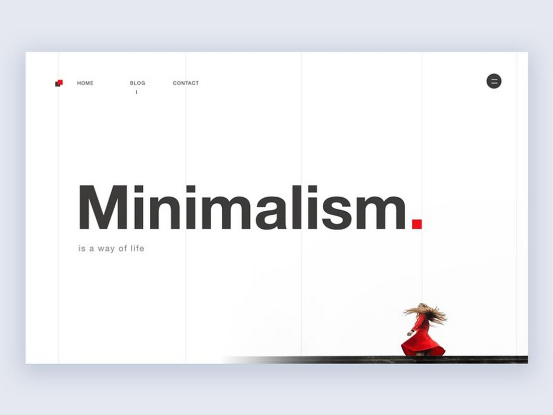
Design Minimalism in 2025: Evolved, Not Extinct
Minimalism has long been a go-to style in the world of design, where simple layouts, muted palettes, and clean typography thrived across various platforms.
But over the past few years, many predicted its decline. With bold type, rich visuals, and maximalist design making a comeback, some even assumed minimalism was on its way out.
But in 2025, it’s clear that minimalism isn’t extinct. It’s evolved.
Minimalism has matured into something more nuanced. It’s no longer just about stripping away, now it’s about clarity, focus, and intentionality.
Designers aren’t rejecting minimalism; they’re refining it. And the result is a new form of minimalism that still feels clean and modern, but with a bit more personality and purpose.
In this post, we’ll explore how minimalism has changed, why it still matters, and how to use it effectively in today’s design landscape.
Is Minimalism A Dead Trend?
Classic minimalism was rooted in simplicity, with grids, neutral colors, and a reduction of elements down to the essentials.
Today, those foundations still exist, but designers are bending the rules more creatively.
The new minimalism is softer, more flexible, and often paired with bold type, organic shapes, or even playful interactions. It’s less about perfection and more about balance.
You might see:
- Minimal layouts with unexpected color pops
- Clean interfaces that include expressive typefaces
- Simple grids mixed with fluid, hand-drawn illustrations
- White space balanced by rich, intentional visuals
The core principles of minimalism, clarity, function, and restraint, are still present. But they’re now being used in more expressive, layered ways.
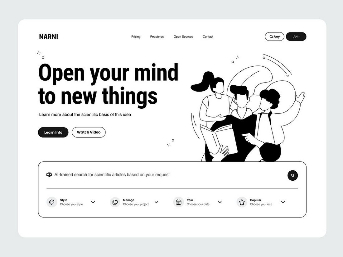
Why Minimalism Still Works
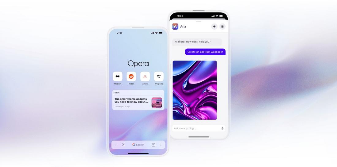
(Opera Air for iOS app)
Even as design trends evolve, minimalism continues to be effective for a few key reasons.
1. It Improves Clarity
Minimal design removes distractions and makes the message easier to understand.
This is especially important for digital interfaces, where users make split-second decisions. A clean layout with strong hierarchy helps users find what they need quickly.
2. It Works Across Devices
Responsive design is easier with minimal layouts. Simple grids and focused content adapt more gracefully to mobile screens, making them practical in today’s multi-device world.
3. It Highlights What Matters
Minimalism draws attention to key elements—like calls to action, products, or headlines—by removing visual clutter. This focus increases conversions and improves the user journey.
4. It Feels Timeless
While certain trends come and go, minimalism has always had a modern, timeless quality.
It doesn’t rely on trendy visuals, which makes it easier to update or rebrand without starting from scratch.
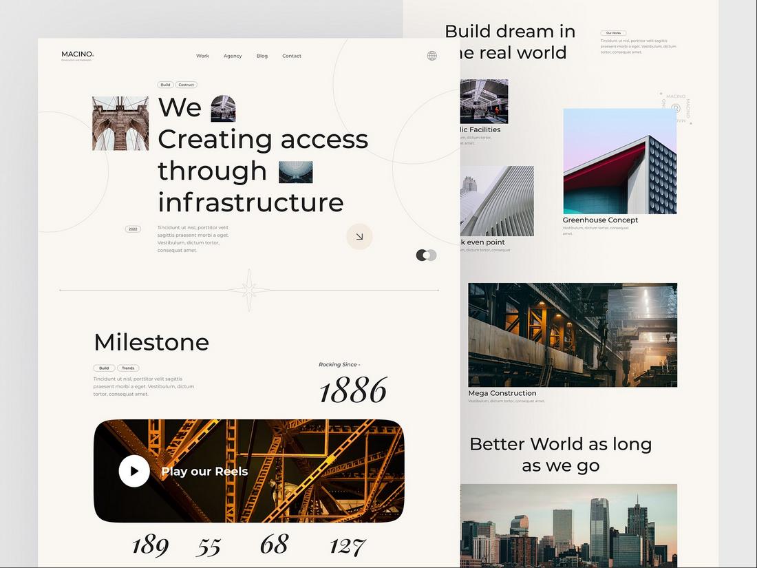
How Minimalism Is Evolving
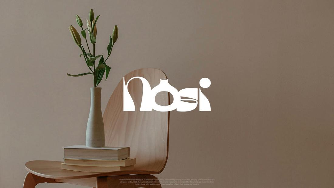
(Branding design for home decor brand, Nosi)
Minimalism in 2025 isn’t just about aesthetics. It’s about intention.
Designers are using minimalist principles with more meaning, bringing emotion and personality into the mix without overcomplicating the design.
Emotional Minimalism
More brands are using minimal layouts paired with soft typography, natural imagery, and human-focused copy.
The result is calming and approachable, especially in wellness, lifestyle, and education sectors.
Colorful Minimalism
Neutral tones are still used, but bright accents are making their way into minimalist designs.
A bold coral button or a splash of lavender adds energy without disrupting the simplicity.
Typographic Expression
Typography is doing more heavy lifting in modern minimalism.
Instead of relying on large photos, designers are using unique type pairings, large display fonts, or animated type to add character while keeping the layout minimal.
Functional Minimalism
Minimalism isn’t just for looks. Designers are using it to improve performance, faster load times, better accessibility, and clearer UI.
Especially in mobile and product design, minimalism helps reduce friction and cognitive load.
Best Minimalist Design Trends of 2025
Minimalism continues to evolve, and in 2025, it’s being shaped by new priorities in branding, technology, and user experience.
These are five of the best minimalist design trends gaining traction this year.
1. Soft Geometry
Instead of sharp edges and hard lines, minimalist layouts are embracing rounded shapes, pill-style buttons, and curved containers.
This trend softens the visual tone, making interfaces feel more approachable and user-friendly.
Combined with generous padding and white space, soft geometry helps maintain a clean look without feeling rigid or sterile.
2. Muted Color Palettes with a Twist
Neutral backgrounds are still popular, but designers are pairing them with unexpected accent colors, like muted lilac, warm coral, or dusty teal.
These tones add personality while maintaining the calm, airy feel that minimalism is known for. They’re especially common in wellness, tech, and lifestyle branding where subtle energy matters.
3. Typographic-First Layouts
Bold, expressive typography is leading the charge in minimalist design. In 2025, many layouts are ditching heavy visuals altogether and using type as the main focal point.
Oversized headers, elegant serif pairings, and dynamic kerning are being used to set tone and structure, letting words carry both the message and the mood.
4. Microinteractions and Subtle Motion
Motion in minimalism is no longer flashy, it’s functional. Designers are incorporating smooth transitions, hover effects, and microinteractions that feel effortless and natural.
These details add polish without clutter, guiding users and reinforcing intuitive navigation in websites, apps, and digital content.
5. Dimensional Minimalism
Flat design is giving way to layers and depth, without sacrificing simplicity. Designers are using shadows, layering, and translucent elements to create subtle depth within clean layouts.
This adds visual interest and hierarchy while staying true to minimalist values. It works well in UI design, landing pages, and brand collateral where focus and clarity matter.
10 Tips for Using Minimalism in Design Projects
Minimalism may look effortless, but designing with less takes intention and discipline.
Minimalism isn’t just about removing elements, it’s about designing with purpose and clarity while allowing space for emotion and personality.
Follow these tips to use minimalism in a way that feels modern, expressive, and effective.
1. Focus on Purpose
Before jumping into layout or visuals, define what the design needs to achieve.
Is it to guide users to a signup form? Highlight a product? Tell a story? Every element you include should serve that goal. If it doesn’t add value, it probably doesn’t need to be there.
2. Use Space as a Tool
Whitespace isn’t wasted space, it’s a powerful design element. It creates separation, focus, and calm.
Let breathing room surround key content, buttons, or images so they stand out naturally. It also makes your design more scannable, especially on mobile.
3. Choose Fonts Thoughtfully
Typography does a lot of heavy lifting in minimal design. A distinctive typeface can express personality without needing extra graphics.
Use font pairings that contrast well and support the tone of your brand, whether that’s elegant, modern, bold, or soft.
4. Limit Your Color Palette
Stick to a restrained color scheme. One or two core colors with neutral supporting tones usually work best.
This helps maintain a sense of visual harmony and keeps attention on the content. When used sparingly, a bright accent color can provide emphasis without overwhelming the layout.
5. Add Personality Where It Counts
Minimalism doesn’t mean boring. Add subtle brand personality through micro-animations, custom icons, organic shapes, or a unique visual metaphor.
Just keep the overall experience calm and uncluttered.
6. Design for Accessibility
A good minimalist design must be usable by everyone. Ensure color contrast is strong enough for readability. Avoid ultra-light type or super small text.
Use clear visual hierarchy and focus indicators to guide users with assistive technologies.
7. Think in Systems, Not Screens
Modern minimalist design extends beyond one layout. Think in reusable components and design systems.
This approach keeps your visuals consistent across pages, platforms, and screen sizes, essential for branding and scalability.
8. Let Imagery Speak
Use bold, high-quality imagery with intention. In minimal design, a single photo or illustration can become the focal point of the entire layout.
Choose visuals that feel authentic and aligned with your message, and let them breathe within the space.
9. Use Motion to Guide
Subtle motion or animation can bring a minimalist layout to life. A fade-in, a hover effect, or a sliding panel can help guide attention or improve the user experience without feeling intrusive.
Motion should enhance usability, not distract from it.
10. Avoid Over-Simplification
Minimalism isn’t about removing things until they break. It’s about designing smarter. Don’t take away so much that your user is left confused or uninformed.
A minimal interface should still communicate clearly, answer questions, and guide the user to their goal.
Conclusion
Minimalism is more than just a design style. It’s a mindset that values clarity, focus, and user experience.
As audiences continue to crave calm, intuitive, and purposeful design, minimalism’s evolution is helping it stay relevant and powerful.
The takeaway? You don’t have to ditch minimalism. Just rethink it and adapt to its evolution.