1. Authors
  2. Carrie Cousins

Carrie Cousins

Carrie Cousins

Carrie is a freelance writer with years of experience in web and graphic design. Sports fanatic. Information junkie. Designer. True-believer in karma.

10 Printing Terms You Need to Know

Business / 7 Aug 2013

10 Printing Terms You Need to Know

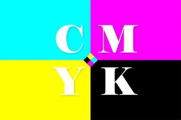
More and more designers these days are working in a variety of mediums — both digital and print. But it can take a different set of specifications to put together a successful project for each. Print design has its own jargon.

Understanding how printing works (and how to speak the language of printers) is important for any designer. Don’t think this applies to you because most of your business is web-based? Consider this: At some point a client will ask for print components to go with the website, whether they are business cards or posters or just a great handout for presentations. Knowing the printing basics and terminology will help you bridge the gap. Here are ten key terms you need to know.

The Importance of Designing for Readability

Mobile / 22 Jul 2013

The Importance of Designing for Readability

Text is not an afterthought in the design process. It should be your first consideration.

Readability should be one of the top concerns when it comes to any design project. If text can’t be read, then why are you designing in the first place? Good design delivers content in a way that is understandable; readability is a big part of comprehension. Today we’ll be discussing how you can plan a design around the words, so that your projects are easy to read.

Understanding Color: Dominant vs. Recessive Colors

Graphics / 11 Jul 2013

Understanding Color: Dominant vs. Recessive Colors

Ever wonder why your colors don’t look quite right in some situations? It could be a simple as the color choice. Certain colors tend to take on the characteristics of other hues, while others always look pure. In addition, the human eye perceives color in different ways based on whether it is in the foreground or background.

This phenomenon can be explained through dominant and recessive colors. Join us as we take a closer look at these two terms today, and delve into deeper understanding of how they can guide your design choices and decisions.

10 Key Features of Popular WordPress Themes

Inspiration / 1 Jul 2013

10 Key Features of Popular WordPress Themes

WordPress is the framework behind many of the websites and blogs you visit every day, including this one. Latest numbers from WordPress attribute the framework as the backbone of 17 percent of the web.

The platform is simple to use, and thanks to plenty of theme builders it can be customized in a variety of ways for everything from blogs, to portfolio sites, to e-commerce. Themes are the element that take WordPress to the next level, giving almost anyone of any skill level the ability to create a site that doesn’t look like a basic template. There are a few key components that set the best themes aside from the rest. The most popular WordPress themes – both paid and free – tend to have 10 key features in common. Let’s take a look at them.

How to Design a Resume That Stands Out

CV & Resume Templates / 24 Jun 2013

How to Design a Resume That Stands Out

Resumes are everywhere. They can be good, bad or downright embarrassing. But one thing is certain — if you want a job, yours must stand out in a good way. The design needs to reflect your personality, and the information needs to be organized, relevant and spot-on.

More often than not in today’s job market, you may even have several versions of your resume; one tailored toward different types of companies, one for potential clients or another as a showcase piece in your portfolio.

Tips and Advice for a Design Portfolio Review

Business / 30 May 2013

Tips and Advice for a Design Portfolio Review

For every member of the design community – designers, photographers and illustrators – the portfolio is an essential tool when it comes to getting new clients or changing jobs.

The portfolio review can be one of the more stressful parts of your career. It can be tough to take criticism and hear things you may not want to about your work. A good portfolio review will make you better and it is just as important to understand how to receive a review as well as give a good one.

Pinterest for Designers: Using It to Your Advantage

Inspiration / 22 May 2013

Pinterest for Designers: Using It to Your Advantage

Design inspiration is all around us. And every day there are new tools popping up to help us collect and share that inspiration. One of those great tools is Pinterest. The image collection platform is a fantastic source of design inspiration, from typography to print, web or packaging design.

Newer additions to the service, such as boards for business and hidden boards make the tool even more useful. Haven’t gotten on board with Pinterest yet? Not sure how to make it work for you? Read on.

How to Build a Brand Bible & Visual Style Guide

Graphics / 13 May 2013

How to Build a Brand Bible & Visual Style Guide

Every brand, from the smallest website or startup, to corporate giants such as Nike or McDonald’s, need a set of branding guidelines and rules to maintain their identity. This document, which can range from a couple of pages, to several hundred, is the thread that holds together what the public sees from a company.

A brand bible establishes the voice and personality of a company, as well as who the public will see, and it governs every aspect of communication from the company. The brand bible is the basis for all interactions on behalf of a company – personal communications, social media, advertising and design. While a brand bible focuses on many things, we are really going to look at how it affects design.

Simple Tips for Designing a Newsletter Template That Stands Out

Business / 29 Apr 2013

Simple Tips for Designing a Newsletter Template That Stands Out

Almost every business has an email newsletter these days. From retailers promoting sales, to organizations showcasing information and events, the email newsletter is one of the most popular marketing tools out there. And for it to really be effective, it must look good.

An almost unlimited number of free email templates can make it easy to just download something and send out an email, but you should really take the time to create a custom template for communications that represents your business and who you are. Your newsletter represents your work just as much as a website or printed product. Although getting started can be intimidating, it’s fairly easy to create a newsletter template, choose software for distribution and send your first group email. It is important to keep in mind that most people get a lot of email every day, so you must work to make your newsletter stand out.

Design a Business Card That Won’t Get Thrown Away

Business Card Templates / 10 Apr 2013

Design a Business Card That Won’t Get Thrown Away

It’s an almost unavoidable part of doing business – the business card. While more people are beginning to ditch traditional paper cards for digital counterparts, the business card is still an integral part of doing business.

Cards are almost as commonplace as the handshake, and it’s something you’ll always want to have ready to hand when you meet a potential new client.

So what makes your card stand out from the pack? How can you design a card that won’t get thrown away minutes after the meeting? And how can your card best illustrate the style of your work?

Let’s delve into some suggestions and tips today.

Mixing Typefaces: Tips and Techniques

Typography / 19 Mar 2013

Mixing Typefaces: Tips and Techniques

Mixing typefaces can be on of the most rewarding, and trickiest parts of the design process. Creating the perfect pairing of typography can result in a beautiful and perfectly readable outline for almost any project.

But how can you get started? What should you consider when mixing typefaces? While the answers aren’t black and white, there are a few things you can do. Think about contrast, x-heights, shapes and slants and overall mood when combining typefaces for any project. In this article, we’ll be delving into each of these in a little more detail!

10 Things I Learned About Design From iPad Apps

Inspiration / 11 Mar 2013

10 Things I Learned About Design From iPad Apps

Good design is all around us. Not just in printed materials or on websites, but also in everyday items. What’s great is that you often don’t notice it — you just enjoy whatever item, tool or website you are using.

Nowhere is this more true than with mobile apps. Most of us use them every day, but do you ever stop to think how much they are shaping the way you approach design? Apps can be a great source of inspiration and also another reminder of time-tested design concepts. Here are ten of the great lessons I have learned (and re-learned) from iPad apps.