Trends / 6 Feb 2026
How Generative AI Is Redefining Brand Identity Systems
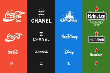
For decades, brand identity systems were built around consistency above all else.
Logos stayed fixed, color palettes were locked down, and typography rules were carefully controlled to avoid variation.
This approach made sense when brands communicated through a limited number of channels. But today’s brands live everywhere at once, across websites, apps, social platforms, motion graphics, and interactive products.
Generative AI is accelerating a shift that was already underway. Instead of treating identity as a rigid set of assets, brands are beginning to see it as a flexible system that can adapt to context, audience, and medium.
This change is reshaping how designers think about identity design, governance, and long-term scalability.
In this post, we explore how AI is redefining brand identity systems and how designers can prepare for this AI-first future.