Navigation - Page 2

Learn how to craft effective navigation for your website — on desktop or mobile. Design navigation that helps users easily find what they’re looking for.

Parallax Effects Compared: 5 Choices to Consider

Layouts / 13 Nov 2017

Parallax Effects Compared: 5 Choices to Consider

Parallax effects remain one of the hottest web design trends. This animated scrolling technique happens when background and foreground move at different speeds while the user scrolls so that there are two independent layers moving at the same time.

This effect can be used for any number of website types and is a fun way to create – and increase – user engagement. The nice thing about parallax effects is that you don’t have to use them on every page of a design; parallax scrolling is a great homepage technique to help drive users to calls to action or other content.

Parallax effects create an element of depth and distance and a greater sense three-dimension than some other techniques, making users feel like part of the design.

The downside to parallax effects is that they don’t always work on mobile devices. (But there are some workarounds for that as well in the tutorial at the end of this article.)

Here are five parallax effects and styles to consider. (Make sure to click through the links to see exactly how each animation works.)

Design Trend: Side Navigation Is Everywhere, but Does It Work?

Navigation / 24 May 2017

Design Trend: Side Navigation Is Everywhere, but Does It Work?

There’s a trending topic in website design navigation: sidebar menus. More designers are working with vertical side navigation for projects, with a specific location on the left side for many of these website designs.

And while it looks nice and can help streamline clutter in the overall canvas, does it really work? Will users respond to side navigation? Is it a design trend that you should consider? Today, we’ll try to get to the heart of the questions with some practical and usable answers.

Design Trend: Innovative Hover Effects

Graphics / 6 Mar 2017

Design Trend: Innovative Hover Effects

Everywhere you look, there’s a cool new animated effect. If animation was the must-have design element of 2016, then innovated hover effects are the up and coming design trend of 2017.

Thanks in part to the popularity of Material Design and Apple’s animation guidelines with a focus on small movements, hover effects are making a comeback. But instead of the tacky, flashing, bouncing and spinning effects of the past, animations are simple, sharp and delightful. The best hover effects help the user and enhance the experience.

Hover effects can range from motion that has an impact on the entire screen to something as small as a directional cue or navigation element.

5 Alternatives to Drop-Down Hover Menus

Navigation / 21 Mar 2016

5 Alternatives to Drop-Down Hover Menus

Is the era of drop-down hover menus over? It might well be. This design pattern doesn’t work for today’s users. The concept is clunky and doesn’t always translate well to smaller screens.

Users want menus and navigation options that are easier to use, simple to understand and don’t come with more options than they can think about in a few seconds. Navigation menus should be device-agnostic and work in the same way, creating a single experience, across device types. So what can you do to say goodbye to those drop down menus? We have five alternatives.

How to Design Killer Micro-Content

Graphics / 25 Jan 2016

How to Design Killer Micro-Content

The smallest parts of a design project can be the most important. It’s something we all know conceptually, right?

But do you ever get caught just filling in these details at the last minute? Does your micro-content suffer because you are ready to be finished with a project? Don’t let that happen. Plan out micro-content from the start to create better, more usable pieces that will help make the design better than you had hoped.

7 Ways to Design a Killer ‘First Screen’ for Your Website

Graphics / 6 Jan 2016

7 Ways to Design a Killer ‘First Screen’ for Your Website

It’s time to talk about first screen design. The first screen is that initial glimpse that a user gets into your website. It’s everything above the scroll, whether the user accesses a website from a desktop, tablet or mobile device.

The information you include on this “first screen” is the key to website success. The design can entice and keep users clicking, or force them to navigate away from the page. What needs to be on the screen before users start scrolling? Let’s take a look.

Grid-First Design: How to Create Vertical Rhythm and Harmony

Layouts / 8 Dec 2015

Grid-First Design: How to Create Vertical Rhythm and Harmony

When you hear grid, what’s the first thing that comes to mind? For most designers, it is often a horizontal based concept with columns across the canvas. This is especially true when thinking about web and digital design projects.

But what about vertical grids? It is just as important to create flow up and down the page as well. And there are a number of ways to do this with grid systems.

Designing for the Interstitial Experience

Accessibility / 5 Jan 2015

Designing for the Interstitial Experience

Yes. Those little pop-ups matter, and are starting to matter more every day. Interstitial space – and content for it – is becoming an increasingly popular part of designing for the web. From ads, to forms, to bits of information, the interstitial experience is a vital part of the design process.

The dilemma for designers is to create something that users want to look at and not feel annoyed by. Here we’ll work to gain a better understanding of interstitial space and how you can work within it well.

Swap Your Page’s Background Image on Navigation Hover

CSS / 29 Nov 2012

Swap Your Page’s Background Image on Navigation Hover

I love the challenge of building something with CSS that uses one item to trigger another. It can get pretty tricky to wrap your mind around all of the pieces involved and come up with a way to flow your HTML in a way that is easily controlled in your CSS.

Today we’re going to embark on just such a challenge. We’ll build a basic home page that swaps out background images based on the link that you’re hovering over in the navigation. Along the way, you’ll learn all about the idea of remote hovers and how to wield them in your projects.

Code a Responsive Navigation Menu

CSS / 14 Mar 2012

Code a Responsive Navigation Menu

Navigation menus used to be a fairly simple thing. Code up an unordered list, float it left and you’re good to go. With responsive design being all the rage these days though you’re faced with some new challenges when creating a menu design.

Follow along as we start from scratch and code a simple but effective responsive navigation menu that you can easily modify and reuse in your own projects.

15 Impressive CSS and PSD Navigation Menus

Navigation / 10 Feb 2012

15 Impressive CSS and PSD Navigation Menus

Today’s awesome collection of design freebies brings you a veritable utopia of navigation menu bliss. Each of the fifteen navigation menus below are both completely gorgeous 100% free to download.

I’ve included both CSS and PSD menus so whether you’re just looking to create a mockup or need something fully functional, we’ve got you covered. Enjoy!

Code a Useful Expanding Vertical Navigation Menu

CSS / 6 Feb 2012

Code a Useful Expanding Vertical Navigation Menu

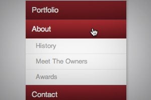
Today we have yet another awesome step-by-step CSS project for you! This time around we’re going to build a super useful expanding vertical navigation menu. It’s a great way to hide a lot of links in a fairly small space and the animations will add a nice touch to your site.

Even if you’re a complete beginner, you should be able to pull this off. I’ll guide you along every step of the way and explain how each chunk of code works so you can implement these same techniques in future projects and deepen your understanding of CSS. Let’s get started!