Articles - Page 168

Browse hundreds of articles, tips, and inspiring design collections. Find helpful design advice, or the perfect resource for your next project.

How to Create a Visual Brand for Yourself

Business / 13 Nov 2012

How to Create a Visual Brand for Yourself

Getting work is about more than your portfolio. Designers must also know a bit about marketing. This is especially true for freelancers. Your marketable self can, and will, help you land (or lose) work before it even hits your radar.

It is important to create a consistent brand for yourself today. Look at the channels you are using and how you are identified online, decide how you want to be identified and what your name and image should be, and then go out and make it happen. Here are a few tips to get you started.

A Beginner’s Guide to Zurb Foundation 3: The Grid

CSS / 8 Nov 2012

A Beginner’s Guide to Zurb Foundation 3: The Grid

In the past, we’ve discussed Twitter Bootstrap quite a bit. Much more so than its most worthy competitor: Zurb’s Foundation. Now on its third iteration, Foundation is a robust and responsive front end framework used by hundreds of developers every day.

Over the course of several articles, we’re going to jump in and take a look at its various aspects from a complete beginner’s perspective. Today’s topic is my favorite part: the grid. Follow along to see how it works!

WebZap: Beautiful Photoshop Web Mockups at Light Speed

Software / 1 Nov 2012

WebZap: Beautiful Photoshop Web Mockups at Light Speed

WebZap is an awesome Photoshop plugin for helping designers create high fidelity web design mockups faster than you ever thought possible. By combining simple one-click actions with robust customization options, this tool makes the entire layout process not only painless, but actually fun.

Follow along as we take a look at what WebZap does and put it through the paces to see how it performs. I promise, it’s the coolest Photoshop plugin that you’ve seen for web designers since GuideGuide.

The New Wendy’s Logo: What Went Right

Inspiration / 30 Oct 2012

The New Wendy’s Logo: What Went Right

Logo updates are a precarious business. One wrong move and you’ll have an angry mob calling for your head. This is especially true with brands that people have literally interacted with for the majority of their lives.

Today we’re going to take a look at just such a brand. Wendy’s, the self-proclaimed old fashioned hamburger joint, has a brand new logo. Spoiler alert: it’s great, especially when compared to the recent Arby’s update. So what went right here compared with what we saw with Arby’s? Let’s take a look.

The New Arby’s Logo: Better or Boring?

Inspiration / 15 Oct 2012

The New Arby’s Logo: Better or Boring?

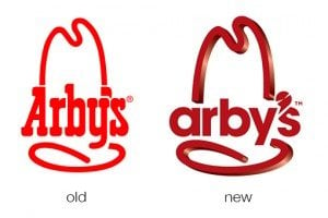
Everyone’s favorite roast beef sandwich fast food chain (ok, maybe the only roast beef fast food chain anyone can name) just jumped headlong into a brand refresh. Their new logo, menu and website is meant to bring the admittedly old-timey restaurant into the 21st century.

The question of course is, did they succeed? Follow along as we take a look at the logo and website to see what we think.

Battle of the LESS Mixin Libraries: LESS Elements vs. LESS Hat vs. Bootstrap

CSS / 8 Oct 2012

Battle of the LESS Mixin Libraries: LESS Elements vs. LESS Hat vs. Bootstrap

LESS is a friendly, easily-approachable CSS preprocessor. Though ultimately, Sass and Stylus are more powerful and robust, LESS has a certain charm that keeps it as a forerunner in the battle of the preprocessors.

If you’re a Sass fan, then you can take advantage of Compass, an incredible framework that makes coding with complex CSS3 properties a breeze. But what about LESS users? Where’s their Compass? Today we’ll look at three awesome mixin libraries that will help fill that void.

How to Use Adobe Edge Web Fonts on Your Site

CSS / 4 Oct 2012

How to Use Adobe Edge Web Fonts on Your Site

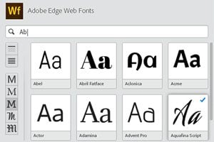
Adobe recently launched a free web font service to complement Typekit, their amazing premium service. Adobe Edge Web Fonts currently gives you around 500 free font families that you can use on your site today with little effort. How great is that?

The process for implementing these fonts isn’t quite as straightforward as some of the other services that you might be used to, so today we’re going to dive in and take a look at how it all works.

How to Avoid Stupid Screw-Ups With Adobe Template Files

Software / 1 Oct 2012

How to Avoid Stupid Screw-Ups With Adobe Template Files

Don’t you hate it when you use some important file as a template and then accidentally save over it? I used to do this all the time and it frustrated me to no end.

Fortunately, Adobe has invented these great little template file types that fundamentally function differently than your normal files to make sure you don’t screw anything up. Read on to see how they work.

Adobe Edge: Does Adobe Finally Understand Developers?

Software / 26 Sep 2012

Adobe Edge: Does Adobe Finally Understand Developers?

Adobe and web design. They have a complicated history. I can never quite tell if Adobe is an estranged partner of web developers or an active advocate. Are they focused on empowering developers or replacing them with clunky WYSIWYGs?

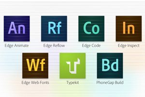
Today we’re going to take a look at Adobe Edge Tools and Services, a new initiative from Adobe that might be enough to change your mind about how Adobe views coders.

Finally, Collect for Output in Illustrator

Software / 25 Sep 2012

Finally, Collect for Output in Illustrator

For over a decade, a fierce debate has raged on about whether or not Adobe Illustrator is an appropriate tool for page layout projects. Should you really be building ads and brochures in an application meant for illustration?

The question is an interesting one, and those in the “yes” camp have always been held back by the simple lack of a “Collect for Output” feature. This has finally changed in CS6. So is the debate over? Not remotely. Read on and join the discussion.

30 Great Looking Web Designs Built With Diagonal Lines

Inspiration / 24 Sep 2012

30 Great Looking Web Designs Built With Diagonal Lines

Too often, we fall back on the same old design techniques and aesthetic feel. Why not mix it up every now and then and try something new? One technique that really seems to be gaining traction lately is the implementation of strong diagonal lines in web design.

After years of strict, standard grids that utilize clear vertical and horizontal directionality, a bold diagonal design can make a refreshing statement that’s eye-catching and attractive. Read on to see thirty recent examples of designers using diagonal lines in their work.