Business / 14 Jul 2025
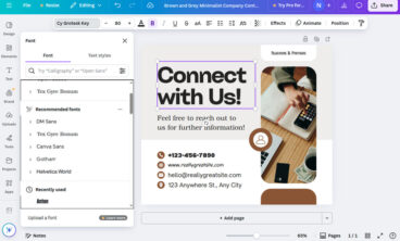
Designing for Print in Canva: Mistakes to Avoid
Canva is perfect for designing everything from business cards to posters. But when it comes to taking those designs from screen to paper, things can get tricky.
Designing for print has different rules from designing for digital. File resolution, bleed settings, color modes, and even licensing can impact how your final product looks and how legally safe it is to use.
If you skip over these details, you could end up with blurry prints, misaligned layouts, or worse, content you can’t legally distribute.
In this guide, we’ll walk through the most common mistakes people make when designing for print in Canva and how to avoid them, so your print materials come out clean, professional, and ready to share with confidence.
Let’s dive in.
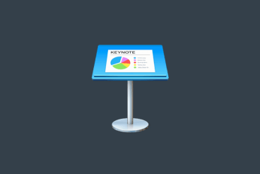
Keynote Templates / 14 Jul 2025
150+ Best Keynote Templates of 2025
Even though Apple’s Keynote app gives you plenty of tools and options for creating beautiful presentations, it can be tricky to find the time to build a beautiful, custom design. Don’t worry — we’ve got you covered with this collection of the best Keynote templates!
With these templates, you don’t have to spend hours designing presentation slides. You can simply edit the slides that have already been crafted by professional designers, customize charts, change colors, and voila! You have your own beautiful, unique Keynote presentation.
We picked out a few of the most professional-looking Keynote templates that’ll work perfectly for your next presentation (and we’ve also collected some tips for using Keynote templates to help you as well!). And if you’re not sure whether to use Keynote or Powerpoint, we also have a quick look at 3 reasons to choose Keynote over PowerPoint.
Font Collections / 14 Jul 2025
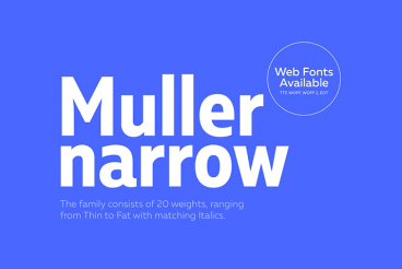
130+ Best Condensed & Narrow Fonts of 2025
Contrary to popular belief, condensed and narrow fonts don’t make your text cramped or crowded. You just have to know the appropriate time and place to use the font. Condensed fonts are widely used these days for headlines and portraying bold messages, and when deployed in the right place, they can give stunning impact!
It takes a lot of testing and experimenting to find the perfect font for a design, but our tips for choosing and working with condensed and narrow fonts will help get you off to a great start!

Inspiration / 14 Jul 2025
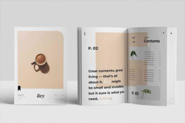
80+ Best Brand Manual & Style Guide Templates 2025 (Free + Premium)
Your brand is the key to a successful business. It’s what gives your business an identity and separates you from the competition. Your brand manual or style guide are the documents you need to help keep it consistent—they’re key to maintaining your brand identity.
Whether you’re a small business, agency, or a corporation, you should have a proper document that covers all the details of the brand. Such as the design of different logos you use, the color palette, fonts used for the brand design, etc.
Think about when you hire a third-party agency to run an ad campaign. To help them avoid misrepresenting your brand, you hand them your brand manual and style guide. So they can present your brand more accurately through the campaign.
If you’re working on a brand manual for your own business, these brand style guide templates will help you put together a more useful and professional document without an effort.
Business / 28 Jun 2025
Canva Whiteboards: Creative Ways to Use Them Beyond Brainstorming
When you hear “whiteboard,” the first thing that probably comes to mind is a classic brainstorming session filled with sticky notes, doodles, and scattered ideas.
But Canva Whiteboards takes that familiar format and turns it into something much more versatile.
With drag-and-drop elements, templates, real-time collaboration, and a simple interface, Canva’s whiteboards can do more than just map out ideas. They can become a tool for strategy, planning, team building, and even storytelling.
Whether you’re working solo or collaborating with a remote team, here are some creative and practical ways to use Canva Whiteboards that go far beyond your typical mind map.
Microsoft Word Templates / 27 Jun 2025
10+ Tips for Modern, Pro Page Layout Designs in Microsoft Word
If you are ready to amp up your designs in Microsoft Word, this is the right place. Here – with templates as examples – we are going to look at a variety of ways you can create more modern, professional-looking page layout designs using this common tool.
Microsoft Word is capable of so much more than you might expect with page layout. You can build modern, on-trend documents, and push the software further than ever before.
Forget the old days of Word Art and choosing between six fonts. Let’s take Microsoft Word into a new world of improved design and typography!
Business / 27 Jun 2025
What Makes a Stock Graphic Truly ‘Premium’? a Designer’s Checklist
We’ve all been there. You find a stock graphic labeled “premium,” pay the extra fee, and then realize it still looks cheap in your design.
The price tag doesn’t always match the design quality, and that’s a hard lesson many designers learn the expensive way.
The truth is, truly premium stock graphics have specific qualities that go way beyond resolution and price.
When you know what to look for, you can spot the difference between genuinely professional assets and overpriced mediocrity.
Let’s break down exactly what separates the “premium” from the generic in the stock graphics world.
CV & Resume Templates / 26 Jun 2025
25+ Best One-Page Resume Templates That Get Noticed
When it comes to job applications, making a great first impression can make a huge difference. And a clean, well-designed one-page resume that gets noticed can help you stand out right away.
Today, recruiters often scan resumes in seconds. That’s why a focused, visually appealing one-page resume layout can be your best tool to highlight your skills, experience, and personality without overwhelming the reader.
In this post, we’ve handpicked the best one-page resume templates that combine smart design with practical structure.
These resume templates are perfect for professionals in any field, and each one is designed to showcase your strengths clearly and stylishly, while keeping the content brief, relevant, and easy to scan.

Font Collections / 25 Jun 2025
30+ Best Collegiate & College Fonts
College fonts carry with them an air of nostalgia and authority, reminiscent of classic letter jackets, spirited chants, and the ivy-covered walls of academia.
In this carefully curated selection, we present the best college fonts that stand out for their readability, character, and ability to convey the dynamic essence of college life.
Collegiate fonts are pivotal in evoking the sense of community, pride, and scholarly excellence that educational institutions stand for. From bold, athletic block letters that scream team spirit to elegant serifs that speak to tradition and prestige, the right college font can make your project resonate with audiences on a deeper level.
Have a look and pick the perfect college font for your project.
Business / 25 Jun 2025
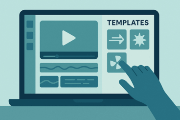
How to Create Reusable Canva Templates for Your Brand
Consistency is key when it comes to building a memorable brand. But keeping your designs aligned, especially when your team is growing or juggling lots of content, can be time-consuming.
Reusable Canva templates are a great solution to this problem.
With a few smart setups, you can save time, reduce design stress, and make sure every post, presentation, or flyer looks and feels on-brand.
In this guide, we’ll walk through the benefits of reusable templates in Canva, how to build them from scratch, and how to share them with your team to enhance design workflow and keep everyone on the same page.
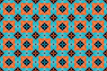
Background Textures / 24 Jun 2025
25+ Best Mosaic Backgrounds & Textures
Mosaic designs have an incredible ability to evoke a sense of tradition, craftsmanship, and timeless beauty in any design.
With their intricate patterns, vibrant colors, and handcrafted feel, mosaic backgrounds and textures are perfect for adding depth and personality to your work.
In this post, we’ve gathered a stunning collection of the best mosaic backgrounds and textures. From classic tile-inspired designs to abstract, modern interpretations, these textures are ideal for creating eye-catching visuals that feel both artistic and refined.
Whether you’re working on a poster, website background, social media graphic, or packaging, these mosaic designs add a decorative flair that stands out without overwhelming your content.
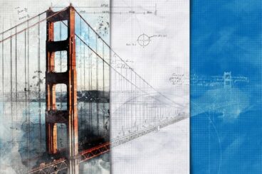
Photoshop Actions / 24 Jun 2025
30+ Architecture Actions, Effects & Presets (For Photoshop + Lightroom)
Architectural photography and design demand precision, clarity, and an eye for detail. The right actions, effects, and presets can dramatically enhance your work, bringing out the best in your images with just a few clicks.
In this post, we showcase a selection of the best architecture-focused actions, effects, and presets available for Photoshop and Lightroom. They are designed to enhance architectural elements, improve lighting and contrast, and add artistic flair to your photos and designs.
From dramatic blueprint-style sketch effects to bold black-and-white conversions, our collection covers a wide range of styles and techniques to suit various creative needs.
Business / 23 Jun 2025
How to Use Motion Templates to Level Up Social Media Ads
If you’ve ever scrolled through social media and stopped mid-swipe because something caught your eye, chances are it had movement.
Motion has a way of grabbing attention in a crowded feed, and brands are using it to their advantage. That’s where motion templates come in.
These ready-made, animated templates make it easy to add movement to your social media ads without needing to be a motion graphics pro.
From animated Instagram Stories to promo reels and TikTok ads, motion templates help turn static visuals into scroll-stopping content.
In this post, we’ll break down what motion templates are, where to find them, and how to use them effectively to boost engagement, clicks, and conversions.
Font Collections / 23 Jun 2025
25+ Best Label Fonts for Product Packaging Designs
Label fonts are all about style, readability, and giving your product a voice before it’s even picked up.
Whether you’re designing labels for artisanal foods, cosmetics, beverages, or handmade goods, the label font you choose helps define the personality of your brand and catch a shopper’s eye in seconds.
In this post, we’ve handpicked the best label fonts for packaging design. Each font is chosen for its ability to elevate packaging and to pair with other design elements like icons, borders, and patterns.
From vintage fonts and elegant scripts to bold sans-serifs and decorative styles, this collection includes fonts that are perfect for everything from minimalist branding to rustic, handcrafted aesthetics.
Figma Templates / 21 Jun 2025
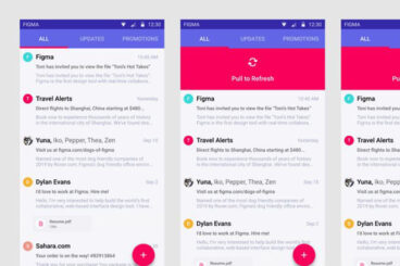
How to Use Figma’s Smart Animate to Prototype Microinteractions
Microinteractions might be small, but they make a big impact on how users experience your designs.
Whether it’s a button that responds to a click, a progress bar that animates smoothly, or a subtle hover effect on a card, these details help bring interfaces to life and make them feel more responsive and polished.
Figma’s Smart Animate feature gives designers an easy way to prototype these kinds of microinteractions, without writing a single line of code.
In this guide, we’ll take a deep dive into how to use Smart Animate effectively, when it works best, and how to level up your prototypes so they feel like real, dynamic products.
Features
Each Design Shack feature covers everything you need to know about a topic, with articles, inspiration, and how-to posts.


Resources
Thousands of free and premium fonts, presentation templates, graphics, video templates, and more.
Explore popular categories:

Watercolor Fruit Photoshop Patterns
These Watercolor Fruit Photoshop Patterns offer graphic design enthusiasts an exceptional collection of vibrant and elegant fruit illustrations. Exclu...
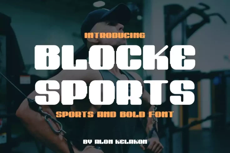
Blocke Sports Bold Font
Blocke Sports Bold Font is a distinctively robust typeface design, specially crafted for those who appreciate a blend of style and versatility in thei...

Doodle Patterns
Doodle Patterns are a set of creative assets you can use to add dimension and personality to your design work. Offered as eight AI swatches, these han...
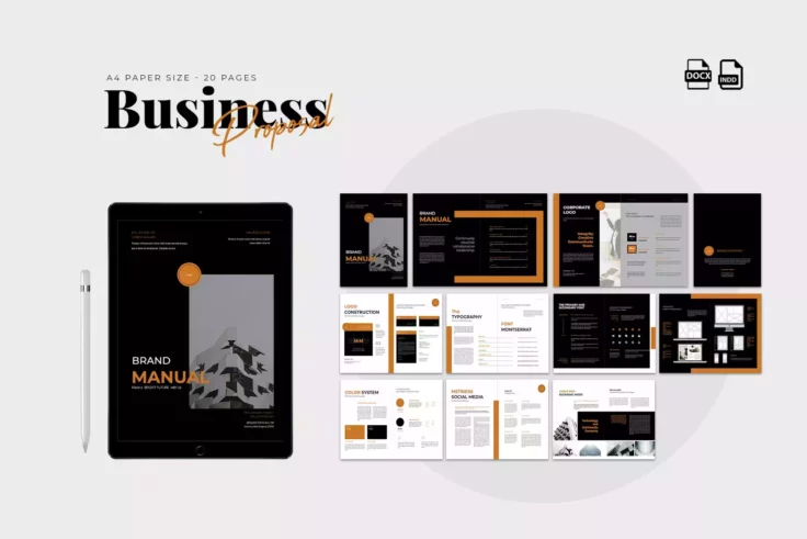
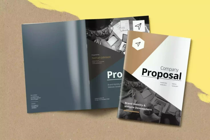
Business INDD Proposal Template
This proficiently designed Business INDD Proposal Template can make a striking difference in the way you present your brand to your clients, especiall...
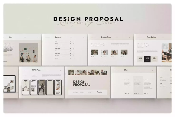
Stylish Business Proposal Template
Present your business proposal in a chic and professional way with our Clean Minimalist Beige Project Proposal Template Design. It ticks all boxes for...
Modern Proposal InDesign Template
Craft an impressive project proposal with this stylish Modern Proposal InDesign Template. The clean and contemporary design lends itself to any projec...