Layouts / 27 Feb 2019
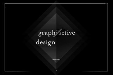
10 Unique + Innovative Website Layout Ideas
The idea has been floating around for a while – web design has a sameness that’s just kind of boring. Let’s dive into some unique and innovative website layouts that can break the mold!
Blame user patterns, too many projects for too few designers, or just the desire of clients to have their site looks like something they’ve already seen and understand. But all is not lost. Even though some people are snoozing at what’s out there, designers are still experimenting and having fun with website design.
Today, we’ll break the routine and dive into ten website designs that feature unique or innovative ideas. If nothing else, it should break you out of any creative rut you might be having.