Software / 26 Sep 2012
Adobe Edge: Does Adobe Finally Understand Developers?
Adobe and web design. They have a complicated history. I can never quite tell if Adobe is an estranged partner of web developers or an active advocate. Are they focused on empowering developers or replacing them with clunky WYSIWYGs?
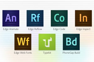
Today we’re going to take a look at Adobe Edge Tools and Services, a new initiative from Adobe that might be enough to change your mind about how Adobe views coders.