Inspiration / 20 Sep 2016
20+ Stunning Hero Images for a Creative Website
What do Salesforce, TaskRabbit, Tesla, and Pocket websites have in common? They all rock hero images.
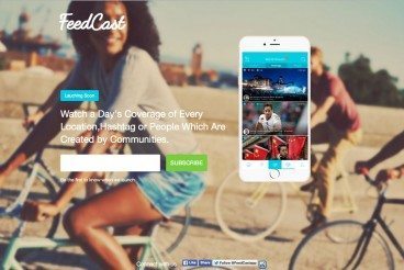
Make no mistake, the hero image web design trend is still very much alive. What is a hero image? Well, it’s basically a giant banner-style image that takes over the top half of the page. The main goal of this design strategy is to quickly grab the user’s attention while showcasing some of the features of a product or a service at the same time.
According to research, colored visuals increase people’s willingness to read a piece of content by 80%. It’s one of the reasons why placing a hero image above the fold has been found to be quite effective in increasing website engagement.