Search Results For: retro

12 Fun CSS Text Shadows You Can Copy and Paste

CSS / 19 Jul 2017

12 Fun CSS Text Shadows You Can Copy and Paste

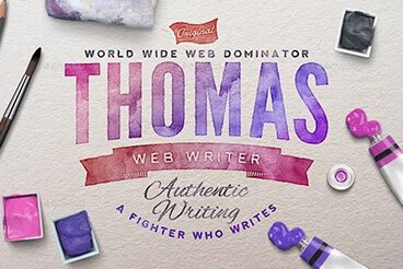
Typography is everyone’s favorite toy in web design. One particularly fun tool that CSS gives you to play with your type is text-shadow, which seems simple enough at first but can be used to create some remarkable effects with a little ingenuity and creativity.

Today we’re going to run through several text-shadow examples that you can copy and paste for your own work.

Designing With an 80s Trend: Memphis Design 101

Graphics / 14 Dec 2016

Designing With an 80s Trend: Memphis Design 101

Every trend eventually makes a comeback. Sometimes that even applies to trends that are more difficult to understand.

Memphis design – exemplified by an 80s aesthetic with bright colors and lots of shapes and lines – is one of those concepts that has come back around again. Not many people have ever said they love the 80s design style. Love it or hate it, the bright design pattern can be a lot of fun and direct attention to the design. Here’s everything you need to know about Memphis design.

20+ Stunning Hero Images for a Creative Website

Inspiration / 20 Sep 2016

20+ Stunning Hero Images for a Creative Website

What do Salesforce, TaskRabbit, Tesla, and Pocket websites have in common? They all rock hero images.

Make no mistake, the hero image web design trend is still very much alive. What is a hero image? Well, it’s basically a giant banner-style image that takes over the top half of the page. The main goal of this design strategy is to quickly grab the user’s attention while showcasing some of the features of a product or a service at the same time.

According to research, colored visuals increase people’s willingness to read a piece of content by 80%. It’s one of the reasons why placing a hero image above the fold has been found to be quite effective in increasing website engagement.

15+ Best Wedding HTML Templates

Wedding Design / 30 Aug 2016

15+ Best Wedding HTML Templates

Still haven’t found the perfect template for your wedding website? Of course not. Why else would you be here on this page, right? Well, don’t worry. We’ve got you covered. Hopefully, you’ll be able to conclude your search here.

We all know how much work you have to put into planning a wedding. So, to save you hours of time that go into coding a website or browsing the web to find the perfect HTML template, we handpicked the best and most beautiful wedding website templates just for you.

These templates are not only beautiful but are also quite affordable, and easy to customize. Which means, you can save some more money from your wedding budget!

What Does That Say? How Typefaces Add Meaning to the Design

Typography / 6 Apr 2016

What Does That Say? How Typefaces Add Meaning to the Design

Can something as simple as a typeface change the meaning of words and an entire design. Of course! A typeface can add a new level of emphasis or meaning to your message.

It can help you connect with users, establish brand, and set the tone for your entire project. The wrong typeface can leave a design feeling flat, disjointed or even give users the wrong impression about your brand. Now let’s take that knowledge and add a little practical application.

Making Vintage Design Work for You

Inspiration / 19 Feb 2014

Making Vintage Design Work for You

Vintage textures and palettes are in. They are popping up in a variety of uses from large-scale design projects to small details in a logo or background texture. This dated-style technique has really made a comeback.

Today, we will look at how you can create and establish a great palette for a vintage-style design from color to type to texture choices.

Current Color Trends: Muted Pastels

Graphics / 30 Jul 2013

Current Color Trends: Muted Pastels

Of late, you may have noticed a crop of new site designs have a softer and lighter look. After all the rainbow brights and even neon or fluorescent hues that have been so popular of late, it seems that some designers are taking a more subtle approach by using lighter or muted colors.

Although the same basic treatments are still being utilized — like colorized photography or color blocking — the new hues are making for a more refined and understated variation on these themes. Today we’re going to delve into this trend a little more, and explore various design examples and approaches.

Compromising With Clients: Play Nice or Take a Stand?

Business / 19 Sep 2012

Compromising With Clients: Play Nice or Take a Stand?

I was recently put in an interesting position where I had to choose between my professional principles and a paycheck. As a designer, you’re probably no stranger to this situation.

What’s the right course of action? When is compromise a laudable action and when is standing firm and refusing a request the better way to go? I’ll share my thoughts through a real and personal story.

5 Design Lessons That I Learned From Writing 85 Web Design Critiques

CSS / 9 Aug 2012

5 Design Lessons That I Learned From Writing 85 Web Design Critiques

Here at Design Shack we offer a simple but useful service called a web design critique. It’s basically a consulting service that you can take advantage of for a mad cheap price in exchange for letting us post it on the site as an educational tool.

I’ve personally written up a whopping eighty five of these things thus far (#85 will be posted later this week). That’s a whole lot of design advice! Read on to see what I’ve learned about web design in the process, both from the good examples and the bad.

200+ Pinterest Boards for Designers to Follow

Inspiration / 11 Apr 2012

200+ Pinterest Boards for Designers to Follow

If you love design inspiration, you should be on Pinterest. This free service has really taken off and designers everywhere are using it to collect and archive examples of great design. Whether you’re a typography nut, need some ideas for design books to read, or want some inspiration for out of the box brochure ideas, there are designers on Pinterest who are no doubt pinning exactly what you’re looking for.

Much like, Twitter, the key to enjoying Pinterest is to find and follow users that share your interests. The trick here is that while every user has multiple “boards,” only some of them are actually design related. We’ve spent hours and hours hunting and have found over two hundred of the best Pinterest boards that designers should find useful. Read on to check them out!

100 Awesome Logos With Script Typography

Inspiration / 14 Feb 2012

100 Awesome Logos With Script Typography

What do script typefaces suggest in a design? Will they make your design dainty or masculine? Timeless or retro? Goofy or sophisticated? Would you believe me if I said all of the above and more?

Today we’re going to look at a massive, handpicked selection of logos from Logopond that all use script and cursive writing in some form or another. The point is to showcase the incredible versatility of these types of fonts. The next time you’re designing a logo and wondering if a script is appropriate, you’ll be able to come back here and browse the various themes that different types of scripts can suggest.

New Logos for the Marlins, Orioles and Jays: Did They Get Better or Worse?

Graphics / 17 Jan 2012

New Logos for the Marlins, Orioles and Jays: Did They Get Better or Worse?

With a new year always comes new branding attempts. Organizations want a fresh face to signal progress and ongoing evolution and branding is the vehicle that designers use to achieve this goal.

As we all know quite well, this is a risky venture with large entities. If it goes well, your customers (or fans in this case) love you for it. If it doesn’t, you’re setting yourself up for plenty of public ridicule. Today we’re going to venture into the world of sports and check out three new Major League Baseball team logo designs. Which teams are updating their look for the new year? Were they successful or is the result a surefire embarrassment? Read on to find out!