PowerPoint Templates / 4 Apr 2025
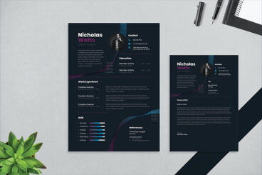
40+ Stylish PowerPoint Color Schemes 2025
Color is an element that can make or break a design, and that rule holds true for presentation design as well. Choosing the right PowerPoint color scheme is super important.
But there’s one extra thing to consider – where your presentation will be given. A PowerPoint presentation can look quite different on a computer or tablet versus on a projected screen.
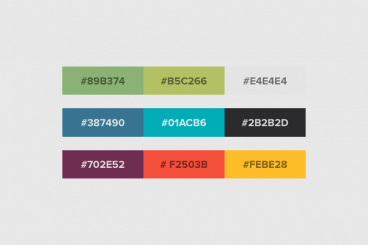
When it comes to selecting a PowerPoint color scheme, this is an important consideration. We’ve rounded nearly stylish PowerPoint color schemes as inspiration. While darker color schemes might look great close-up on screens, opt for lighter backgrounds (for enhanced readability) for projected presentations.
Note: The last color in each scheme is for the slide background.