Ever get that feeling that some members of your creative team just aren’t quite with the program? It is entirely likely. Sending out communications and messages that will reach your whole team can be somewhat tricky because of the differences in how people think.
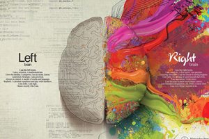
Creatives sometimes tend to be a little more free-thinking and less-structured than some of their office counterparts. Research has shown that people who use more right brain functions, such as designers and creative thinkers, also respond to and process the same information differently than left-brain thinkers, who tend to be more organized and logic-oriented. (Some studies have even shown that the highest rates of dyslexia, which affects reading and comprehension, have been found in right-brain thinkers.) With just a few tweaks, you can more effectively get your message across to everyone.