CSS / 15 Feb 2012
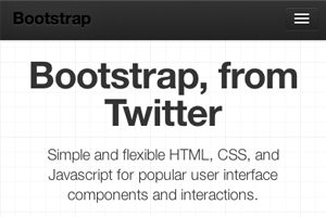
Twitter Bootstrap 2: Bootstrap Goes Responsive
Recently, we published a piece titled 5 Incredibly Useful Tools Built Into Twitter Bootstrap, which took a look at the basic structure of Twitter’s Bootstrap framework and walked you through implementing some of the major components.
Twitter just released Bootstrap 2.0, an update so large it equates to a near full rewrite. There are quite a few new features and toys to play with, but the real headliner is that the framework is now fully responsive. Join us as we dig in to see how the new grid works and what other cool new features have been added. You’ll learn how to implement Bootstrap in your projects and will also pick up some extremely handy CSS techniques that you can use anywhere.