CSS / 15 Mar 2012
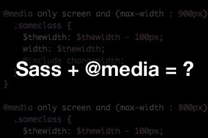
Sass and Media Queries: What You Can and Can’t Do
Preprocessors like Sass are helping us flex our development muscles in nearly every area of our CSS. Variables, mixins, inheritance and many more great features make coding easier and more concise than ever.
So what about leveraging Sass for responsive design, or more specifically, for media queries? Are there any features of Sass that pair particularly well with media queries? Is there anything you should avoid? Join me as I experiment and discover the answers.