CSS / 28 Aug 2012
Semantic Grid Class Naming With Placeholder Selectors in Sass 3.2
CSS frameworks are known for taking a club to the idea of semantic HTML. This is such a problem that developers everywhere have entirely sworn off the idea of grid-based frameworks solely on the principle that it leads to non-semantic class names.
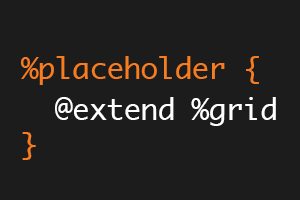
With Sass, it becomes quite easy to work around this problem and use a predefined grid without resorting to wonky class names. In fact, the latest version of Sass (3.2) has a new feature that makes this task easier than ever. Read on to see what it is and how it works.