Inspiration / 15 May 2019
19 Best Photoshop Tutorials for Designing Posters + Flyers
What makes a great poster design? It’s often a mix of creativity and design elements that have a certain panache.
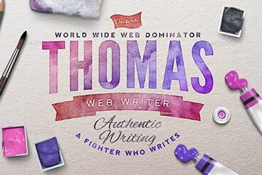
Poster and flyer design can be a lot of fun because you can often stretch your design muscles and try things you wouldn’t for other projects. It’s an opportunity to do something attention-grabbing and unique!
With that idea in mind, here are twenty different poster/flyer tutorials that you can try out. Plus, you’ll get a chance to try out some new design techniques along the way!