Inspiration - Page 72

Beautiful, inspiring examples of graphic design, mockups, presentation templates, websites, fonts, icons, and more.

How to Use Cool Color in Design Projects

Inspiration / 10 Jun 2014

How to Use Cool Color in Design Projects

Cool and warm colors. These descriptions are commonly used to describe hue choices in a variety of conversations – fashion, beauty, decorating and design. But while we commonly talk about warm and cool, do you really know what these terms mean and how to use the colors?

Today, we will look at using cool color in design projects and create a few color palettes with cool hues. (Also make sure to check out the recent Design Shack article featuring warm colors.)

How to Use Warm Color in Design Projects

Inspiration / 2 Jun 2014

How to Use Warm Color in Design Projects

Warm and cool colors. These descriptions are commonly used to describe hue choices in a variety of conversations – fashion, beauty, decorating and design. But while we commonly talk about warm and cool, do you really know what these terms mean and how to use the colors?

Today, we will look at using warm color in design projects and create a few color palettes with warm hues. We’ll also investigate the theory and meaning behind different choices.

5 Tips for Creating a Fun Summer Color Palette

Inspiration / 19 May 2014

5 Tips for Creating a Fun Summer Color Palette

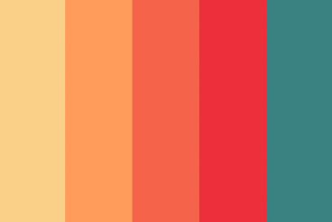
The official start of summer is just around the corner. Longer days, warmer temperatures and splashing in the lake or pool are just a few of the things that come with the change in season. When it comes to design, a change in seasons can create the urge to update your color palette as well.

With warmer days, warmer colors, brighter hues and even the use of more color are popular. And while you may not want to change the color scheme of an existing project — although you can – this season can be a great inspiration for designing a project with a summer-inspired color palette. Here are five tips for creating a great color palette with a few swatches to try based on each concept. Happy summer!

Why You Should Be Sketching (Even if You Can’t Draw)

Inspiration / 13 Jan 2014

Why You Should Be Sketching (Even if You Can’t Draw)

The first part of any project, print or digital, should start on paper. Sketching can be an integral part of any design process — even if you can’t draw.

But who needs to sketch? Just artists and illustrators are required to put pen to paper, right? Wrong! Today we’ll take a look at why sketching can be an integral part of everyone’s design and brainstorming process.

Pinterest for Designers: Using It to Your Advantage

Inspiration / 22 May 2013

Pinterest for Designers: Using It to Your Advantage

Design inspiration is all around us. And every day there are new tools popping up to help us collect and share that inspiration. One of those great tools is Pinterest. The image collection platform is a fantastic source of design inspiration, from typography to print, web or packaging design.

Newer additions to the service, such as boards for business and hidden boards make the tool even more useful. Haven’t gotten on board with Pinterest yet? Not sure how to make it work for you? Read on.

The New Wendy’s Logo: What Went Right

Inspiration / 30 Oct 2012

The New Wendy’s Logo: What Went Right

Logo updates are a precarious business. One wrong move and you’ll have an angry mob calling for your head. This is especially true with brands that people have literally interacted with for the majority of their lives.

Today we’re going to take a look at just such a brand. Wendy’s, the self-proclaimed old fashioned hamburger joint, has a brand new logo. Spoiler alert: it’s great, especially when compared to the recent Arby’s update. So what went right here compared with what we saw with Arby’s? Let’s take a look.

The New Arby’s Logo: Better or Boring?

Inspiration / 15 Oct 2012

The New Arby’s Logo: Better or Boring?

Everyone’s favorite roast beef sandwich fast food chain (ok, maybe the only roast beef fast food chain anyone can name) just jumped headlong into a brand refresh. Their new logo, menu and website is meant to bring the admittedly old-timey restaurant into the 21st century.

The question of course is, did they succeed? Follow along as we take a look at the logo and website to see what we think.

30 Great Looking Web Designs Built With Diagonal Lines

Inspiration / 24 Sep 2012

30 Great Looking Web Designs Built With Diagonal Lines

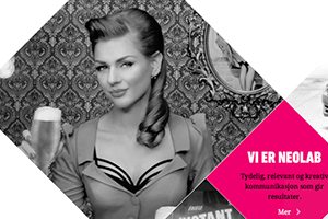
Too often, we fall back on the same old design techniques and aesthetic feel. Why not mix it up every now and then and try something new? One technique that really seems to be gaining traction lately is the implementation of strong diagonal lines in web design.

After years of strict, standard grids that utilize clear vertical and horizontal directionality, a bold diagonal design can make a refreshing statement that’s eye-catching and attractive. Read on to see thirty recent examples of designers using diagonal lines in their work.

Art vs. Design: Are They the Same Thing?

Inspiration / 29 Aug 2012

Art vs. Design: Are They the Same Thing?

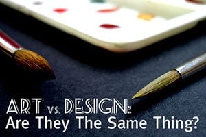
Every project is created by design. It is thought out, analyzed and finally, designed and executed.

But is every design project also a work of art? How similar (or different) are the processes and results? You may find that every designer or artist has a different definition. Here I will share my characteristics of each. (Feel free to agree with or even challenge me.)

25 Amazingly Bizarre Minor League Baseball Logos

Inspiration / 16 Jul 2012

25 Amazingly Bizarre Minor League Baseball Logos

Being familiar with my love of logos and tendency to point out crazy design, a friend of mine recently showed me a fascinatingly bizarre niche of design of which I had, up to now, been entirely ignorant: Minor League baseball team logos.

When I tell you to prepare yourself for some of the zaniest examples of professional logo design that you’ve ever seen, I’m using neither exaggeration nor hyperbole. Buckle your seat belts, you’re in for quite a ride.

Best and Worst Design: 50 U.S. State Websites

Inspiration / 31 May 2012

Best and Worst Design: 50 U.S. State Websites

In the past, we took a look at fifty of the best and worst university websites from around the United States, a post which launched an interesting discussion about how web design projects can be destroyed by committees and politics, even if talented designers are leading up the team.

Today we’re following that up with a similar discussion on official state websites. Which U.S. states have the absolute best looking websites and which have sites that look like they haven’t been updated since Clinton was in the Oval Office? Read on to see how your state ranked.

10 Tips for Awesome Tumblr Theme Design

Tumblr Themes / 16 May 2012

10 Tips for Awesome Tumblr Theme Design

Here at Design Shack, WordPress is our bread and butter, but in the world of blogging platforms, we have lots of love for Tumblr as well. It’s simple, gorgeous, and simply enjoyable to use.

Today we’re going to take a look at what makes a great Tumblr theme. With thousands of options in the Tumblr theme garden, it can be difficult to stand out.

Why do some themes catch so much attention while others are ignored? Good design holds the answer. Not all themes are created equally, and knowing what aesthetic cues to look for can help you choose a Tumblr theme that will serve you well.