Font Collections / 23 Apr 2025
Typography in Dark Mode: How to Optimize Fonts for Low-Light UI
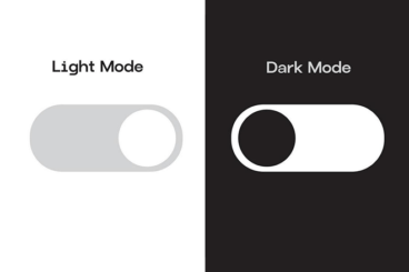
Dark mode has become more than just a trend—it’s a preferred way to browse, work, and interact for millions of users.
From mobile apps and websites to operating systems and dashboards, dark-themed interfaces are now a standard part of digital design.
But while switching the background to black or deep gray might seem simple, designing for readability in these settings requires extra attention, especially when it comes to typography.
Typography in dark mode isn’t just about inverting colors. It involves making thoughtful choices about font weight, spacing, contrast, and even the color of your text.
The goal is to create a comfortable reading experience in low-light environments without causing eye strain or losing clarity.
Here’s how to optimize your fonts for dark mode interfaces.