Articles - Page 116

Browse hundreds of articles, tips, and inspiring design collections. Find helpful design advice, or the perfect resource for your next project.

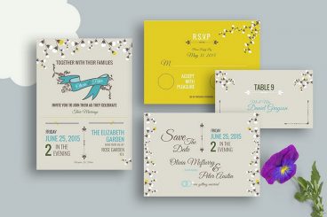
10 Design Tips for Wedding Cards & Invitations

Wedding Design / 2 Apr 2018

10 Design Tips for Wedding Cards & Invitations

Wedding season is here. Whether you’re planning to design invitations and cards for your own wedding, or for a client or a friend, there are several wedding card design tips that you’ll want to consider!

Wedding invitations present an opportunity to work with some beautiful elements and printing techniques to create a piece of art that isn’t part of the usual workflow. From scripts with long tails to foiling and amazing paper stocks, designing wedding cards and invitations can be a lot of fun (and a bit of a design challenge).

The big thing to keep in mind is that the invitation should evoke an emotional connection to the couple. It should reflect their personality and style.
20+ Awesome Resources for Bootstrap Lovers

Bootstrap / 22 Mar 2018

20+ Awesome Resources for Bootstrap Lovers

Bootstrap has simply exploded in the web development community. There will always be skeptics and haters but on the whole, the project has been a smashing success and can constantly be seen at the top of the Forked and Watched charts at GitHub.

As a result of Bootstrap’s fame, lots of great related resources have been put forth by the development community. Today we’ve collected our favorites into a list of everything you need to get started with Bootstrap. From introductory tutorials to wireframing kits and custom generators, there’s something here for every Bootstrap lover.

Serif, Sans, Script & Slab: 4 Font Types Explained

Typography / 5 Mar 2018

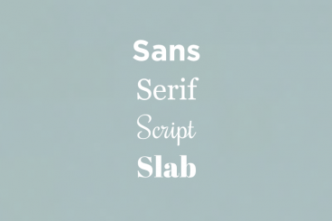
Serif, Sans, Script & Slab: 4 Font Types Explained

Always wanted to know the difference between serif, sans, script, and slab fonts? Look no further. Take your typography game to the next level, and quit guessing if certain typefaces or font pairs work together. Back your logic with a little design theory!

Having a better knowledge of fonts and typography can make explaining your choices to clients easier (always a bonus), and will give you more confidence when selecting font pairs. Here’s a primer (or refresher) on four common font types and how to use them in your design projects.

13 Best Ways to Learn CSS Grid

CSS / 26 Feb 2018

13 Best Ways to Learn CSS Grid

CSS Grid an increasingly popular method for creating complex responsive web design layouts that render more consistently across browsers. Now is the time to familiarize yourself with CSS Grid, so we’ve collected 13 of the best ways to get started learning today.

Rather than old-school methods such as tables or the box model, CSS Grid allows you to create more asymmetrical layouts and more standardized code that is cross-browser compatible. Most major website browsers already support CSS Grid and it is a W3C Candidate Recommendation, which would formalize it as a standard practice. It’s widely believed that CSS Grid will be the future of website layouts.

The 3 Cs of User Interfaces: Color, Contrast, and Content

Web Standards / 7 Feb 2018

The 3 Cs of User Interfaces: Color, Contrast, and Content

There’s an old business model that many business strategists live by—the 3 Cs. It’s a reminder to focus on the company, customers and competitors. Many small businesses and websites also use this model. But for designers, the three Cs are a little different.

When creating user interfaces, you should focus on color, contrast, and content. These three elements are the foundation of good design. But each is a little more complex than it might seem from the surface. Here’s how to think about–and incorporate–the three Cs of user interfaces into your design projects.

Pantone’s Color of the Year: Ultra Violet (And How to Use It)

Graphics / 14 Dec 2017

Pantone’s Color of the Year: Ultra Violet (And How to Use It)

Ultra Violet. It sounds like the name of a pop band. Pantone’s Color of the Year for 2018 is inspired by music and art and individuality.

The color is reminiscent of Prince’s famous purple and it is part of a growing trend in design to use bolder, brighter colors in more projects. Here’s a look at Pantone’s color of the year and how you can use it in your projects.

Every Design Needs Three Levels of Typographic Hierarchy

Typography / 15 Nov 2017

Every Design Needs Three Levels of Typographic Hierarchy

One of the most important elements for people looking at anything you design is the type. It needs to be clear and readable and it should direct users through a design, from most important elements to least.

And that, in a nutshell, explains typography hierarchy. But to really master the art of type, you need to understand how to layer type throughout a design to achieve maximum impact. Read on to learn how to master typography hierarchy and create effective type in every project.

Parallax Effects Compared: 5 Choices to Consider

Layouts / 13 Nov 2017

Parallax Effects Compared: 5 Choices to Consider

Parallax effects remain one of the hottest web design trends. This animated scrolling technique happens when background and foreground move at different speeds while the user scrolls so that there are two independent layers moving at the same time.

This effect can be used for any number of website types and is a fun way to create – and increase – user engagement. The nice thing about parallax effects is that you don’t have to use them on every page of a design; parallax scrolling is a great homepage technique to help drive users to calls to action or other content.

Parallax effects create an element of depth and distance and a greater sense three-dimension than some other techniques, making users feel like part of the design.

The downside to parallax effects is that they don’t always work on mobile devices. (But there are some workarounds for that as well in the tutorial at the end of this article.)

Here are five parallax effects and styles to consider. (Make sure to click through the links to see exactly how each animation works.)

Is the Static Logo Dead?

How to Design a Logo / 23 Oct 2017

Is the Static Logo Dead?

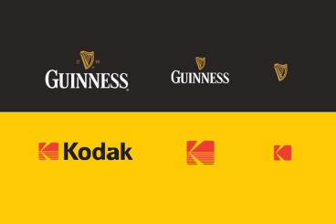
There’s a bit of disruption happening in the world of logos. The single static logo isn’t enough to carry your brand anymore. You actually need a library of logos to meet all the needs of your brand.

This idea has been evolving for a while; just think of the variations for a website, social media and even that tiny favicon in web browsers.

It can be a lot to think about. So let’s try to organize those logo thoughts.

The Greatest Print Campaigns of All Time: Volkswagen Think Small

Graphics / 18 Oct 2017

The Greatest Print Campaigns of All Time: Volkswagen Think Small

You’re a web designer living large in the 21st century. Your job is defined by screens and software. What in the world could you possibly learn about design from a bunch of old dusty print ads? The answer of course, is “a ton.”

Today we’re examining one of the most famous print ad campaigns of all time. The Volkswagen “Think Small” campaign. How did a funny looking car that was named after a bug, known for being slow and manufactured in factories built by Nazis ever become iconic to a generation of post-war Americans? Great design and fantastic marketing.

Design Trend: Vivid Rainbow Colors

Graphics / 16 Oct 2017

Design Trend: Vivid Rainbow Colors

If nothing else, 2017 has been a year of color in website design. Color trends have dominated the conversation about design, with brighter, bolder hues as a large part of the landscape.

There’s a new color trend that combines a lot of those bright options into bigger color palettes that you might now expect – rainbow color patterns. That’s right, more designers are taking a change with a lot of color and incorporating vivid rainbow, gradient colors into design projects. And it’s pretty cool!

Here’s a look at the trend and some ideas for how to use vivid color that aren’t garish.

Tips for Creating a Modern Monochrome Color Palette

Graphics / 9 Oct 2017

Tips for Creating a Modern Monochrome Color Palette

A monochrome color scheme isn’t always the first idea that comes to mind when starting a new design project. But single-color design projects can have a lot of impact and give the opportunity to branch out and try some new techniques.

Monochromatic projects, which consist of a color palette with just one color, can be striking because they aren’t as commonly seen as projects with more color variances. This alone can make your project stand out.