Poster Design / 5 Aug 2019
How to Design a Poster for an Event: 7 Key Tips
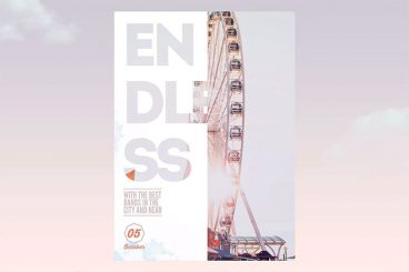
Event poster design is a lot of fun. For most poster projects, you really get to express creativity with a one-off design for a single event. While you may still have constraints such as brand typography or color palette, there’s often lots of leeway to create something visually impressive.
With a goal of enticing people to show up or buy tickets, you have to design with impact for these kinds of project. But you also need to convey quite a bit of information in a concise way.
Here’s how to design a poster for an event.