Articles - Page 119

Browse hundreds of articles, tips, and inspiring design collections. Find helpful design advice, or the perfect resource for your next project.

Design Trend: Sliced Text & Typography

Trends / 11 Jun 2018

Design Trend: Sliced Text & Typography

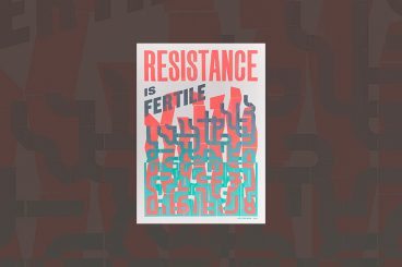
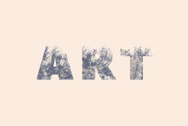
Purists say that you should never alter typography. Lettering should appear as intended by the type designer, or you should select a different font altogether. While this is mostly true, the exception is in the sliced text trend.

The nifty effect makes type elements look like they’ve been cut with a precision tool and can add visual interest to logotypes, headlines and simple text blocks. Sliced text effects can vary from super subtle (such as a small bit of a letter that’s missing) to major parts of words missing altogether.

The thing to keep in mind when using sliced text is that words must always be readable – what point is there otherwise? – and you should pay close attention so that unintended letter combinations or words don’t appear due to slicing. Here’s a look at how to make it work for you with some examples of designs that do it well.

Wedding Monogram Logo Ideas, Tips & Advice

Wedding Design / 4 Jun 2018

Wedding Monogram Logo Ideas, Tips & Advice

A classic wedding monogram is a design element that almost any couple can incorporate into their wedding design and stationery. From use in invitations and mailings to a shared post-nuptial monogram, creating a classy wedding logo or monogram element can be a great touch.

Here are a few tips to help you make your own wedding logo or monogram including templates, ideas, and graphics to help you get started fast.

27 Inspiring Letterpress Style Posters

Poster Design / 31 May 2018

27 Inspiring Letterpress Style Posters

Are you planning on designing a poster with a retro or a vintage vibe? Not sure where to start? Then browse our hand-picked collection of letterpress posters and letterpress templates to find inspiration.

Letterpress is one of the oldest printing techniques that date back to the early 1440s. Back in the day, this technique was used to easily print many copies of a poster, flyer, and other designs with photo and letter-etched plates.

Even though it’s no longer widely used by printers and publishers, the technique and the unique design style is still celebrated by artists and designers. It’s especially popular among poster designers. In this collection, we’re featuring elegant and modern letterpress poster designs.

10 Tips for Using Text Effects That Don’t Suck

Typography / 30 Apr 2018

10 Tips for Using Text Effects That Don’t Suck

Adding effects to typography can be a source of heartache for designers. Clients demand a drop shadow or embossing, and you’re stuck with text effects that threaten to ruin a project. What you need is an arsenal of text effects that don’t suck so you can help the client pivot to something a little more classy.

The trick to all of these effects is using them with purpose. Good typography doesn’t need “help.” If a font isn’t working alone, it’s not going to work with a bunch of techniques added either. (You’ll only make something bad even worse.)

The best text effects are nearly invisible to non-designers. Or text effects are used to add meaning to typography or lettering. Here are a few tips for using text effects that don’t suck with some pretty cool examples.

10 Examples of Timeless Apple Design

Inspiration / 25 Apr 2018

10 Examples of Timeless Apple Design

When we set out to create a list of ten historic Apple products that feature timeless design, it seemed a little daunting. The reality is that it was anything but.

Apple has been at the forefront of design and product design innovation since the Apple I in 1976. (Yes, Apple really has been making computers for 40-plus years.) There are so many products and designs that continue to shape the way we think about creating things today. Wikipedia has a pretty impressive timeline that shows every release – good and bad.

Let’s take a look at ten of our favorite examples that stand the test of time!

10 Tips for a Perfect Facebook Cover Image

Graphics / 18 Apr 2018

10 Tips for a Perfect Facebook Cover Image

Almost every business and individual – from personal pages to freelance business pages – uses Facebook. It’s likely an integral part of your marketing strategy. It might even be your main professional website.

So it is important that you make the most of this platform to ensure that your social media profile is polished and professional. A sloppy image, bad crop, or text that scales improperly can give the wrong first impression. Here are 10 tips for creating a perfect Facebook cover image that people will want to click.

7 Tips for Finding the Perfect PowerPoint Presentation Template

PowerPoint Templates / 11 Apr 2018

7 Tips for Finding the Perfect PowerPoint Presentation Template

A great PowerPoint presentation template can wow audiences, and help you to build a slideshow quickly and easily. While you can create your own custom template, there’s a whole market of affordable PowerPoint templates that you can customize. But what should you be considering when deciding which one to choose?

PowerPoint templates are a great option for designers – or practically anyone – who wants to create a polished, professional-looking presentation that doesn’t take a lot of time to put together. Here’s what to look for to ensure that you are getting the perfect PowerPoint template for each specific presentation.

10 Design Tips for Wedding Cards & Invitations

Wedding Design / 2 Apr 2018

10 Design Tips for Wedding Cards & Invitations

Wedding season is here. Whether you’re planning to design invitations and cards for your own wedding, or for a client or a friend, there are several wedding card design tips that you’ll want to consider!

Wedding invitations present an opportunity to work with some beautiful elements and printing techniques to create a piece of art that isn’t part of the usual workflow. From scripts with long tails to foiling and amazing paper stocks, designing wedding cards and invitations can be a lot of fun (and a bit of a design challenge).

The big thing to keep in mind is that the invitation should evoke an emotional connection to the couple. It should reflect their personality and style.

20+ Awesome Resources for Bootstrap Lovers

Bootstrap / 22 Mar 2018

20+ Awesome Resources for Bootstrap Lovers

Bootstrap has simply exploded in the web development community. There will always be skeptics and haters but on the whole, the project has been a smashing success and can constantly be seen at the top of the Forked and Watched charts at GitHub.

As a result of Bootstrap’s fame, lots of great related resources have been put forth by the development community. Today we’ve collected our favorites into a list of everything you need to get started with Bootstrap. From introductory tutorials to wireframing kits and custom generators, there’s something here for every Bootstrap lover.

Serif, Sans, Script & Slab: 4 Font Types Explained

Typography / 5 Mar 2018

Serif, Sans, Script & Slab: 4 Font Types Explained

Always wanted to know the difference between serif, sans, script, and slab fonts? Look no further. Take your typography game to the next level, and quit guessing if certain typefaces or font pairs work together. Back your logic with a little design theory!

Having a better knowledge of fonts and typography can make explaining your choices to clients easier (always a bonus), and will give you more confidence when selecting font pairs. Here’s a primer (or refresher) on four common font types and how to use them in your design projects.

13 Best Ways to Learn CSS Grid

CSS / 26 Feb 2018

13 Best Ways to Learn CSS Grid

CSS Grid an increasingly popular method for creating complex responsive web design layouts that render more consistently across browsers. Now is the time to familiarize yourself with CSS Grid, so we’ve collected 13 of the best ways to get started learning today.

Rather than old-school methods such as tables or the box model, CSS Grid allows you to create more asymmetrical layouts and more standardized code that is cross-browser compatible. Most major website browsers already support CSS Grid and it is a W3C Candidate Recommendation, which would formalize it as a standard practice. It’s widely believed that CSS Grid will be the future of website layouts.

How to Design Readable Content for the Web

Typography / 14 Feb 2018

How to Design Readable Content for the Web

Designing content is more than just making something look great. You have to create a design that people will actually read, and help them engage with the content. Sometimes, that’s easier said than done.

People generally have short attention spans, and you shouldn’t expect them to digest every word on the screen. But you can use certain design techniques and elements to help users read as much as possible.