Graphics / 9 Feb 2012
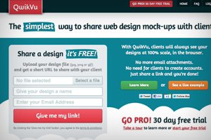
Effortlessly Showcase Your Mockups to Clients With QwikVu
If you’re a front end designer, presenting clients with mockups can be tricky. Emailing files can be cumbersome and lead to unwanted questions about how to view the image properly, and many image sharing services aren’t ideal for viewing full-size website mockups in their proper context.
Today we’re going to take a look at QwikVu, a web app that’s specifically built for designers who want to share web design mockups with clients. Is it the tool you’ve been looking for to make client presentations easier? Read on to find out.