Search Results For: break

How to Create Reusable Canva Templates for Your Brand

Business / 25 Jun 2025

How to Create Reusable Canva Templates for Your Brand

Consistency is key when it comes to building a memorable brand. But keeping your designs aligned, especially when your team is growing or juggling lots of content, can be time-consuming.

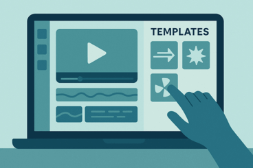
Reusable Canva templates are a great solution to this problem.

With a few smart setups, you can save time, reduce design stress, and make sure every post, presentation, or flyer looks and feels on-brand.

In this guide, we’ll walk through the benefits of reusable templates in Canva, how to build them from scratch, and how to share them with your team to enhance design workflow and keep everyone on the same page.

How to Use Motion Templates to Level Up Social Media Ads

Business / 23 Jun 2025

How to Use Motion Templates to Level Up Social Media Ads

If you’ve ever scrolled through social media and stopped mid-swipe because something caught your eye, chances are it had movement.

Motion has a way of grabbing attention in a crowded feed, and brands are using it to their advantage. That’s where motion templates come in.

These ready-made, animated templates make it easy to add movement to your social media ads without needing to be a motion graphics pro.

From animated Instagram Stories to promo reels and TikTok ads, motion templates help turn static visuals into scroll-stopping content.

In this post, we’ll break down what motion templates are, where to find them, and how to use them effectively to boost engagement, clicks, and conversions.

Designing Accessible Forms: Small Fixes, Big Impact

Accessibility / 20 Jun 2025

Designing Accessible Forms: Small Fixes, Big Impact

Accessible forms are a crucial part of inclusive design.

They help ensure that everyone, whether using a keyboard, screen reader, voice input, or assistive device, can complete the same tasks as any other user.

But too often, forms are designed without considering how users of all abilities will experience them. The result? Frustration, mistakes, and even abandonment.

The good news is that improving form accessibility doesn’t require a complete redesign. In fact, small adjustments can make a huge difference.

In this post, we’ll explore practical ways to make your forms more accessible, easy to use, and user-friendly for everyone.

25+ Best Rough & Weathered Textures (Free & Pro)

Background Textures / 19 Jun 2025

25+ Best Rough & Weathered Textures (Free & Pro)

Rough and weathered textures can instantly add depth, personality, and a sense of history to your work.

Whether you’re designing a vintage poster, crafting a rugged brand identity, or giving your digital art a raw, tactile feel, these textures help break the clean, flat look of modern design and bring in layers of authenticity and mood.

Today, we bring you a collection of the best rough and weathered textures, including distressed paper and scratched metal to grunge overlays, cracked surfaces, and worn fabric patterns.

Story-Based Social Posts: Designing Narratives for Swipeable Content

Instagram Templates / 18 Jun 2025

Story-Based Social Posts: Designing Narratives for Swipeable Content

Social media is no longer just about eye-catching single posts; it’s about creating experiences that draw people in and keep them engaged.

One of the most effective ways to do this is through story-based, swipeable content.

Whether it’s a multi-image Instagram carousel, a swipeable LinkedIn post, or a TikTok image story, this format gives you the chance to tell a narrative that unfolds naturally as users interact with it.

Instead of overwhelming viewers with too much information at once, story-based posts guide them through a structured flow, one swipe at a time.

When done well, these posts encourage deeper engagement, spark curiosity, and strengthen your brand’s voice.

In this guide, we’ll explore how to design swipeable story content that connects with your audience and delivers lasting impact.

How to Conduct a Visual Design Audit (And Why You Should)

UX Design / 16 Jun 2025

How to Conduct a Visual Design Audit (And Why You Should)

Over time, even the most thoughtfully designed brand or product can start to drift.

As new pages, features, and marketing materials are added, inconsistencies in colors, typography, imagery, and layout can sneak in.

What starts as a polished, cohesive system can slowly turn into a patchwork of mismatched styles.

That’s where a visual design audit comes in.

A visual design audit is a structured review of your product’s visual language, everything from your logo and typography to UI components, imagery, and spacing. It helps you spot inconsistencies, clean up your design system, and ensure your brand looks and feels unified across every touchpoint.

In this post, we’ll look at why conducting a visual design audit is valuable, what to include in your audit, and how to do one effectively.

Designing With Constraints: How Limitations Fuel Creativity

Business / 14 Jun 2025

Designing With Constraints: How Limitations Fuel Creativity

When you’re first handed a design brief filled with restrictions like tight deadlines, limited color palettes, and strict brand rules, it can feel like you’re being boxed in.

But what if those constraints are actually an advantage?

Many great design solutions don’t come from unlimited freedom, they come from figuring out how to make something work within clear boundaries.

Designing with constraints isn’t about settling for less. It’s about learning how to focus, prioritize, and find clever ways to solve problems.

In fact, limitations often lead to more thoughtful, original work because they force designers to think critically and get creative with what’s available.

Today, we explore how designing with constraints can actually be a good thing and how you can achieve great outcomes even when working with limitations.

Building Cross-Platform UI Kits in Figma: A Practical Guide

Figma Templates / 13 Jun 2025

Building Cross-Platform UI Kits in Figma: A Practical Guide

Designing for multiple platforms, like iOS, Android, and web, can be challenging when each system has its own guidelines, user expectations, and interface patterns.

This is where cross-platform UI kits come in to help streamline the design process, create consistency, and speed up development.

Figma makes it easier than ever to build, maintain, and scale a UI kit that works across platforms.

In this guide, we will walk you through the process of creating a cross-platform UI kit in Figma, from setting up foundations to organizing components and working with teams.

20+ Best Small Caps Fonts

Font Collections / 12 Jun 2025

20+ Best Small Caps Fonts

Small caps fonts are a designer’s secret weapon for creating sophisticated, balanced typography.

Unlike regular uppercase letters, small caps are specially designed to match the height and weight of lowercase characters, making them perfect for acronyms, headings, subheadings, and stylistic emphasis without overpowering the text.

Here, you’ll find many small caps fonts you can use in your design projects. These fonts either include true small caps or offer well-crafted alternatives.

From timeless serif fonts to sleek modern sans-serifs, these fonts are built for readability, elegance, and flexibility across a wide range of design projects. Have a look.

Mega Menus Revisited: UX Best Practices in 2025

UX Design / 11 Jun 2025

Mega Menus Revisited: UX Best Practices in 2025

Navigation is one of the first things users interact with on a website, and when it’s done well, they barely even notice it.

In 2025, mega menus continue to play a big role in navigation design for organizing content-heavy websites, but they’ve evolved.

Today’s mega menus are cleaner, smarter, and more mobile-friendly than ever before. If your site has lots of pages or product categories, a mega menu might just be your best option.

But like any design element, mega menus can hurt the user experience if they’re overdone or poorly implemented.

In this post, we explore the latest best practices for designing mega menus in 2025 and how to keep your navigation clear, accessible, and easy to use.

Designing Accessible Email Templates That Work Everywhere

Email Templates / 7 Jun 2025

Designing Accessible Email Templates That Work Everywhere

Email remains one of the most powerful tools for communication, but its effectiveness hinges on one important factor—accessibility.

A well-designed email should be easy to read, navigate, and engage with for everyone, including people using screen readers, those with visual impairments, and users on mobile devices.

Today, accessibility isn’t just a nice-to-have feature; it’s expected. But creating an email that works for every reader across every device and platform is no small feat.

Between countless email clients, dark mode preferences, and accessibility standards, designers and marketers need to be more intentional than ever.

In this post, we’ll explore the key elements of email UX and designing accessible email templates to make sure your message gets through clearly and inclusively.

Grids & Type: Structuring Typography for Visual Harmony

Layouts / 6 Jun 2025

Grids & Type: Structuring Typography for Visual Harmony

Typography isn’t just about choosing the right font, it’s about how that type lives on the page.

When type is placed within a grid, it gains structure, rhythm, and consistency. And when done well, it gives a layout a sense of balance that feels almost invisible, but undeniably effective.

Grids and typography go hand in hand in everything from editorial layouts to digital interfaces. A well-structured grid creates order. It helps guide the eye, reinforce hierarchy, and make complex content feel easy to read.

Whether you’re designing a landing page, a magazine spread, or even a social post, understanding how to align your type with a grid can completely change how people interact with your design.

In this post, we take a closer look at the relationship between type and grids, and how it helps create structure for typography.