Search Results For: design

5 Reasons to Use a Responsive Mockup Template

Mockup Templates / 13 Jun 2018

5 Reasons to Use a Responsive Mockup Template

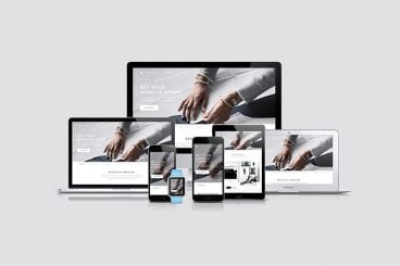
If you aren’t using responsive mockup templates to showcase your website and app design projects, you’re missing out! A mockup template provides a realistic or stylized shell to highlight a design, and choosing a responsive template can beautifully show your design’s versatility.

Most designers use a mockup template to place a website design into a computer screen, tablet, or phone to give clients or other stakeholders a preview of what a finished project will look like. The result is polished and easy for users to understand.

If you haven’t ventured into the world of using one of these tools yet, here are five reasons to use a responsive mockup template. All with some great examples to show you exactly how they work.

Features

Each Design Shack feature covers everything you need to know about a topic, with articles, inspiration, and how-to posts. Brush up on anything from PowerPoint templates to Tumblr themes, with our in-depth features.

Read the Feature →

Wedding Monogram Logo Ideas, Tips & Advice

Wedding Design / 4 Jun 2018

Wedding Monogram Logo Ideas, Tips & Advice

A classic wedding monogram is a design element that almost any couple can incorporate into their wedding design and stationery. From use in invitations and mailings to a shared post-nuptial monogram, creating a classy wedding logo or monogram element can be a great touch.

Here are a few tips to help you make your own wedding logo or monogram including templates, ideas, and graphics to help you get started fast.

27 Inspiring Letterpress Style Posters

Poster Design / 31 May 2018

27 Inspiring Letterpress Style Posters

Are you planning on designing a poster with a retro or a vintage vibe? Not sure where to start? Then browse our hand-picked collection of letterpress posters and letterpress templates to find inspiration.

Letterpress is one of the oldest printing techniques that date back to the early 1440s. Back in the day, this technique was used to easily print many copies of a poster, flyer, and other designs with photo and letter-etched plates.

Even though it’s no longer widely used by printers and publishers, the technique and the unique design style is still celebrated by artists and designers. It’s especially popular among poster designers. In this collection, we’re featuring elegant and modern letterpress poster designs.

10 Tips for Using Text Effects That Don’t Suck

Typography / 30 Apr 2018

10 Tips for Using Text Effects That Don’t Suck

Adding effects to typography can be a source of heartache for designers. Clients demand a drop shadow or embossing, and you’re stuck with text effects that threaten to ruin a project. What you need is an arsenal of text effects that don’t suck so you can help the client pivot to something a little more classy.

The trick to all of these effects is using them with purpose. Good typography doesn’t need “help.” If a font isn’t working alone, it’s not going to work with a bunch of techniques added either. (You’ll only make something bad even worse.)

The best text effects are nearly invisible to non-designers. Or text effects are used to add meaning to typography or lettering. Here are a few tips for using text effects that don’t suck with some pretty cool examples.

10 Tips for a Perfect Facebook Cover Image

Graphics / 18 Apr 2018

10 Tips for a Perfect Facebook Cover Image

Almost every business and individual – from personal pages to freelance business pages – uses Facebook. It’s likely an integral part of your marketing strategy. It might even be your main professional website.

So it is important that you make the most of this platform to ensure that your social media profile is polished and professional. A sloppy image, bad crop, or text that scales improperly can give the wrong first impression. Here are 10 tips for creating a perfect Facebook cover image that people will want to click.

7 Tips for Finding the Perfect PowerPoint Presentation Template

PowerPoint Templates / 11 Apr 2018

7 Tips for Finding the Perfect PowerPoint Presentation Template

A great PowerPoint presentation template can wow audiences, and help you to build a slideshow quickly and easily. While you can create your own custom template, there’s a whole market of affordable PowerPoint templates that you can customize. But what should you be considering when deciding which one to choose?

PowerPoint templates are a great option for designers – or practically anyone – who wants to create a polished, professional-looking presentation that doesn’t take a lot of time to put together. Here’s what to look for to ensure that you are getting the perfect PowerPoint template for each specific presentation.

20+ Awesome Resources for Bootstrap Lovers

Bootstrap / 22 Mar 2018

20+ Awesome Resources for Bootstrap Lovers

Bootstrap has simply exploded in the web development community. There will always be skeptics and haters but on the whole, the project has been a smashing success and can constantly be seen at the top of the Forked and Watched charts at GitHub.

As a result of Bootstrap’s fame, lots of great related resources have been put forth by the development community. Today we’ve collected our favorites into a list of everything you need to get started with Bootstrap. From introductory tutorials to wireframing kits and custom generators, there’s something here for every Bootstrap lover.

Serif, Sans, Script & Slab: 4 Font Types Explained

Typography / 5 Mar 2018

Serif, Sans, Script & Slab: 4 Font Types Explained

Always wanted to know the difference between serif, sans, script, and slab fonts? Look no further. Take your typography game to the next level, and quit guessing if certain typefaces or font pairs work together. Back your logic with a little design theory!

Having a better knowledge of fonts and typography can make explaining your choices to clients easier (always a bonus), and will give you more confidence when selecting font pairs. Here’s a primer (or refresher) on four common font types and how to use them in your design projects.

13 Best Ways to Learn CSS Grid

CSS / 26 Feb 2018

13 Best Ways to Learn CSS Grid

CSS Grid an increasingly popular method for creating complex responsive web design layouts that render more consistently across browsers. Now is the time to familiarize yourself with CSS Grid, so we’ve collected 13 of the best ways to get started learning today.

Rather than old-school methods such as tables or the box model, CSS Grid allows you to create more asymmetrical layouts and more standardized code that is cross-browser compatible. Most major website browsers already support CSS Grid and it is a W3C Candidate Recommendation, which would formalize it as a standard practice. It’s widely believed that CSS Grid will be the future of website layouts.

The 3 Cs of User Interfaces: Color, Contrast, and Content

Web Standards / 7 Feb 2018

The 3 Cs of User Interfaces: Color, Contrast, and Content

There’s an old business model that many business strategists live by—the 3 Cs. It’s a reminder to focus on the company, customers and competitors. Many small businesses and websites also use this model. But for designers, the three Cs are a little different.

When creating user interfaces, you should focus on color, contrast, and content. These three elements are the foundation of good design. But each is a little more complex than it might seem from the surface. Here’s how to think about–and incorporate–the three Cs of user interfaces into your design projects.

Pantone’s Color of the Year: Ultra Violet (And How to Use It)

Graphics / 14 Dec 2017

Pantone’s Color of the Year: Ultra Violet (And How to Use It)

Ultra Violet. It sounds like the name of a pop band. Pantone’s Color of the Year for 2018 is inspired by music and art and individuality.

The color is reminiscent of Prince’s famous purple and it is part of a growing trend in design to use bolder, brighter colors in more projects. Here’s a look at Pantone’s color of the year and how you can use it in your projects.