Search Results For: pattern

Is Your Design Inclusive? (And How to Make It More Inclusive)

UX Design / 18 Aug 2020

Is Your Design Inclusive? (And How to Make It More Inclusive)

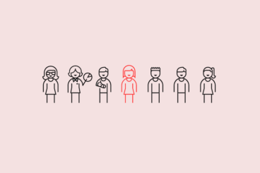
Is your design for everyone? We talk a lot about creating with an audience in mind, but it’s important to understand that audience can identify in several ways.

Now more than ever before, it is important to create designs and visuals that are inclusive of that entire audience segment. An inclusive aesthetic will make users feel like they are part of the design and that a company, organization, or product is for them.

Inclusivity is more than just accessibility. It’s a combination of function and visual design that creates something that people identify with and want to be a part of.

It’s time to check yourself and your designs, put aside your biases and take a hard look at projects to ensure they are as all-encompassing as they can be. Let’s get started.

Split Screen Web Design: The Trend That Keeps Growing

Trends / 15 Jun 2020

Split Screen Web Design: The Trend That Keeps Growing

Website design with a split-screen aesthetic is a trend that keeps evolving and growing. A split-screen design can be good for a number of reasons, including mobile compatibility and user-friendliness. Plus, many of these designs just look great!

Shifts in the trend show that there are so many different ways to create an effective split screen design that users will love. Consider this your introduction to split-screen design in the new and improved era!

Design Psychology: 8 Strategies to Use in Your Projects

Business / 26 May 2020

Design Psychology: 8 Strategies to Use in Your Projects

Psychology, the study of the human mind, is a very complex subject that even the scientists struggle with. In fact, scientists and researchers are still trying to figure out why we have dreams when we sleep.

However, thanks to many studies, years of research, and the dedication of brilliant minds like Sigmund Freud, we now have a general understanding of how the human mind works.

As it turns out, our minds are pre-programmed to respond and react to certain things in certain ways. There are also specific patterns of how our mind reacts and the way we think. In psychology, these patterns are called “schemas”. Researchers have also found strategies that could influence these patterns to control our reactions.

Everyone from magicians to big brand corporations and the mass media have been using and taking advantage of these strategies for generations. To influence our behavior and sell products.

In this guide, we look at how you can apply the same psychological strategies they use for the good of others. And make better and more effective designs.

5 Reasons to Avoid the Desktop Hamburger Menu Icon

Navigation / 18 May 2020

5 Reasons to Avoid the Desktop Hamburger Menu Icon

A hamburger icon as the only source of navigation on a desktop website sucks. It’s frustrating, confusing, and violates unwritten rules of navigation and user flow best practices. Why would you do it? Other than to maintain or establish a certain aesthetic, it’s hard to find an answer that makes any sense.

The often-debated hamburger icon can be a great complement to website navigation or even for small screens, but it shouldn’t be the only option for desktops. You are doing yourself – and the website design – a huge disservice if this is your only menu option.

Take note of the different desktop menu styles throughout this post. Some of the best uses of the hamburger icon come with other menu items.

Design Trend: Liquid Animation in Web Design

Trends / 4 Mar 2020

Design Trend: Liquid Animation in Web Design

Delightful design accents can be one of those things that creates an unexpected user experience that keeps visitors on your website.

A trending technique that does exactly this is the use of liquid animation in web design. What’s great about his trend is that you can use it in so many different ways to create an interface that works with your content.

Here, we’re going to look at various examples of this trend and how you can make it work for you. (Make sure to click through the examples to get a good feel for how each of these animations works.)

Design Trend: Mixing Realism and Illustrations

Trends / 19 Feb 2020

Design Trend: Mixing Realism and Illustrations

There’s a trend afoot in website design that mixes real images with illustrations and art elements in interesting ways. And it’s quirky, unique, and beautiful!

It’s a mashup of visual elements that don’t seem like they go together at first, but when done well can create a stunning aesthetic that is highly engaging and delightful.

Here, we’re going to look at examples of this design trend and different ways of mixing realism and illustrations for maximum impact. Some of these sit within fairly corporate designs, and others are completely playful and entertaining. It’s a wide range of applications of a thoroughly unique and interesting trend.

10 Pros and Cons of Minimal Navigation in Web Design

UX Design / 17 Feb 2020

10 Pros and Cons of Minimal Navigation in Web Design

There’s been a shift happening in website design for a while: navigation and menus are shrinking. Minimal navigation styles and elements are growing in popularity, despite arguments against the hamburger menu icon.

Although not all minimal navigation elements use this style, it’s certainly a visual style we’ve seen explode in use over the past few years.

But does it work? Should you consider using minimal navigation for projects? Here, we’re going to take a look at some pros and cons with examples of use. The answer might not be as simple as you think.

Airline Logos: The 20 Best and Worst Examples

Inspiration / 4 Feb 2020

Airline Logos: The 20 Best and Worst Examples

The best way to learn logo design is to learn from the very best and the worst. In this case study, we explore some of the best airline logos as well as a few terrible logo designs, to help you learn the right way to design a logo and the mistakes to avoid.

Why airline logos? Well, it’s all about branding. Incorporating a brand identity into a logo design is the main part of logo design. It plays a key role in making the logo more appealing to its target audience.

Airlines usually target and serve various audiences. As a result, they are also challenged with designing a logo that appeals to all audiences around the world. This makes airline logos a great source for learning how to properly craft a logo that effectively promotes the brand.

Let’s start by checking out some of the best logos made by airlines.

5 New CSS Techniques to Master in 2025

CSS / 3 Jan 2020

5 New CSS Techniques to Master in 2025

Web designers are fascinated with ways to try new CSS techniques and push the boundaries of what CSS can do. Well-planned CSS can control almost any aspect of a design, and contribute to better overall user experiences—with cleaner and more consistent code.

But what techniques are trending? What should you learn next? We have a few ideas for the latest developments to watch this year. Dive in, see what’s hot, and try some of these new CSS tips and techniques to give your next project an exciting edge.

Vintage Graphic Design: Inspiration, Ideas + Modern Takes

Trends / 27 Nov 2019

Vintage Graphic Design: Inspiration, Ideas + Modern Takes

Vintage graphic design is a nifty way to create an old-school feel for projects. Today we’re exploring the vintage graphic design trend, and how to use it in your design projects.

Vintage elements can include typography, illustrations, photo styles, and even entire aesthetic palettes. Further, there are different eras to choose from when you want to go for a vintage feel.

Vintage themes from different time periods can provide completely different visual properties and techniques to play with.

Let’s explore some of them!

What Is Modern UI Design? 10 Tips & Examples

Trends / 30 Oct 2019

What Is Modern UI Design? 10 Tips & Examples

Chances are that you might not be able to list the aesthetics of a modern user interface, but you sure know when you land on a website that doesn’t use one. It just feels dated.

Modern UI design helps establish credibility for your website or brand because it has a style that fits what most people to be a current visual aesthetic. This might include visual trends, adapting to usability standards and patterns, and using development techniques that are appropriate for today’s users.

Here, we’re going to look at elements that you’ll find in modern user interfaces. Hopefully, most of these examples seem pretty familiar, but if not, it might be time to plan a little web refresh.

The Art of Website UI Button Design: 10 Trends & Tips

Trends / 28 Oct 2019

The Art of Website UI Button Design: 10 Trends & Tips

Great button design is something that most website users never think about… because when it works well, it’s almost invisible. The best buttons are easy to click or tap, have an obvious function, and help users interact with the design without thinking.

It’s a fairly simple formula, but it can be hard to design if you leave it as an afterthought.

Today, we’re looking at trends in button design, plus a few tips to help you design a UI button that people click over and over again. Give your button design a boost with these tips, trends, and ideas to spark inspiration.