Search Results For: pattern

Design History: The Art of Playing Cards

Layouts / 7 Nov 2011

Design History: The Art of Playing Cards

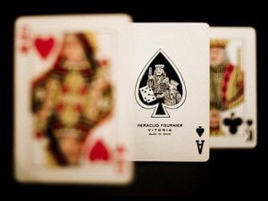
Great design inspiration is all around us. Sometimes the best examples are so common that we see them all the time without a second thought. The cars we drive, the advertisements in our mailbox, the cover art on that new album you just downloaded, all of these are teaching their own little design lessons and if we would but listen, we just might learn something.

Today’s subject is playing cards. At least one pack can be found in almost every home in America, which means they’re a perfect example of ubiquitous design that we take for granted. We’ll take a fresh look at why they’re so perfectly designed and learn a little history along the way.

Five Fascinating Things You Didn’t Know About Famous Car Logos

Graphics / 5 Oct 2011

Five Fascinating Things You Didn’t Know About Famous Car Logos

Automobile logos represent some of my favorite emblems. I recently became curious as to the origins of several of these popular icons and came across some incredibly interesting facts!

Join us as we look back at some of the most well known logos around and uncover some of their unbelievable secrets!

Graphics / 15 Sep 2011

Then and Now: The Evolution of Cereal Mascots

Today we’re going to have some good old nostalgic fun and take a walk through cereal box history to look at some beloved characters that have been with most of us since we could chew.

Keep reading to see what your favorite cereal box mascot looked like years ago versus today!

Typography / 31 Aug 2011

8 Simple and Useful Tips for Kerning Type

Kerning is fun! All right, unless you’re a serious type nerd like me, that’s definitely not going to be a true statement. However, it is an absolutely essential part of your typographical education and implementation.

If you’ve been ignoring kerning or simply aren’t sure how to do it properly, take a look at these eight quick tips and get started on the road to becoming a kerning master.

Graphics / 5 Aug 2011

Separating Content: 10 Ways to Draw the Line

The story is as old as graphic design itself: you have two different sections and you need a way to visually separate them. As a designer, I frequently spot myself reverting to the same old one or two tricks to pull this off. Why not mix it up a bit?

Today we’ll show you ten awesome ways to create two distinct sections of content. Each example is from a real website so you can click through to see it in action.

CSS / 25 Jul 2011

Achieving Multi-Step Animations With CSS Transitions

Multi-step CSS animations are easy with keyframes, but what if we want to use plain old transitions to achieve a similar effect? Further, how do we take a single hover event and translate that into multiple animations on different elements?

The answer lies in using buried hovers, a simple and effective trick you should definitely try out.

CSS / 22 Jul 2011

How to Implement Some Slick Icons Using a Font and CSS

Using an image-based font can be a fun and quick way to implement icons across your site. It’s a super easy process that gives you complete freedom to go back and re-size your icons at any time.

Today we’ll use the excellent Pictos font to build a simple web page so you can get a feel for the process.

CSS / 11 May 2011

Build a Pure CSS Slideshow With Webkit Keyframes

While playing around with Webkit Keyframe Animations I figured out a way to create an awesome little image slider using only CSS. It’s definitely a bit unconventional but it’s a great way to learn to think outside of the box with what you can do with CSS3.

Keep in mind that since we’re using Webkit Keyframes, this is purely an educational experiment and will only work in Safari or Chrome. As more browsers begin to support keyframe animations in the future, this method should become perfectly usable in your own web projects.

Graphics / 28 Apr 2011

Dribbble, Philosophy and the Art vs. Design Debate

Always eager to jump into a debate, today I tackle the concept that artsy eye candy is currently too prevalent in design. Design inspiration galleries and communities are constantly critiqued for displaying art when their focus should be on design.

Can we cut through the biases and assumptions of the common rhetoric and discover the proper place for artistic talent in relation to functional design? Let’s find out.

Inspiration / 1 Apr 2011

20 Great Sign Up Form Examples to Learn From

Sign up forms come in many different shapes and sizes. Some are a single field, others are a multi-step process that stretch over several screens.

Today we’ll take a look at 20 attractive and functional forms to see if we can find any useful ideas that you can apply the next time you’re building a sign up form.

Software / 31 Mar 2011

Apply Graphics to Textured Surfaces With Displacement Maps

Do you ever wonder how Photoshop masters create such realistic compositions? Seemingly simple tasks such as throwing some text onto a brick wall can easily lead to lackluster results if you don’t know what you’re doing.

So what sets you apart from the pros? Why are their final results so believable while yours reek of Photoshop? The simple answer is that they know more tricks than you! Let’s fix that.

Graphics / 9 Mar 2011

5 Quick and Easy Photoshop Textures You Can Make From Scratch

The web is full of free texture resources. Unfortunately, we’ve all used them before and hate all the inherent restrictions that come as a result of using borrowed art. For your next project, why not just use textures that you make yourself from scratch? You skip the restrictions and the end product is much more unique because you’re not using the same resources used by everyone else.

Today we’re going to get you started by teaching you how to use a couple of basic Photoshop filters to create five completely different textures. Each texture should only take you anywhere from one to three minutes to bust out and can therefore be quickly applied without eating up your crucial design time. Let’s get started!