Inspiration / 15 Oct 2012
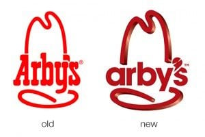
The New Arby’s Logo: Better or Boring?
Everyone’s favorite roast beef sandwich fast food chain (ok, maybe the only roast beef fast food chain anyone can name) just jumped headlong into a brand refresh. Their new logo, menu and website is meant to bring the admittedly old-timey restaurant into the 21st century.
The question of course is, did they succeed? Follow along as we take a look at the logo and website to see what we think.