CSS / 3 Apr 2012
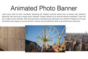
Build an Infinite Scrolling Photo Banner With HTML and CSS
Today we’re going to embark on the challenge of creating an animated banner of photos that automatically scrolls horizontally through an infinite loop. The best part: we’re going to do it without a single line of JavaScript.
To make this banner truly useful, our goal will be to use individual photos dropped into our HTML, not simply one long CSS background that repeats. This is pretty tricky but we’ll walk you through exactly how it works. Let’s get started!