Search Results For: visual effects

Design Trend: How to Create a Cool Split Screen Aesthetic

Layouts / 22 Dec 2015

Design Trend: How to Create a Cool Split Screen Aesthetic

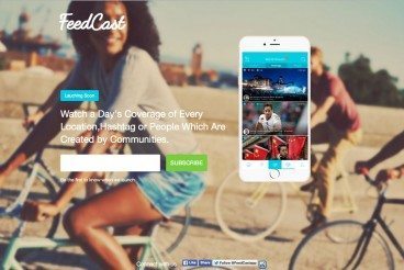
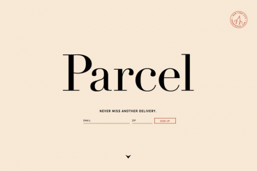
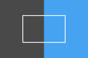
One screen divided in two. This might be one of the bigger design trends emerging right now. More and more websites are using design patterns that include two vertical or square panels placed side by side.

And it’s a nice aesthetic. The look is user friendly, can be adapted for a variety of needs, and helps guide navigation. It’s a trend that we are likely to see more of – and design – in the coming months. Today we are looking at a few great examples of split screen design with mini case studies and finding out how you can make the most of this design trend.

The Practical Beginner’s Guide to SVG

Graphics / 12 Oct 2015

The Practical Beginner’s Guide to SVG

Although the format is not particularly new, SVG images are increasingly popular in the design of websites. All major web browsers support the format and SVG is changing the way we think about and render images for the web.

Why at they so popular? And what exactly is different about an SVG file? Today, we have the answers and everything else you need to know to get started with this file type. (As a little bonus, all of the images in this post are available in SVG from Creative Market.)

Use Abstract Geometry to Create Stunning Designs

Inspiration / 24 Sep 2015

Use Abstract Geometry to Create Stunning Designs

If you’ve ever found yourself in a design rut, wondering how to come up with some fresh ideas, then you’ve no doubt experienced how refreshing it can be to experiment with a new design style that’s completely outside of what you typically produce.

Today we’re going to do exactly that. I’ve been fascinated with a particular style lately and just itching to give it a test drive. We’ll start by analyzing this style’s characteristics through the work of others and then proceed to building something on our own using what we learn. Read on to see the step by step process.

Blurred Images in Web Design: How to Make Them Work

Graphics / 10 Aug 2015

Blurred Images in Web Design: How to Make Them Work

It’s an undeniable fact: using blurred images is a trending web design technique in 2015. It seems like everywhere you look there’s some element of blur.

But this is not a solution to some of your photo problems. It’s a distinct technique that takes practice to perfect and attention to detail to get it right. So before you jump on the trend, think about the options for using blurred images to decide if it is right for you and how you can make the best use of this technique in your projects.

Kinetic Typography: An Introductory Guide

Typography / 5 Aug 2015

Kinetic Typography: An Introductory Guide

Kinetic typography seems to be everywhere these days. From television commercials to website landing pages, movable type is a popular visual tool. This popularity could come from a number of reasons but one obvious factor is that it catches your attention. People tend to be drawn to words and want to read them.

Kinetic typography puts this together with some simple animations to create words that move on the screen, grabbing your attention and engaging the senses. So let’s take a look at kinetic typography and how you can integrate it into some of your design projects. (Note: The examples in this article include animation; click the images for links to the original sources to see them in action.)

Can You Fix a Bad Design? Here’s Where to Start

Graphics / 16 Jun 2015

Can You Fix a Bad Design? Here’s Where to Start

It’s an hour before deadline and your boss just handed you a design project to finish up. And it’s bad. Very bad. It has problems ranging from poor images to crazy color, typography choices to general sloppiness. What should you do? Can it be fixed?

There are a few things you can do to help salvage a bad design with the understanding that it won’t be perfect. But making it passable as a design project for your company might well still be an option. Here’s how!

Minimalist Design Is Taking Over: Here’s Why

Minimalist Graphic Design / 15 Jun 2015

Minimalist Design Is Taking Over: Here’s Why

Everywhere you turn, another designer is releasing a project featuring a minimalist design style. This focus on space, simplicity and beautiful typography is refreshing. And it’s a great option for a number of design projects. That might be one of the reasons minimalist design is so popular.

But the trend is not brand new. Minimalism has been around almost as long as design itself. It’s a technique that ebbs and flows, but always remains as one of the classic styles, making it a design choice that almost always works.

30 Premium Tumblr Themes With Beautiful, Minimal Design

Tumblr Themes / 29 Apr 2015

30 Premium Tumblr Themes With Beautiful, Minimal Design

There are thousands of Tumblr themes all over the web. To be perfectly frank, most of them aren’t great, and won’t do your creative work justice. Today we’ve collected thirty of our favourite premium Tumblr themes from across the web.

All of these cost a few dollars, but all of them will take your Tumblr blog to another level. From stylish, minimal Tumblr themes, through to those featuring big colours and bold images — we have a full selection. All of them are available to buy straight from Tumblr directly, and can be set up on your blog in a few minutes!

The Complete Guide to an Effective Card-Style Interface Design

Layouts / 18 Mar 2015

The Complete Guide to an Effective Card-Style Interface Design

Card-style architecture is one of the biggest things in web design, and mobile design in particular. From apps to responsive websites, the card-style format is popping up everywhere.

And for good reason. Mobile card design looks nice, works well on a variety of devices and creates distinct organization and a method for content delivery. That’s why many large, well-known brands are using the card format and many smaller design and development groups are following suit.

Designing Without Images: Making Typography Work for You

Inspiration / 16 Mar 2015

Designing Without Images: Making Typography Work for You

You don’t need a great image for every design project. In fact, you can create a great design with no images at all. It’s a trend that is gaining a lot of momentum as typography-focused projects can be used to stand out against a crowded sea of hero images, video and animations.

All you have to do is think like a typographer. Designing without images takes focus, vision and a clear understanding of design and typography principles to create a piece of art that is totally comprised of text.

Designing Hover Styles and the Future of the Technique

UX Design / 24 Dec 2014

Designing Hover Styles and the Future of the Technique

Despite arguments that hover styles are dead, these small boxes that pop-up over images, text or other elements on websites are still found all over the web. Designers like them for an added bit of style and information; users like them for functionality. (They are only “dead” because hover styles don’t work without a mouse-over).

The UI function is still there for now. And if you opt to use it, you’ll want to create well-designed hover styles that engage users. You’ll also want to think about how to alter these areas of your website for responsive sites.

7 Tips for Designing a Better Checkout Page

Graphics / 26 Nov 2014

7 Tips for Designing a Better Checkout Page

With the holiday season right around the corner, many of us will be doing some shopping online. (OK… maybe a lot of shopping!) The checkout page of a website can make that experience one to remember, or one you wish you could forget.

If you are designing a checkout page, there are so many considerations – functionality, usability, security and design. The last element is something every designer can have impact on. A checkout page should not be designed as an afterthought; it is arguably the most important page in the online shopping experience.