Inspiration / 30 Jul 2014
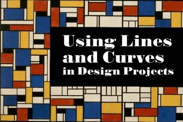
How to Tell a Story With Design
Design is a method of expression. It communicates a visual message to those who see it. It also communicates a story, whether implied or clearly stated.
As a designer, it is your job to make sure that story is clear. The design story should fall in line with the story of the company, brand, website, game, bottled drink or whatever you are working with. Telling a story is important to create a lasting impression and make your “thing” more memorable than all the others out there.